
What is
a
Top 10 KPI Report with 13 Month Rolling Trend Analysis
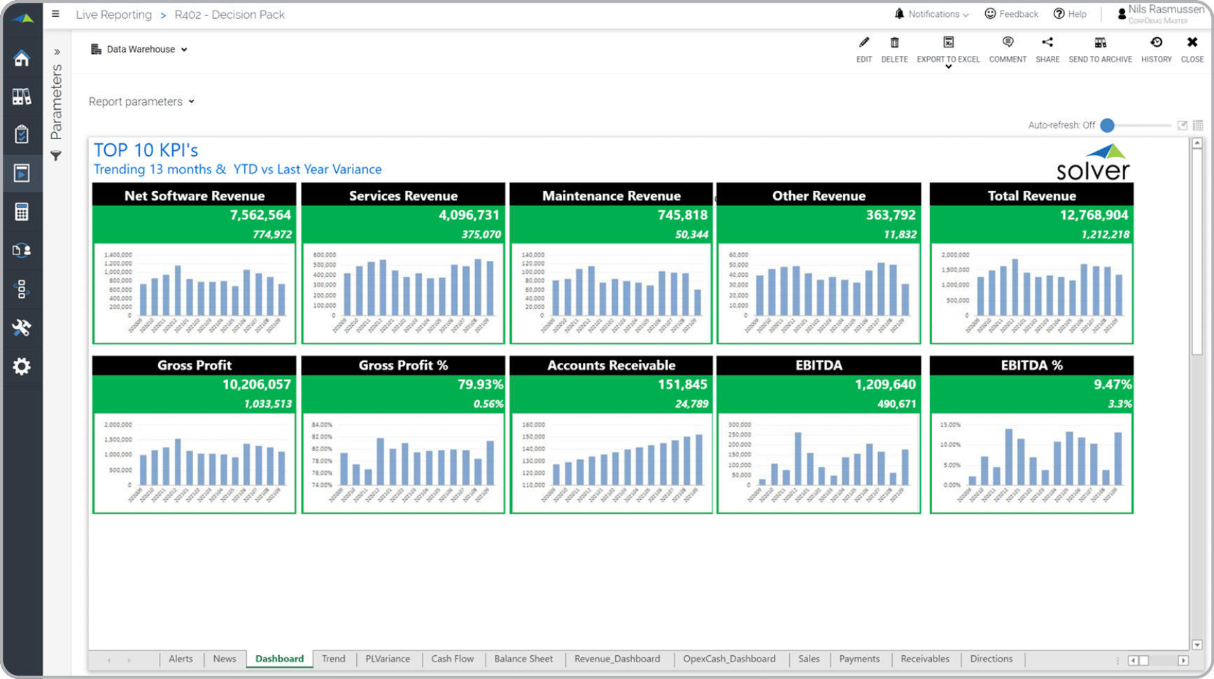
? Top KPI trend reports are considered dashboards and are often used by CFOs and Executives to analyze trends and current statuses for the company's most important key performance indicators (KPIs). Key functionality in this type of report includes a KPI page that is very graphical with dynamic, rolling 13-month trend charts. Note that the current month is highlighted as a number in each chart. Users consider this a most useful element since this KPI dashboard is part of a complete report book with many other supporting reports that offer drill down into transactional detail. These can be seen in the example as additional tabs. You will find an example of this type of report below.
Purpose of
Top KPI Trend Reports Companies and organizations use Top KPI Trend Reports to quickly see how each of their most important metrics are trending over the past 13 months. When used as part of good business practices in a Financial Planning & Analysis (FP&A) Department, a company can improve its ability to discover trends and drill down into the underlying reasons, as well as, reduce the chances that important exceptions or shifts in the business go undetected.
Top KPI Trend Report
Example Here is an example of a report book with a Top 10 KPI dashboard with 13 month rolling trend charts and supplemental reports on the other tabs. [caption id="" align="alignnone" width="1735"]
 Top 10 KPI Report with 13 Month Rolling Trend Analysis Example[/caption] You can find hundreds of additional examples
here.
Who Uses This Type of
Report
? The typical users of this type of report are: Executives and Analysts.
Other
Report
s Often Used in Conjunction with
Top KPI Trend Reports Progressive Financial Planning & Analysis (FP&A) Departments sometimes use several different Top KPI Trend Reports, along with financial reports, operational reports and other management and control tools.
Where Does the Data for Analysis Originate From? The Actual (historical transactions) data typically comes from enterprise resource planning (ERP) systems like: Microsoft Dynamics 365 (D365) Finance, Microsoft Dynamics 365 Business Central (D365 BC), Microsoft Dynamics AX, Microsoft Dynamics NAV, Microsoft Dynamics GP, Microsoft Dynamics SL, Sage Intacct, Sage 100, Sage 300, Sage 500, Sage X3, SAP Business One, SAP ByDesign, Acumatica, Netsuite and others. In analyses where budgets or forecasts are used, the planning data most often originates from in-house Excel spreadsheet models or from professional corporate performance management (CPM/EPM) solutions.
What Tools are Typically used for Reporting, Planning and Dashboards?
Examples of business software used with the data and ERPs mentioned above are:
Top 10 KPI Report with 13 Month Rolling Trend Analysis Example[/caption] You can find hundreds of additional examples
here.
Who Uses This Type of
Report
? The typical users of this type of report are: Executives and Analysts.
Other
Report
s Often Used in Conjunction with
Top KPI Trend Reports Progressive Financial Planning & Analysis (FP&A) Departments sometimes use several different Top KPI Trend Reports, along with financial reports, operational reports and other management and control tools.
Where Does the Data for Analysis Originate From? The Actual (historical transactions) data typically comes from enterprise resource planning (ERP) systems like: Microsoft Dynamics 365 (D365) Finance, Microsoft Dynamics 365 Business Central (D365 BC), Microsoft Dynamics AX, Microsoft Dynamics NAV, Microsoft Dynamics GP, Microsoft Dynamics SL, Sage Intacct, Sage 100, Sage 300, Sage 500, Sage X3, SAP Business One, SAP ByDesign, Acumatica, Netsuite and others. In analyses where budgets or forecasts are used, the planning data most often originates from in-house Excel spreadsheet models or from professional corporate performance management (CPM/EPM) solutions.
What Tools are Typically used for Reporting, Planning and Dashboards?
Examples of business software used with the data and ERPs mentioned above are:
- Native ERP report writers and query tools
- Spreadsheets (for example Microsoft Excel)
- Corporate Performance Management (CPM) tools (for example Solver)
- Dashboards (for example Microsoft Power BI and Tableau)
- View 100’s of reporting, consolidations, planning, budgeting, forecasting and dashboard examples here
- See how reports are designed in a modern report writer using a cloud-connected Excel add-in writer
- Discover how the Solver CPM solution delivers financial and operational reporting
- Discover how the Solver CPM solution delivers planning, budgeting and forecasting
- Watch demo videos of reporting, planning and dashboards
August 26, 2020