

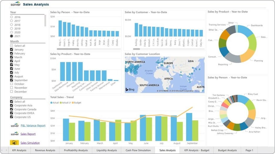
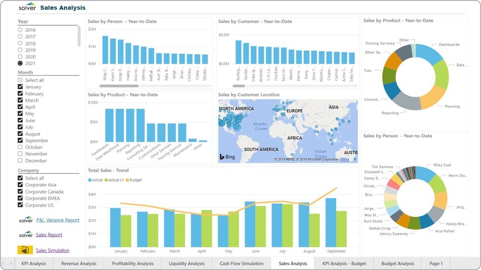
What is a Sales Dashboard? Sales visualization tools are considered operational dashboards and are often used by sales managers to analyze trends and performance rankings related to the company's sales. Key functionality in this type of dashboard shows the overall sales trend by month with comparison of actual this year versus budget and actual of last year. It also breaks down and ranks sales by sales person, customer and product. The map displays where customer concentrations are geographically. The entire dashboard is interactive, including the filters on the left side. You will find an example of this type of dashboard below.


Purpose of Sales Dashboards Companies and organizations use Sales Dashboards to provide sales managers with an easy, web-based interface to keep track of their key performance metrics. When used as part of good business practices in a sales department, a company can improve its sales monitoring capabilities, as well as, reduce the chances that performance issues are discovered late and thus cost more to resolve. Sales Dashboard Example Here is an example of a Sales Dashboard with performance rankings and trend analysis.
Who Uses This Type of Dashboard? The typical users of this type of dashboard are: Chief Revenue Officers and sales managers. Other Dashboards Often Used in Conjunction with Sales Dashboards Progressive sales departments sometimes use several different Sales Dashboards, along with KPI dashboards, detailed sales reports and other management and control tools.
Where Does the Data for Analysis Originate From? The Actual (historical transactions) data typically comes from enterprise resource planning (ERP) systems like: Microsoft Dynamics 365 (D365) Finance, Microsoft Dynamics 365 Business Central (D365 BC), Microsoft Dynamics AX, Microsoft Dynamics NAV, Microsoft Dynamics GP, Microsoft Dynamics SL, Sage Intacct, Sage 100, Sage 300, Sage 500, Sage X3, SAP Business One, SAP ByDesign, Acumatica, Netsuite and others. In analyses where budgets or forecasts are used, the planning data most often originates from in-house Excel spreadsheet models or from professional xFP&A solutions.
What Tools are Typically used for Reporting, Planning and Dashboards? Examples of business software used with the data and ERPs mentioned above are: 

Purpose of Sales Dashboards Companies and organizations use Sales Dashboards to provide sales managers with an easy, web-based interface to keep track of their key performance metrics. When used as part of good business practices in a sales department, a company can improve its sales monitoring capabilities, as well as, reduce the chances that performance issues are discovered late and thus cost more to resolve. Sales Dashboard Example Here is an example of a Sales Dashboard with performance rankings and trend analysis.
Who Uses This Type of Dashboard? The typical users of this type of dashboard are: Chief Revenue Officers and sales managers. Other Dashboards Often Used in Conjunction with Sales Dashboards Progressive sales departments sometimes use several different Sales Dashboards, along with KPI dashboards, detailed sales reports and other management and control tools.
Where Does the Data for Analysis Originate From? The Actual (historical transactions) data typically comes from enterprise resource planning (ERP) systems like: Microsoft Dynamics 365 (D365) Finance, Microsoft Dynamics 365 Business Central (D365 BC), Microsoft Dynamics AX, Microsoft Dynamics NAV, Microsoft Dynamics GP, Microsoft Dynamics SL, Sage Intacct, Sage 100, Sage 300, Sage 500, Sage X3, SAP Business One, SAP ByDesign, Acumatica, Netsuite and others. In analyses where budgets or forecasts are used, the planning data most often originates from in-house Excel spreadsheet models or from professional xFP&A solutions.
What Tools are Typically used for Reporting, Planning and Dashboards? Examples of business software used with the data and ERPs mentioned above are:
- Native ERP report writers and query tools
- Spreadsheets (for example Microsoft Excel)
- xFP&A tools (for example Solver)
- Dashboards (for example Microsoft Power BI and Tableau)
To learn more, visit the Resource Library.