
What is a
Revenue KPI dashboard for Mobile Phones
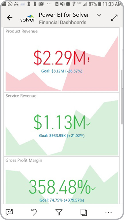
? Mobile apps that display revenue KPIs and charts are considered analytical apps and are used by executives and financial managers to monitor the company's revenue and gross margin metrics on their phones. Some of the main functionality in this type of mobile dashboard is that it displays revenue-related financial figures and charts directly on mobile phones such as iPhones and Android-based phones like Samsung Galaxy. This particular sample dashboard shows three main metrics: 1) Revenue (for any number of accounts or account groups) trend with variance versus goal, 2) Gross profit margin trend and variance versus goal, 3) Gross profit (amount) trend and variance. You find an example of this type of mobile dashboard below.
Purpose of
Revenue and Gross Margin KPI Dashboards for Mobile Phones Companies use Revenue and Gross Margin KPI Dashboards for Mobile Phones to enable managers to monitor Revenue and Gross Margin at any time by simply viewing it on their cell phone. When used as part of good business practices in a Financial Planning & Analysis (FP&A) department, an organization can improve and speed up its decision-making, and it can reduce the chances that busy managers fall behind and lose track of revenue and margin trends and goals.
Revenue and Gross Margin KPI Dashboard for Mobile Phone
s - Example Here is an example of a Revenue KPI Dashboard for mobile phones. [caption id="" align="alignnone" width="432"]
 Revenue KPIs for Mobile Phones - Example[/caption] You can find hundreds of additional examples
here
Who Uses This Type of
Mobile dashboard
? The typical users of this type of mobile dashboard are: Senior executives, sales executives and financial managers.
Other Reports Often Used in Conjunction with
Revenue and Gross Margin KPI Dashboards for Mobile Phones Progressive Financial Planning & Analysis (FP&A) departments sometimes use several different Key Performance Indicator (KPI) mobile phone dashboards, along with profit & loss reports, monthly financial trend reports, sales dashboards, revenue dashboards and other management and control tools.
Where Does the Data for Analysis Originate From? The Actual (historical transactions) data typically comes from enterprise resource planning (ERP) systems like: Microsoft Dynamics 365 (D365) Finance, Microsoft Dynamics 365 Business Central (D365 BC), Microsoft Dynamics AX, Microsoft Dynamics NAV, Microsoft Dynamics GP, Microsoft Dynamics SL, Sage Intacct, Sage 100, Sage 300, Sage 500, Sage X3, SAP Business One, SAP ByDesign, Acumatica, Netsuite and others. In analyses where budgets or forecasts are used, the planning data most often originates from in-house Excel spreadsheet models or from professional corporate performance management (CPM/EPM) solutions.
What Tools are Typically used for Reporting, Planning and Dashboards? Examples of business software used with the data and ERPs mentioned above are:
Revenue KPIs for Mobile Phones - Example[/caption] You can find hundreds of additional examples
here
Who Uses This Type of
Mobile dashboard
? The typical users of this type of mobile dashboard are: Senior executives, sales executives and financial managers.
Other Reports Often Used in Conjunction with
Revenue and Gross Margin KPI Dashboards for Mobile Phones Progressive Financial Planning & Analysis (FP&A) departments sometimes use several different Key Performance Indicator (KPI) mobile phone dashboards, along with profit & loss reports, monthly financial trend reports, sales dashboards, revenue dashboards and other management and control tools.
Where Does the Data for Analysis Originate From? The Actual (historical transactions) data typically comes from enterprise resource planning (ERP) systems like: Microsoft Dynamics 365 (D365) Finance, Microsoft Dynamics 365 Business Central (D365 BC), Microsoft Dynamics AX, Microsoft Dynamics NAV, Microsoft Dynamics GP, Microsoft Dynamics SL, Sage Intacct, Sage 100, Sage 300, Sage 500, Sage X3, SAP Business One, SAP ByDesign, Acumatica, Netsuite and others. In analyses where budgets or forecasts are used, the planning data most often originates from in-house Excel spreadsheet models or from professional corporate performance management (CPM/EPM) solutions.
What Tools are Typically used for Reporting, Planning and Dashboards? Examples of business software used with the data and ERPs mentioned above are:
- Native ERP report writers and query tools
- Spreadsheets (for example Microsoft Excel)
- Corporate Performance Management (CPM) tools (for example Solver)
- Dashboards (for example Microsoft Power BI and Tableau)
- View 100’s of reporting, consolidations, planning, budgeting, forecasting and dashboard examples here
- See how reports are designed in a modern report writer using a cloud-connected Excel add-in writer
- Discover how the Solver CPM solution delivers financial and operational reporting
- Discover how the Solver CPM solution delivers planning, budgeting and forecasting
- Watch demo videos of reporting, planning and dashboards
February 25, 2021
TAGS: Reporting, Solver, report writer, Microsoft, galaxy, template, cell phone, practice, Acumatica, visualization, Netsuite, Finance, planning, GP, dashboard, graphical, Business Central, excel, ax, iPhone, forecast, Budget, samsung, Dynamics 365, budgeting, KPI, revenue, Cloud, Software, Tableau, SAP, example, mobile, best, Sage, BC, D365, NAV, Intacct, apple, CPM, report, SL, Management, dynamics, Power BI