
What is a
Merchandise Sales Dashboard
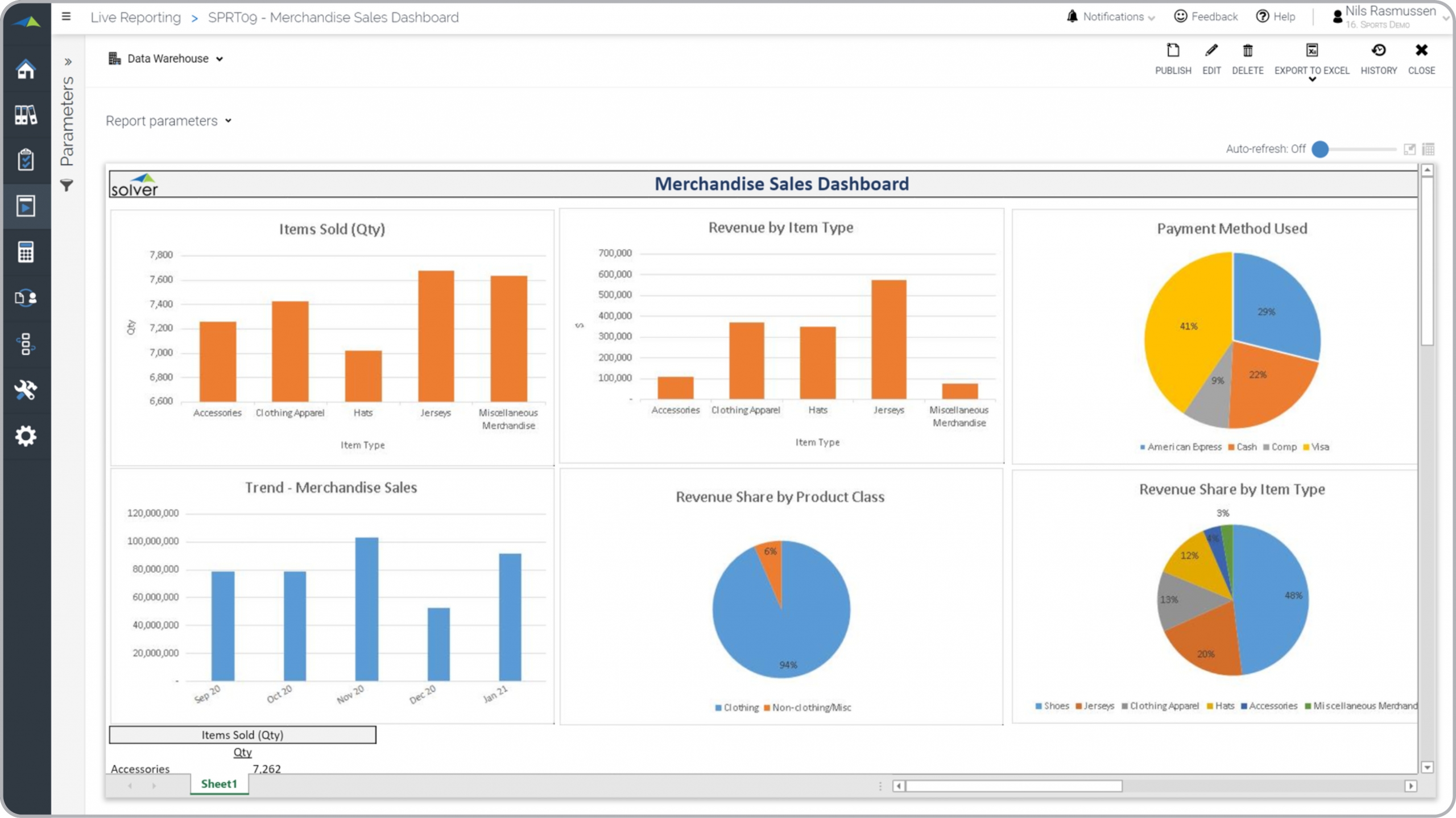
? Merchandise Sales Dashboards are considered product sales analysis tools and are used by sales and merchandise managers to always have a clear picture of which items drive the most sales. Some of the main functionality in this type of report is that it delivers visualization for key sales metrics, including item comparisons and monthly trends. The charts show items sold by amount and by quantity, popularity of different payment methods, monthly trend in total merchandise sales, revenue share by product class, and revenue share by item type. You find an example of this type of report below.
Purpose of
Merchandise Sales Dashboards Sports organizations use Merchandise Sales Dashboards to easily analyze the sales performance of different products. When used as part of good business practices in Sales and FP&A departments, an organization can improve its product strategies and increase revenues, and it can reduce the chances that excessive inventory builds up (or the opposite) due to poor visibility into product sales trends.
Example of a
Merchandise Sales Dashboard Here is an example of a Merchandise Sales Dashboard with key product sales comparisons and trend analysis. [caption id="" align="alignnone" width="2560"]
 Example of a Merchandise Sales Dashboard for Professional Sports Teams[/caption] You can find hundreds of additional examples
here
Who Uses This Type of
Report
? The typical users of this type of report are: product managers, merchandise managers, buyers, sales managers, store managers.
Other Reports Often Used in Conjunction with
Merchandise Sales Dashboards Progressive Sales and FP&A departments sometimes use several different Merchandise Sales Dashboards, along with detailed product sales reports, sales forecasts, sales by store reports, profit & loss reports and other management and control tools.
Where Does the Data for Analysis Originate From? The Actual (historical transactions) data typically comes from enterprise resource planning (ERP) systems like: Microsoft Dynamics 365 (D365) Finance, Microsoft Dynamics 365 Business Central (D365 BC), Microsoft Dynamics AX, Microsoft Dynamics NAV, Microsoft Dynamics GP, Microsoft Dynamics SL, Sage Intacct, Sage 100, Sage 300, Sage 500, Sage X3, SAP Business One, SAP ByDesign, Acumatica, Netsuite and others. In analyses where budgets or forecasts are used, the planning data most often originates from in-house Excel spreadsheet models or from professional corporate performance management (CPM/EPM) solutions.
What Tools are Typically used for Reporting, Planning and Dashboards? Examples of business software used with the data and ERPs mentioned above are:
Example of a Merchandise Sales Dashboard for Professional Sports Teams[/caption] You can find hundreds of additional examples
here
Who Uses This Type of
Report
? The typical users of this type of report are: product managers, merchandise managers, buyers, sales managers, store managers.
Other Reports Often Used in Conjunction with
Merchandise Sales Dashboards Progressive Sales and FP&A departments sometimes use several different Merchandise Sales Dashboards, along with detailed product sales reports, sales forecasts, sales by store reports, profit & loss reports and other management and control tools.
Where Does the Data for Analysis Originate From? The Actual (historical transactions) data typically comes from enterprise resource planning (ERP) systems like: Microsoft Dynamics 365 (D365) Finance, Microsoft Dynamics 365 Business Central (D365 BC), Microsoft Dynamics AX, Microsoft Dynamics NAV, Microsoft Dynamics GP, Microsoft Dynamics SL, Sage Intacct, Sage 100, Sage 300, Sage 500, Sage X3, SAP Business One, SAP ByDesign, Acumatica, Netsuite and others. In analyses where budgets or forecasts are used, the planning data most often originates from in-house Excel spreadsheet models or from professional corporate performance management (CPM/EPM) solutions.
What Tools are Typically used for Reporting, Planning and Dashboards? Examples of business software used with the data and ERPs mentioned above are:
- Native ERP report writers and query tools
- Spreadsheets (for example Microsoft Excel)
- Corporate Performance Management (CPM) tools (for example Solver)
- Dashboards (for example Microsoft Power BI and Tableau)
- View 100’s of reporting, consolidations, planning, budgeting, forecasting and dashboard examples here
- View a Sports industry white paper and other industry-specific information here
- See how reports are designed in a modern report writer using a cloud-connected Excel add-in writer
- Discover how the Solver CPM solution delivers financial and operational reporting
- Discover how the Solver CPM solution delivers planning, budgeting and forecasting
- Watch demo videos of reporting, planning and dashboards
June 19, 2021
TAGS: Reporting, Solver, NPSL, report writer, Microsoft, NBA, template, practice, Acumatica, basketball, league, MLB, Netsuite, Finance, planning, GP, Business Central, excel, professional, ax, Sports, forecast, Budget, Dynamics 365, budgeting, professional sports, Cloud, Software, product, Tableau, SAP, NRL, example, NHL, NFL, best, Sage, BC, store, EPL, D365, MLS, NAV, Intacct, soccer, hockey, baseball, CPM, report, SL, Management, dynamics, sales, football, Power BI, event, merchandise sales