
What is
a
Student Enrollment Dashboard
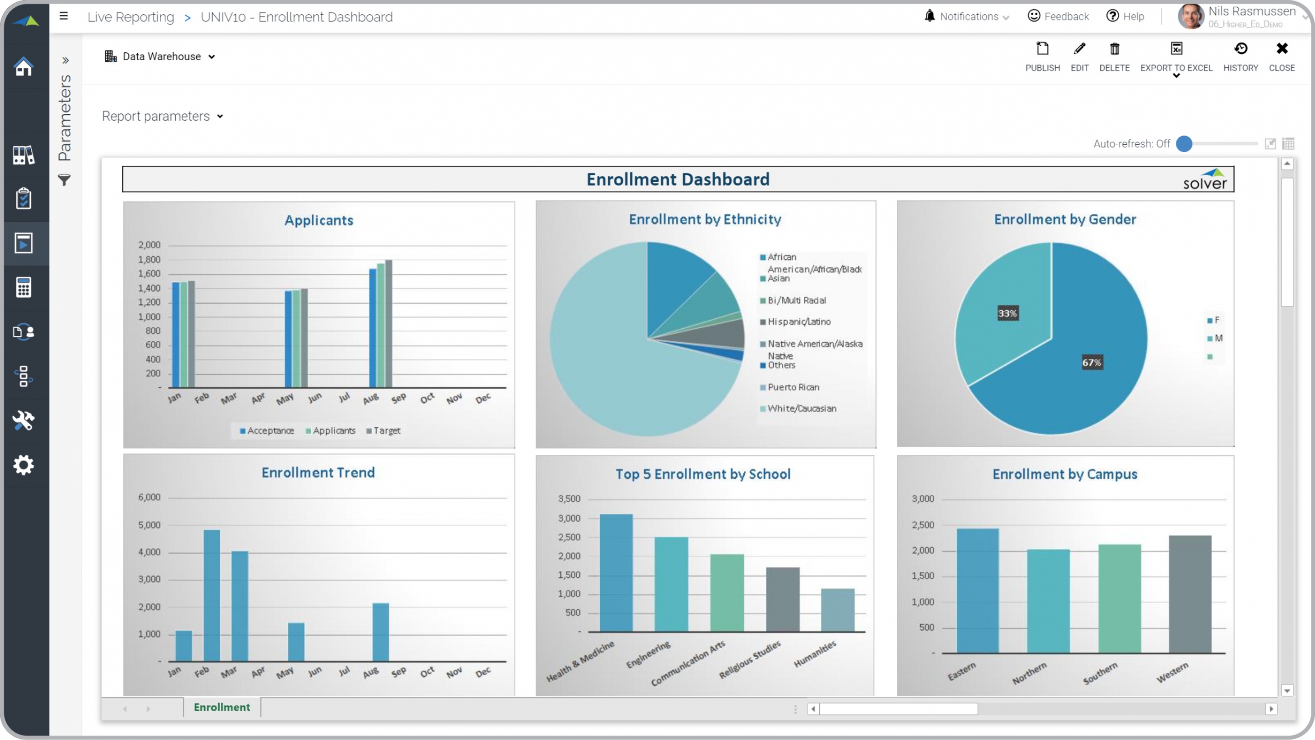
? Student Enrollment Dashboards are considered operational analysis tools and are used by enrollment officers and dean of students to analyze student demographics and expected headcount. Some of the main functionality in this type of visualization report is that it provides insight into student statistics from six different KPI perspectives: 1) Applicants by semester/quarter, 2) Enrollment by ethnicity, 3) Enrollment by gender, 4) Enrollment trend, 5) Top 5 enrollment figures by school, 6) Enrollment by campus. All the figures from the charts are also listed below the dashboard in a tabular report format. You find an example of this type of visualization report below.
Purpose of
Student Enrollment Dashboards Universities and colleges use Student Enrollment Dashboards to provide their decisionmakers with an easy way to understand enrollment data. When used as part of good business practices in a Student Recruiting and Enrollment department, a higher education institution can improve its strategies and initiatives related to student headcount and demographics as well as associated financial planning. It can also reduce the chances that the employees make inferior decisions because they lack quick and easy access to these key statistics.
Student Enrollment Dashboard
Example Here is an example of a Student Enrollment Dashboard with applicant metrics and enrollment trends. [caption id="" align="alignnone" width="2560"]
 Higher Education - Student Enrollment Dashboard Example[/caption] You can find hundreds of additional examples
here
Who Uses This Type of
Visualization report
? The typical users of this type of visualization report are: Enrollment officers, Dean of Students, School administrators and Planners.
Other
Visualization Report
s Often Used in Conjunction with
Student Enrollment Dashboards Progressive Student Recruiting and Enrollment departments sometimes use several different Student Enrollment Dashboards, along with detailed enrollment reports, student dashboards, staff and tuition revenue budgets and other management and control tools.
Where Does the Data for Analysis Originate From? The Actual (historical transactions) data typically comes from admission and enrollment management software, student information systems as well as enterprise resource planning (ERP) systems like: Microsoft Dynamics 365 (D365) Finance, Microsoft Dynamics 365 Business Central (D365 BC), Microsoft Dynamics AX, Microsoft Dynamics NAV, Microsoft Dynamics GP, Microsoft Dynamics SL, Sage Intacct, Sage 100, Sage 300, Sage 500, Sage X3, SAP Business One, SAP ByDesign, Acumatica, Netsuite and others. In analyses where budgets or forecasts are used, the planning data most often originates from in-house Excel spreadsheet models or from professional corporate performance management (CPM/EPM) solutions.
What Tools are Typically used for Reporting, Planning and Dashboards? Examples of business software used with the data and ERPs mentioned above are:
Higher Education - Student Enrollment Dashboard Example[/caption] You can find hundreds of additional examples
here
Who Uses This Type of
Visualization report
? The typical users of this type of visualization report are: Enrollment officers, Dean of Students, School administrators and Planners.
Other
Visualization Report
s Often Used in Conjunction with
Student Enrollment Dashboards Progressive Student Recruiting and Enrollment departments sometimes use several different Student Enrollment Dashboards, along with detailed enrollment reports, student dashboards, staff and tuition revenue budgets and other management and control tools.
Where Does the Data for Analysis Originate From? The Actual (historical transactions) data typically comes from admission and enrollment management software, student information systems as well as enterprise resource planning (ERP) systems like: Microsoft Dynamics 365 (D365) Finance, Microsoft Dynamics 365 Business Central (D365 BC), Microsoft Dynamics AX, Microsoft Dynamics NAV, Microsoft Dynamics GP, Microsoft Dynamics SL, Sage Intacct, Sage 100, Sage 300, Sage 500, Sage X3, SAP Business One, SAP ByDesign, Acumatica, Netsuite and others. In analyses where budgets or forecasts are used, the planning data most often originates from in-house Excel spreadsheet models or from professional corporate performance management (CPM/EPM) solutions.
What Tools are Typically used for Reporting, Planning and Dashboards? Examples of business software used with the data and ERPs mentioned above are:
- Native ERP report writers and query tools
- Spreadsheets (for example Microsoft Excel)
- Corporate Performance Management (CPM) tools (for example Solver)
- Dashboards (for example Microsoft Power BI and Tableau)
- View 100’s of reporting, consolidations, planning, budgeting, forecasting and dashboard examples here
- Read more about Higher Education industry solutions here
- See how reports are designed in a modern report writer using a cloud-connected Excel add-in writer
- Discover how the Solver CPM solution delivers financial and operational reporting
- Discover how the Solver CPM solution delivers planning, budgeting and forecasting
- Watch demo videos of reporting, planning and dashboards
February 15, 2021
TAGS: Reporting, Solver, report writer, Microsoft, template, practice, Acumatica, Netsuite, college, Finance, planning, GP, dashboard, Business Central, higher ed, excel, ax, higher education, enrollment, forecast, Budget, Dynamics 365, budgeting, university, enrollment dashboard, school, Cloud, Software, Tableau, SAP, student demographics, example, best, Sage, BC, D365, major, NAV, Intacct, Variance, CPM, student, report, SL, Management, dynamics, Power BI