

View Favorites
Nonprofit – Events and Grants Dashboard
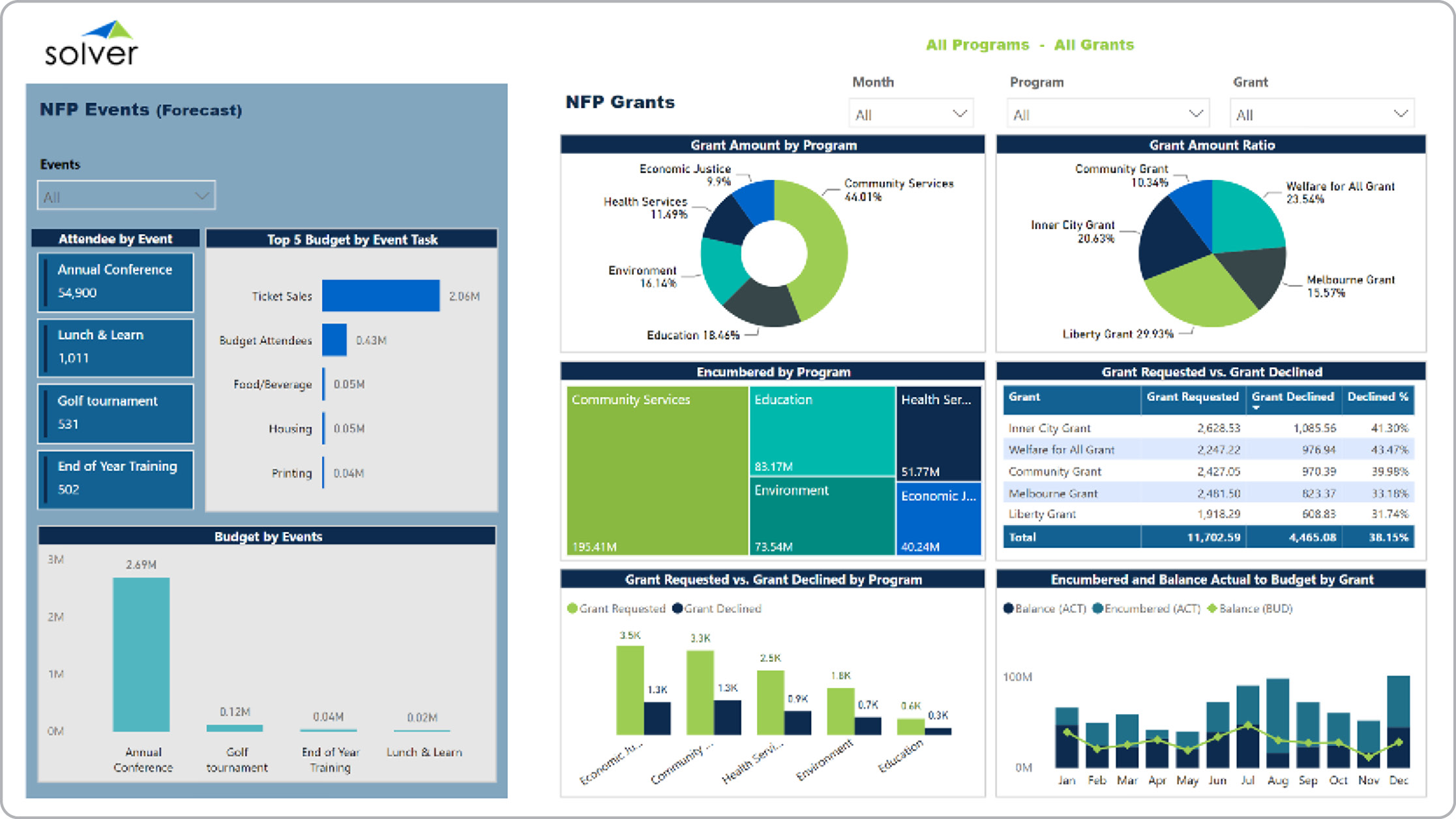
Nonprofit grants and events dashboard example.
What is a Grants and Events Dashboard? Grants and Events Dashboards are considered analysis tools and are used by managers to analyze grants, program and event metrics. Some of the main functionality in this type of dashboard is that it includes graphical analysis of nine different areas: 1) Attendee by event, 2) Top 5 event budget items, 3) Budget per event, 4) Grant amount per program, 5) Grant amount ratio, 6) Encumbered amount per program, 7) Grants requested versus grants declines, 8) Grant requests versus grants declined by program (ranked), and 9) Encumbered and balance - actual to budget by grant. The filters on the top right enables drill-down into month, program and grant. You find an example of this type of dashboard below.
Purpose of Grants and Events Dashboards Nonprofits use Grants and Events Dashboards to make it easy and quick to monitor and analyze essential KPIs. When used as part of good business practices in a Financial Planning & Analysis (FP&A) and Grant department, an organization can improve and speed up its grant, program and event strategies, and it can reduce the chances that revenues are lost because managers do not have the right information available.
Who Uses This Type of Dashboard? The typical users of this type of dashboard are: Executives, budget managers, grant and program managers. Other Reports Often Used in Conjunction with Grants and Events Dashboards Progressive Financial Planning & Analysis (FP&A) and Grant departments sometimes use several different Grants and Events Dashboards, along with detailed encumbrance reports, budget models for grant/event/program budget input, financial dashboards, financial reports and other management and control tools.
Where Does the Data for Analysis Originate From? The Actual (historical transactions) data typically comes from grant management systems and/or enterprise resource planning (ERP) systems like: Microsoft Dynamics 365 (D365) Finance, Microsoft Dynamics 365 Business Central (D365 BC), Microsoft Dynamics AX, Microsoft Dynamics NAV, Microsoft Dynamics GP, Microsoft Dynamics SL, Sage Intacct, Sage 100, Sage 300, Sage 500, Sage X3, SAP Business One, SAP ByDesign, Acumatica, Netsuite and others. In analyses where budgets or forecasts are used, the planning data most often originates from in-house Excel spreadsheet models or from professional xFP&A solutions.
To learn more, visit the Resource Library.
View Favorites