
What is
a
Food & Beverage Revenue Dashboard
? Food and Beverage (F&B) Dashboards are considered revenue analysis tools and are used by Finance and restaurant managers to drill into revenues by looking at trends and comparing restaurants and F&B categories. Some of the main functionality in this type of dashboard is that it provides users with graphical analysis from eight different perspectives: 1) Breakfast revenue compared across restaurants, 2) Lunch revenue compared across restaurants, 3) Dinner revenue compared across restaurants, 4) Beverage revenue compared across restaurants, 5) Monthly revenue trend for breakfast revenue, 6) Monthly revenue trend for lunch revenue, 7) Monthly trend for dinner revenue, and 8) Monthly trend for beverage revenue. You find an example of this type of dashboard below.
Purpose of
Food & Beverage Revenue Dashboards Hospitality companies use Food & Beverage Revenue Dashboards to easily find trends and high/low performing F&B categories. When used as part of good business practices in FP&A and Operations departments, a company can improve its revenues by optimizing menu offerings and location strategies, and it can reduce the chances that poor performing F&B categories are not fixed with quick and informed decisions.
Example of a
Food & Beverage Revenue Dashboard Here is an example of a Food & Beverage Revenue Dashboard with restaurant comparisons and monthly trends. [caption id="" align="alignnone" width="2560"]
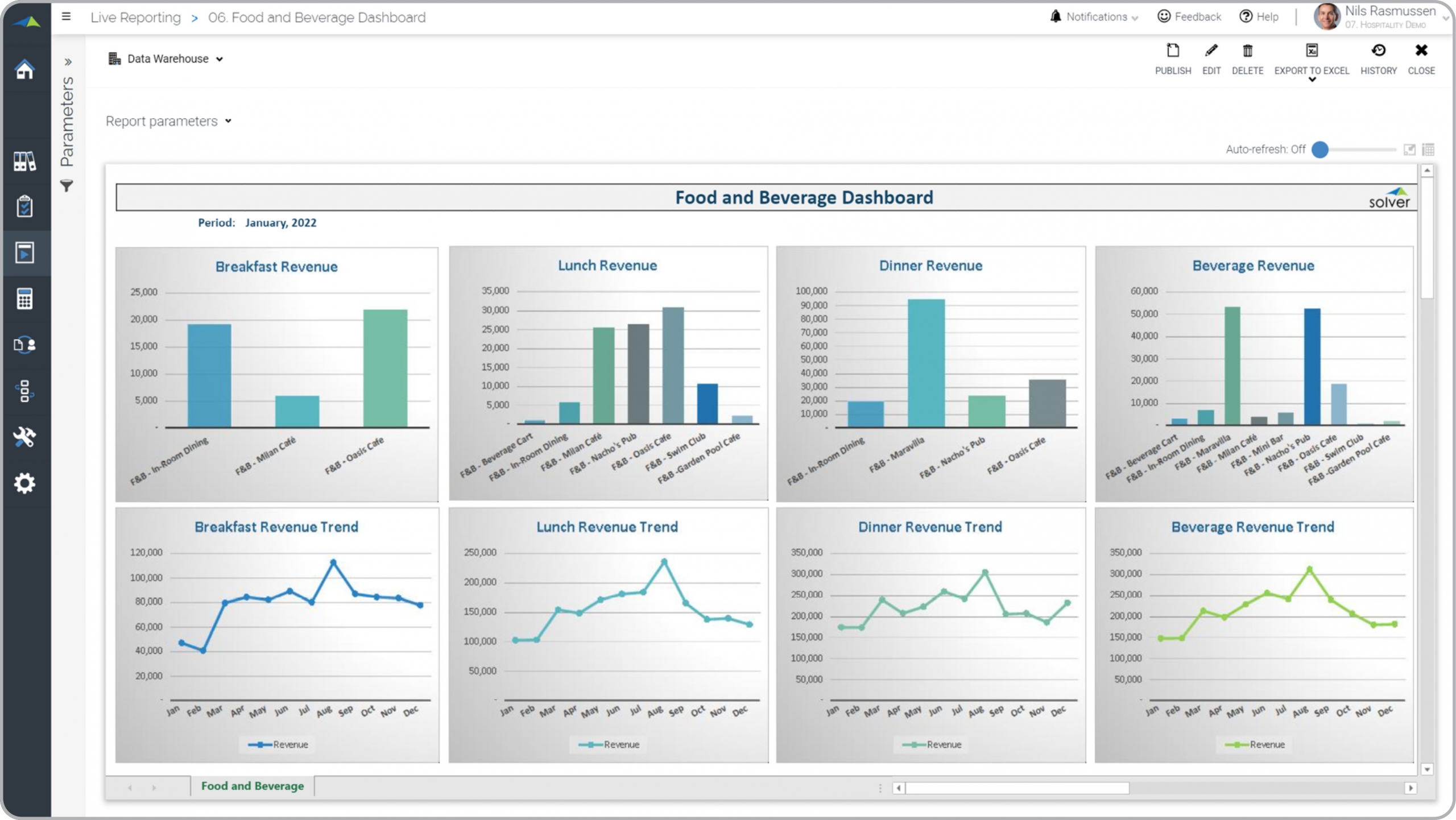 Example of a Food & Beverage Revenue Dashboard for Hospitality Companies[/caption] You can find hundreds of additional examples
here
Who Uses This Type of
Dashboard
? The typical users of this type of dashboard are: Executives, CFOs, Analysts, Restaurant Managers.
Other Reports Often Used in Conjunction with
Food & Beverage Revenue Dashboards Progressive FP&A and Operations departments sometimes use several different Food & Beverage Dashboards, along with detailed F&B reports, financial statements, corporate dashboards, forecast models, budgets, KPI scorecards and other management and control tools.
Where Does the Data for Analysis Originate From? The Actual (historical transactions) data typically comes from enterprise resource planning (ERP) systems like: Microsoft Dynamics 365 (D365) Finance, Microsoft Dynamics 365 Business Central (D365 BC), Microsoft Dynamics AX, Microsoft Dynamics NAV, Microsoft Dynamics GP, Microsoft Dynamics SL, Sage Intacct, Sage 100, Sage 300, Sage 500, Sage X3, SAP Business One, SAP ByDesign, Acumatica, Netsuite and others. In analyses where budgets or forecasts are used, the planning data most often originates from in-house Excel spreadsheet models or from professional corporate performance management (CPM/EPM) solutions.
What Tools are Typically used for Reporting, Planning and Dashboards? Examples of business software used with the data and ERPs mentioned above are:
Example of a Food & Beverage Revenue Dashboard for Hospitality Companies[/caption] You can find hundreds of additional examples
here
Who Uses This Type of
Dashboard
? The typical users of this type of dashboard are: Executives, CFOs, Analysts, Restaurant Managers.
Other Reports Often Used in Conjunction with
Food & Beverage Revenue Dashboards Progressive FP&A and Operations departments sometimes use several different Food & Beverage Dashboards, along with detailed F&B reports, financial statements, corporate dashboards, forecast models, budgets, KPI scorecards and other management and control tools.
Where Does the Data for Analysis Originate From? The Actual (historical transactions) data typically comes from enterprise resource planning (ERP) systems like: Microsoft Dynamics 365 (D365) Finance, Microsoft Dynamics 365 Business Central (D365 BC), Microsoft Dynamics AX, Microsoft Dynamics NAV, Microsoft Dynamics GP, Microsoft Dynamics SL, Sage Intacct, Sage 100, Sage 300, Sage 500, Sage X3, SAP Business One, SAP ByDesign, Acumatica, Netsuite and others. In analyses where budgets or forecasts are used, the planning data most often originates from in-house Excel spreadsheet models or from professional corporate performance management (CPM/EPM) solutions.
What Tools are Typically used for Reporting, Planning and Dashboards? Examples of business software used with the data and ERPs mentioned above are:
- Native ERP report writers and query tools
- Spreadsheets (for example Microsoft Excel)
- Corporate Performance Management (CPM) tools (for example Solver)
- Dashboards (for example Microsoft Power BI and Tableau)
- View 100’s of reporting, consolidations, planning, budgeting, forecasting and dashboard examples here
- View a Hospitality industry white paper and other industry-specific information here
- See how reports are designed in a modern report writer using a cloud-connected Excel add-in writer
- Discover how the Solver CPM solution delivers financial and operational reporting
- Discover how the Solver CPM solution delivers planning, budgeting and forecasting
- Watch demo videos of reporting, planning and dashboards
August 10, 2021
TAGS: Reporting, Solver, food & beverage, report writer, Microsoft, template, practice, Acumatica, hospitality, f&b, Netsuite, covers, Finance, planning, GP, dashboard, Business Central, excel, restaurant, food, resort, beverage, ax, forecast, Budget, Dynamics 365, analysis, budgeting, KPI, revenue, Cloud, Software, Tableau, SAP, example, best, Sage, BC, D365, NAV, Intacct, Variance, CPM, report, SL, Management, dynamics, Power BI, dinner, restaurant dashboard, lunch, food and beverage dashboard, breakfast