
What is a
Contribution Margin Dashboard for Retail Companies
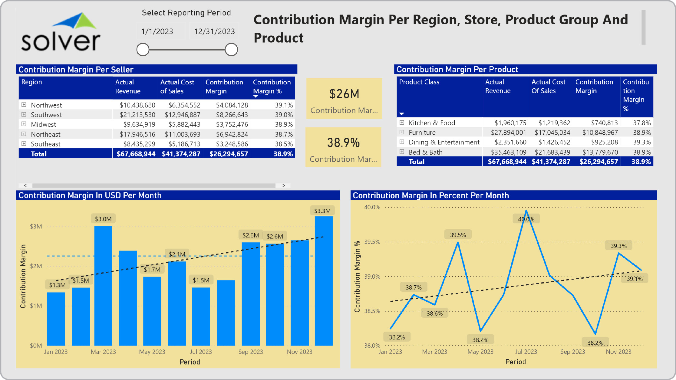
? Product and Store Contribution Margin Dashboards are considered financial analysis tools and are used by product and regional managers to monitor the profitability of items and geographic areas. Some of the main functionality in this type of dashboard is that it presents margins in amounts and percent for both stores/regions and products. The dashboard provides five key components: 1) A matrix showing contribution margin figures per seller (regions with drill down to store), 2) Contribution margin per product group with drill down to products, 3) Contribution margin monthly trend in USD/amount, 4) Contribution margin monthly trend in percent, and 5) KPIs showing total contribution margin as an amount and as a percent.. You find an example of this type of dashboard below.
Purpose of
Contribution Margin Dashboards Retail organizations use Contribution Margin Dashboards to enable managers to go beyond sales figures to look at the true gross profit that a store or a product contributes. When used as part of good business practices in Financial Planning & Analysis (FP&A) and product/sales departments, an organization can improve and speed up its sales and cost strategies and related profitability, and it can reduce the chances that low performers are not getting timely attention.
Contribution Margin Dashboard
Example Here is an example of a Retail Contribution Margin Dashboard with region, store and product sales and margins. [caption id="" align="alignnone" width="2233"]
 Example of a Contribution Margin Dashboard for Retail Companies[/caption] You can find hundreds of additional examples
here
Who Uses This Type of
Dashboard
? The typical users of this type of dashboard are: CFOs, analysts, regional managers, store managers, ecommerce managers, price managers, product managers.
Other Reports Often Used in Conjunction with
Contribution Margin Dashboards Progressive Financial Planning & Analysis (FP&A) departments sometimes use several different Contribution Margin Dashboards, along with financial dashboards, profit & loss reports, sales reports, price and cost reports, sales forecast, annual budgets and other management and control tools.
Where Does the Data for Analysis Originate From? The Actual (historical transactions) data typically comes from enterprise resource planning (ERP) systems like: Microsoft Dynamics 365 (D365) Finance, Microsoft Dynamics 365 Business Central (D365 BC), Microsoft Dynamics AX, Microsoft Dynamics NAV, Microsoft Dynamics GP, Microsoft Dynamics SL, Sage Intacct, Sage 100, Sage 300, Sage 500, Sage X3, SAP Business One, SAP ByDesign, Acumatica, Netsuite and others. In analyses where budgets or forecasts are used, the planning data most often originates from in-house Excel spreadsheet models or from professional corporate performance management (CPM/EPM) solutions.
What Tools are Typically used for Reporting, Planning and Dashboards? Examples of business software used with the data and ERPs mentioned above are:
Example of a Contribution Margin Dashboard for Retail Companies[/caption] You can find hundreds of additional examples
here
Who Uses This Type of
Dashboard
? The typical users of this type of dashboard are: CFOs, analysts, regional managers, store managers, ecommerce managers, price managers, product managers.
Other Reports Often Used in Conjunction with
Contribution Margin Dashboards Progressive Financial Planning & Analysis (FP&A) departments sometimes use several different Contribution Margin Dashboards, along with financial dashboards, profit & loss reports, sales reports, price and cost reports, sales forecast, annual budgets and other management and control tools.
Where Does the Data for Analysis Originate From? The Actual (historical transactions) data typically comes from enterprise resource planning (ERP) systems like: Microsoft Dynamics 365 (D365) Finance, Microsoft Dynamics 365 Business Central (D365 BC), Microsoft Dynamics AX, Microsoft Dynamics NAV, Microsoft Dynamics GP, Microsoft Dynamics SL, Sage Intacct, Sage 100, Sage 300, Sage 500, Sage X3, SAP Business One, SAP ByDesign, Acumatica, Netsuite and others. In analyses where budgets or forecasts are used, the planning data most often originates from in-house Excel spreadsheet models or from professional corporate performance management (CPM/EPM) solutions.
What Tools are Typically used for Reporting, Planning and Dashboards? Examples of business software used with the data and ERPs mentioned above are:
- Native ERP report writers and query tools
- Spreadsheets (for example Microsoft Excel)
- Corporate Performance Management (CPM) tools (for example Solver)
- Dashboards (for example Microsoft Power BI and Tableau)
- View 100’s of reporting, consolidations, planning, budgeting, forecasting and dashboard examples here
- View a Retail white paper and other industry-specific information here
- See how reports are designed in a modern report writer using a cloud-connected Excel add-in writer
- Discover how the Solver CPM solution delivers financial and operational reporting
- Discover how the Solver CPM solution delivers planning, budgeting and forecasting
- Watch demo videos of reporting, planning and dashboards
March 15, 2021
TAGS: Reporting, Solver, report writer, Microsoft, template, practice, Acumatica, visualization, Netsuite, Finance, gross margin, planning, GP, dashboard, Business Central, margin, excel, ax, contribution margin, forecast, Budget, Dynamics 365, budgeting, region, gross profit, Cloud, Software, contribution, product, Tableau, SAP, example, ecommerce, best, Sage, BC, store, D365, NAV, Intacct, online, Retail, CPM, report, SL, Management, dynamics, Power BI