
Professional Services – Project Manager Dashboard
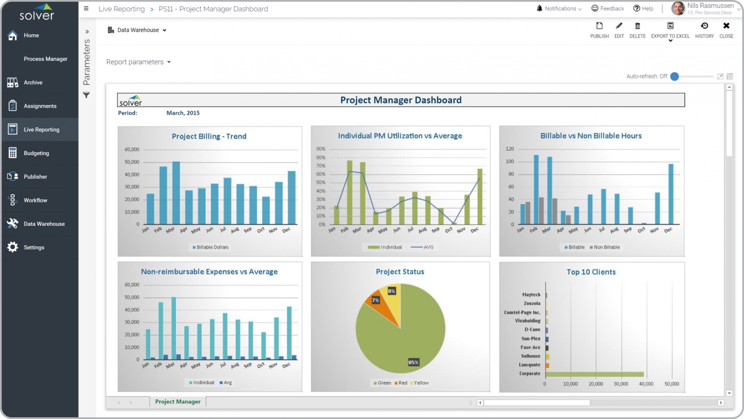
What is Project Manager Dashboard? Project Manager Dashboards are considered key performance indicator (KPI) analysis tools and are used by project leaders and executives to enable easy monitoring of important trends and variances related to services and clients. Some of the main functionality in this type of dashboard is that it the user can run the report to get a snapshot of the current month or any historical period and all the data will update accordingly. The report provides analysis from six different perspectives: 1) Monthly trend in client billing, 2) Monthly trend in non-reimbursable expenses benchmarked against the average, 3) Monthly trend showing individual PM utilization benchmarked against the average, 4) Percent of projects with red, yellow and green status, 5) Monthly trend in billable versus non-billable hours, and 6) Top 10 clients ranked by billing amount. You find an example of this type of dashboard below.
Purpose of Project Manager Dashboards Professional Services organizations use Project Manager Dashboards to enable leaders with a clear, self-service view of important KPIs and trends related to their clients and projects. When used as part of good business practices in FP&A and PMO departments, a company can improve its project strategies and revenue growth, and it can reduce the chances that project/client outliers or trends are left untouched due to lack of visibility to performance metrics.
Who Uses This Type of Dashboard? The typical users of this type of dashboard are: Service Leaders, Project Managers. Other Reports Often Used in Conjunction with Project Manager Dashboards Progressive FP&A and PMO departments sometimes use several different Project Manager Dashboards, along with profit & loss reports, KPI dashboards, project detailed project reports, project forecast models, annual budget models and other management and control tools.
Where Does the Data for Analysis Originate From? The Actual (historical transactions) data typically comes from enterprise resource planning (ERP) systems like: Microsoft Dynamics 365 (D365) Finance, Microsoft Dynamics 365 Business Central (D365 BC), Microsoft Dynamics AX, Microsoft Dynamics NAV, Microsoft Dynamics GP, Microsoft Dynamics SL, Sage Intacct, Sage 100, Sage 300, Sage 500, Sage X3, SAP Business One, SAP ByDesign, Acumatica, Netsuite and others. In analyses where budgets or forecasts are used, the planning data most often originates from in-house Excel spreadsheet models or from professional xFP&A solutions.
Built for professional services finance teams and aligned with Solver's xFP&A platform, this Solver dashboard template connects directly to your ERP data via the Solver Data Warehouse, enabling near real-time analysis with minimal setup. Designed for QuickStart deployment, it can be activated rapidly so your team can focus on analysis and decisions — not data preparation.
What is the Professional Services – Project Manager Dashboard in Solver? The Professional Services – Project Manager Dashboard is a pre-built xFP&A dashboard template in Solver designed for professional services organizations. It delivers key financial and operational metrics in a single, easy-to-use interface — purpose-built for professional services finance workflows.
Who uses this Solver dashboard template? Finance leaders at professional services organizations — including CFOs, project managers, and professional services finance teams — use this template to get fast, reliable answers without waiting on IT or building custom reports. It supports both day-to-day monitoring and strategic decision-making.
Where does the data come from? Data is sourced automatically from your ERP system through the Solver Data Warehouse, which integrates with platforms such as Microsoft Dynamics 365 Business Central, Dynamics 365 Finance, Acumatica, Sage Intacct, and other leading ERP solutions. Once connected, the template updates in near real-time with no manual data entry required.
To learn more, visit the Resource Library.