
Nonprofit – Financial Dashboard
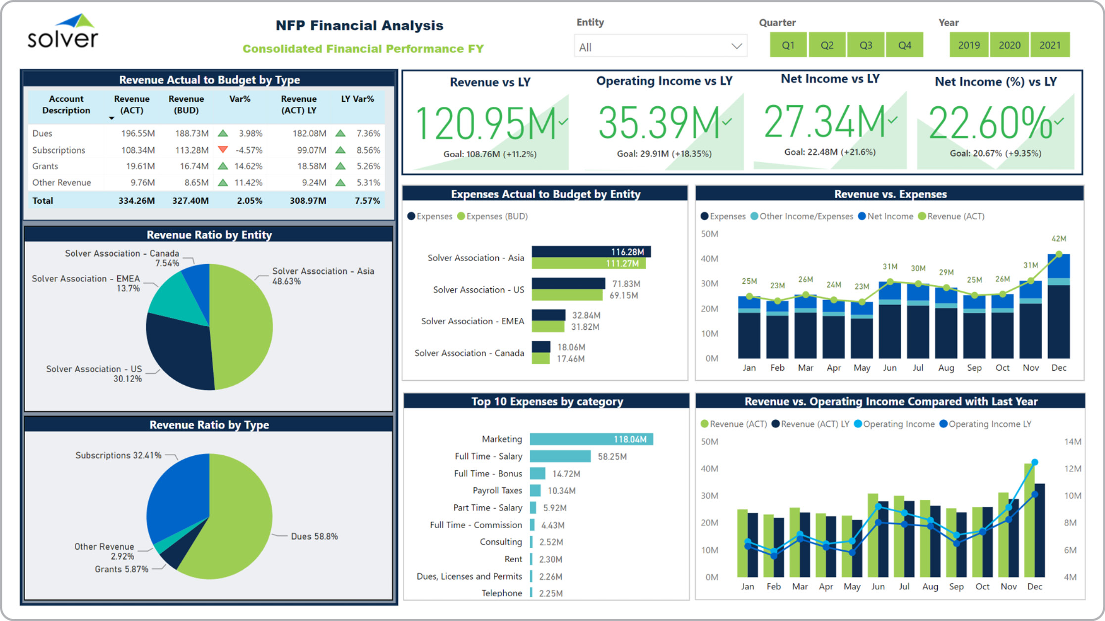
What is a Financial Dashboard for Nonprofits? Financial Dashboards are considered analysis and business monitoring tools and are used by executives and financial managers to analyze key financial metrics on a single screen and with powerful visualizations. Some of the main functionality in this type of dashboard is that it provides analysis through eight different perspectives on the dashboard. They include: 1) Actual versus budget and Last Year variance analysis for revenues, 2) Revenue ratio for each location/division as a percent of total revenues, 3) Revenue ratio based on the Type of revenue, 4) Trend KPIs for revenues, Operating income, Net income, 5) Actual versus budgeted expenses per entity, 6) Top 10 expenses per category, 7) Revenues versus expenses trend 8) Revenues versus operating income trend. The filters on the top right of the dashboard makes it quick for the user to switch period and business unit You find an example of this type of dashboard below.
Purpose of Financial Dashboards for Nonprofit Organizations Nonprofits use Financial Dashboards to give managers an easy and user-friendly way to analyze financial performance. When used as part of good business practices in a Financial Planning & Analysis (FP&A) and Executive department, an organization can improve and speed up its decisions and related strategies, and it can reduce the chances that managers miss important trends and variances.
Who Uses This Type of Dashboard? The typical users of this type of dashboard are: Senior executives, financial managers, department heads. Other Reports Often Used in Conjunction with Financial Dashboards for Nonprofit Organizations Progressive Financial Planning & Analysis (FP&A) and Executive departments sometimes use several different Financial Dashboards, along with profit & loss reports, monthly financial trend reports, KPI dashboards, budgeting and forecasting models and other management and control tools.
Where Does the Data for Analysis Originate From? The Actual (historical transactions) data typically comes from enterprise resource planning (ERP) systems like: Microsoft Dynamics 365 (D365) Finance, Microsoft Dynamics 365 Business Central (D365 BC), Microsoft Dynamics AX, Microsoft Dynamics NAV, Microsoft Dynamics GP, Microsoft Dynamics SL, Sage Intacct, Sage 100, Sage 300, Sage 500, Sage X3, SAP Business One, SAP ByDesign, Acumatica, Netsuite and others. In analyses where budgets or forecasts are used, the planning data most often originates from in-house Excel spreadsheet models or from professional xFP&A solutions.
Built for nonprofit finance teams and aligned with Solver's xFP&A platform, this Solver dashboard template connects directly to your ERP data via the Solver Data Warehouse, enabling near real-time analysis with minimal setup. Designed for QuickStart deployment, it can be activated rapidly so your team can focus on analysis and decisions — not data preparation.
What is the Nonprofit – Financial Dashboard in Solver? The Nonprofit – Financial Dashboard is a pre-built xFP&A dashboard template in Solver designed for nonprofit organizations. It delivers key financial and operational metrics in a single, easy-to-use interface — purpose-built for nonprofit finance workflows.
Who uses this Solver dashboard template? Cfos, controllers, and nonprofit finance teams in nonprofit organizations rely on this Solver dashboard template to replace manual spreadsheet-based processes with automated, near real-time analysis. It is especially useful during month-end close, budget cycles, and board reporting.
Where does the data come from? Data is sourced automatically from your ERP system through the Solver Data Warehouse, which integrates with platforms such as Microsoft Dynamics 365 Business Central, Dynamics 365 Finance, Acumatica, Sage Intacct, and other leading ERP solutions. Once connected, the template updates in near real-time with no manual data entry required.
To learn more, visit the Resource Library.