
Mfg – Yield Analysis
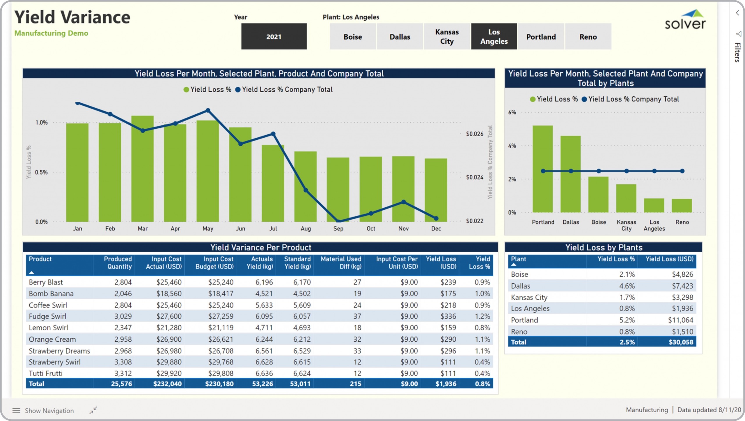
What is a Yield Loss and Variance Dashboard? Yield Dashboards are considered operational analysis tools and are used by Cost Accountants and Production Managers to analyze scrap-related metrics from the manufacturing of their products. Some of the main functionality in this type of dashboard is that it provides yield loss and variance analysis from four different perspectives. These include: 1) Monthly trend in yield loss for selected plant and for the company total, 2) Yield variance per product with metrics for produced quantity, input cost actual, input cost budget, actual yield, standard yield, material used, input cost per unit, yield loss amount and yield loss percent, 3) Yield loss with benchmark comparison across selected plants and % of company total, and 4) Yield loss per plant with loss % and loss amount and grand total. The user can select plant(s) and years on the top of the dashboard. You find an example of this type of dashboard below.
Purpose of Yield Loss and Yield Variance Dashboards Manufacturing companies use scrap-related dashboards to give managers an easy to understand and graphical analysis of yield loss metrics. When used as part of good business practices in Financial Planning & Analysis (FP&A) and manufacturing operations departments, an organization can improve its decisions related to cost and production efficiency, and it can reduce the chances that managers miss any trends or outliers.
Who Uses This Type of Dashboard? The typical users of this type of dashboard are: Analysts, plant managers, production managers, cost accountants, budget managers. Other Reports Often Used in Conjunction with Yield Loss Dashboards Progressive Financial Planning & Analysis (FP&A) and manufacturing operations departments sometimes use several different Yield Loss Dashboards, along with manufacturing dashboards, profit & loss reports, annual budgets, expense variance reports and other management and control tools.
Where Does the Data for Analysis Originate From? The Actual (historical transactions) data typically comes from enterprise resource planning (ERP) systems like: Microsoft Dynamics 365 (D365) Finance, Microsoft Dynamics 365 Business Central (D365 BC), Microsoft Dynamics AX, Microsoft Dynamics NAV, Microsoft Dynamics GP, Microsoft Dynamics SL, Sage Intacct, Sage 100, Sage 300, Sage 500, Sage X3, SAP Business One, SAP ByDesign, Acumatica, Netsuite and others. In analyses where budgets or forecasts are used, the planning data most often originates from in-house Excel spreadsheet models or from professional xFP&A solutions.
Built for manufacturing finance teams and aligned with Solver's xFP&A platform, this Solver report template connects directly to your ERP data via the Solver Data Warehouse, enabling near real-time analysis with minimal setup. Designed for QuickStart deployment, it can be activated rapidly so your team can focus on analysis and decisions — not data preparation.
What is the Mfg – Yield Analysis in Solver? The Mfg – Yield Analysis is a pre-built xFP&A report template in Solver designed for manufacturing organizations. It delivers key financial and operational metrics in a single, easy-to-use interface — purpose-built for manufacturing finance workflows.
Who uses this Solver report template? Cfos, operations managers, and manufacturing finance teams in manufacturing organizations rely on this Solver report template to replace manual spreadsheet-based processes with automated, near real-time analysis. It is especially useful during month-end close, budget cycles, and board reporting.
Where does the data come from? Data is sourced automatically from your ERP system through the Solver Data Warehouse, which integrates with platforms such as Microsoft Dynamics 365 Business Central, Dynamics 365 Finance, Acumatica, Sage Intacct, and other leading ERP solutions. Once connected, the template updates in near real-time with no manual data entry required.
To learn more, visit the Resource Library.