
Mfg – Utility Cost Analysis
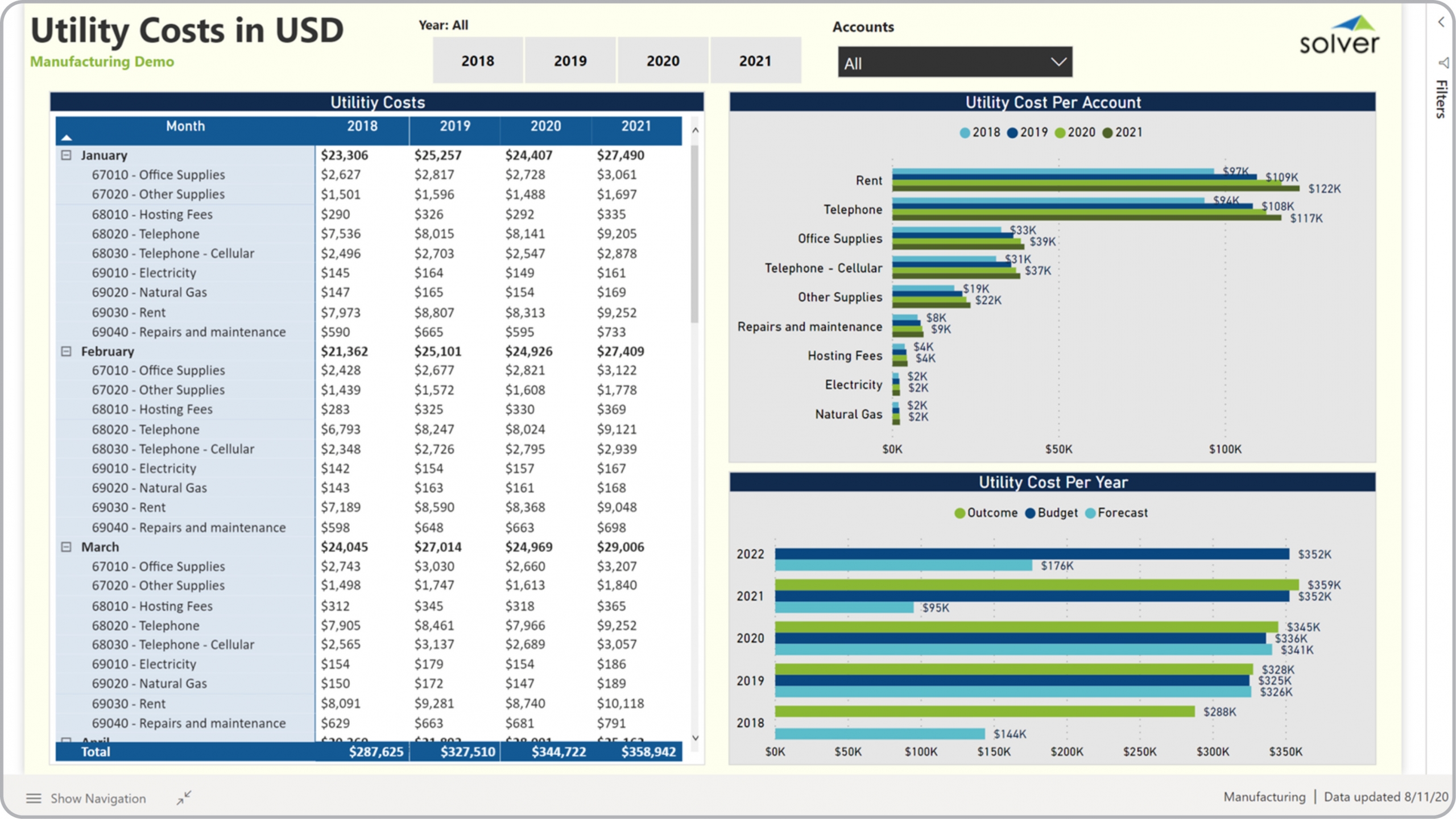
What is a Utility Cost Dashboard for Manufacturing Companies? Utility Cost Dashboards are considered cost analysis tools and are used by controllers and cost accountants to track utility expenses. Some of the main functionality in this type of dashboard is that it compares expenses over months, years and GL accounts. Analysis includes: 1) Utility cost metrics by GL account by month over the last four years, 2) Utility cost by GL account with benchmarking of the last four years, and 3) Total utility cost per year for the past four years. The user can filter the dashboard on years and GL accounts. You find an example of this type of dashboard below.
Purpose of Utility Cost Dashboards Manufacturing companies use Utility Cost Dashboards to provide managers with an easy way to compare utility expenses over a number of years. When used as part of good business practices in Financial Planning & Analysis (FP&A) departments, an organization can improve its expense control and profitability, and it can reduce the chances that managers miss any utility cost or trends.
Who Uses This Type of Dashboard? The typical users of this type of dashboard are: CFOs, controllers, cost accountants, plant managers, budget managers. Other Reports Often Used in Conjunction with Utility Cost Dashboards Progressive Financial Planning & Analysis (FP&A) departments sometimes use several different Utility Cost Dashboards, along with profit & loss reports, cash flow reports, corporate financial dashboards, annual budgets, expense variance reports and other management and control tools.
Where Does the Data for Analysis Originate From? The Actual (historical transactions) data typically comes from enterprise resource planning (ERP) systems like: Microsoft Dynamics 365 (D365) Finance, Microsoft Dynamics 365 Business Central (D365 BC), Microsoft Dynamics AX, Microsoft Dynamics NAV, Microsoft Dynamics GP, Microsoft Dynamics SL, Sage Intacct, Sage 100, Sage 300, Sage 500, Sage X3, SAP Business One, SAP ByDesign, Acumatica, Netsuite and others. In analyses where budgets or forecasts are used, the planning data most often originates from in-house Excel spreadsheet models or from professional xFP&A solutions.
Built for manufacturing finance teams and aligned with Solver's xFP&A platform, this Solver report template connects directly to your ERP data via the Solver Data Warehouse, enabling near real-time analysis with minimal setup. Designed for QuickStart deployment, it can be activated rapidly so your team can focus on analysis and decisions — not data preparation.
What is the Mfg – Utility Cost Analysis in Solver? The Mfg – Utility Cost Analysis is a pre-built xFP&A report template in Solver designed for manufacturing organizations. It delivers key financial and operational metrics in a single, easy-to-use interface — purpose-built for manufacturing finance workflows.
Who uses this Solver report template? Finance leaders at manufacturing organizations — including CFOs, operations managers, and manufacturing finance teams — use this template to get fast, reliable answers without waiting on IT or building custom reports. It supports both day-to-day monitoring and strategic decision-making.
Where does the data come from? Data is sourced automatically from your ERP system through the Solver Data Warehouse, which integrates with platforms such as Microsoft Dynamics 365 Business Central, Dynamics 365 Finance, Acumatica, Sage Intacct, and other leading ERP solutions. Once connected, the template updates in near real-time with no manual data entry required.
To learn more, visit the Resource Library.