

Mfg – Utilities Cost Analysis
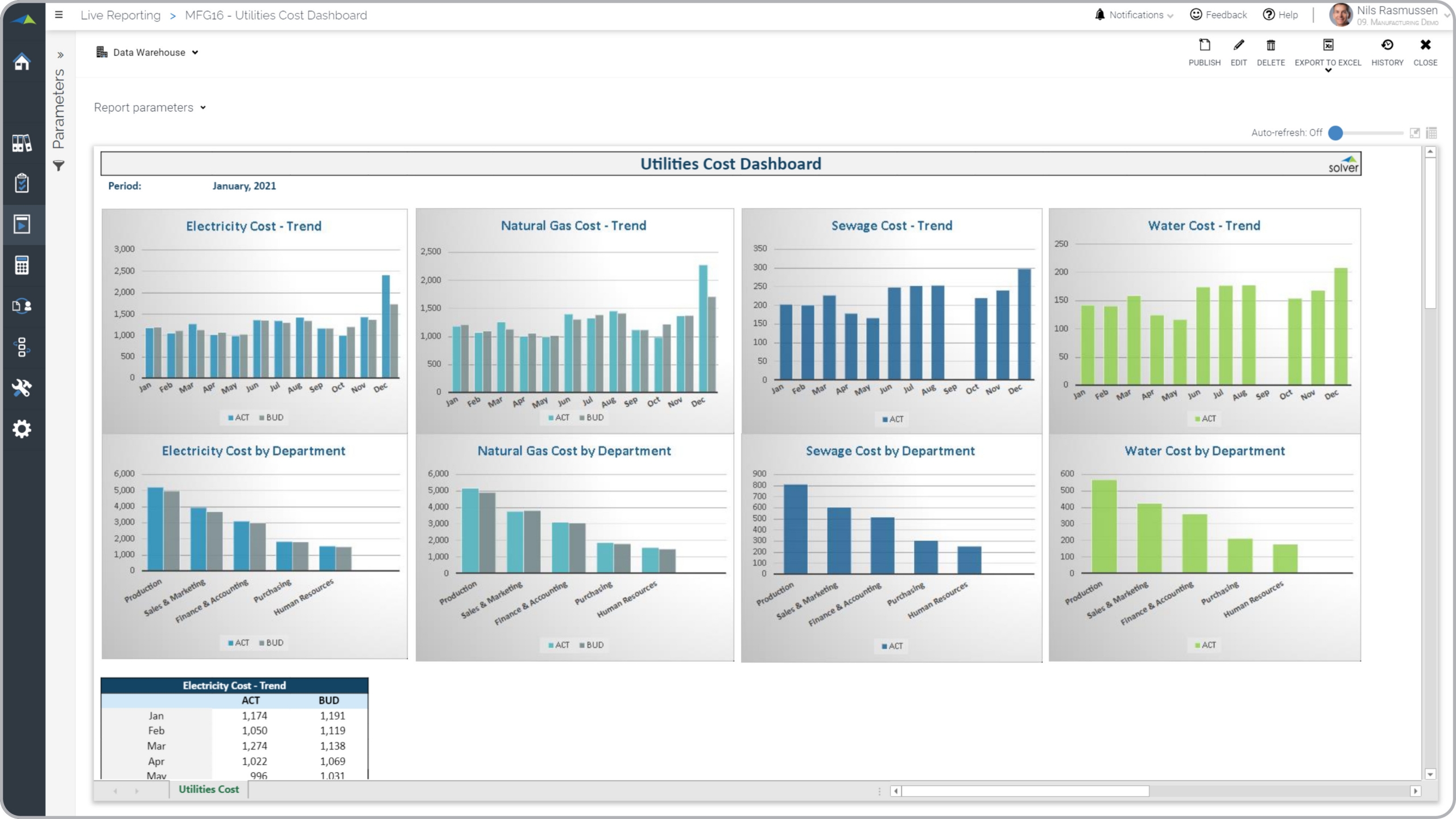
What is a Utilities Cost Dashboard? Utilities cost dashboards are considered operational analysis tools and are used by accountants and plant managers to analyze utility expenses by department and by month. Some of the main functionality in this type of dashboard report is that it benchmarks costs across departments and compares to budgets. The report has eight charts as well as a section at the bottom with figures. The top four charts provides monthly trends for Electricity cost, Natural gas cost, Sewage cost, and Water cost. The four bottom charts shows the same KPIs but benchmarks them across departments. You find an example of this type of dashboard report below.
Purpose of Utilities Cost Dashboards Manufacturers use Utilities Cost Dashboards to quickly understand major utilities expenses in order to produce accurate budgets and to analyze profit margins. When used as part of good business practices in a Financial Planning & Analysis (FP&A) department, an organization can improve its expense planning and margins as well as reduce the chances that executives don’t have a good understanding of utility expenses.
Who Uses This Type of Dashboard Report? The typical users of this type of dashboard report are: COOs, budget managers, accountants, plant managers. Other Dashboards and Reports Often Used in Conjunction with Utilities Cost Dashboards Progressive Financial Planning & Analysis (FP&A) departments sometimes use several different Utilities Cost Dashboards, along with profit & loss reports, expense budgets and other management and control tools.
Where Does the Data for Analysis Originate From? The Actual (historical transactions) data typically comes from enterprise resource planning (ERP) systems like: Microsoft Dynamics 365 (D365) Finance, Microsoft Dynamics 365 Business Central (D365 BC), Microsoft Dynamics AX, Microsoft Dynamics NAV, Microsoft Dynamics GP, Microsoft Dynamics SL, Sage Intacct, Sage 100, Sage 300, Sage 500, Sage X3, SAP Business One, SAP ByDesign, Acumatica, Netsuite and others. In analyses where budgets or forecasts are used, the planning data most often originates from in-house Excel spreadsheet models or from professional xFP&A solutions.
To learn more, visit the Resource Library.