

Distribution – Transportation Carrier Trend Analysis
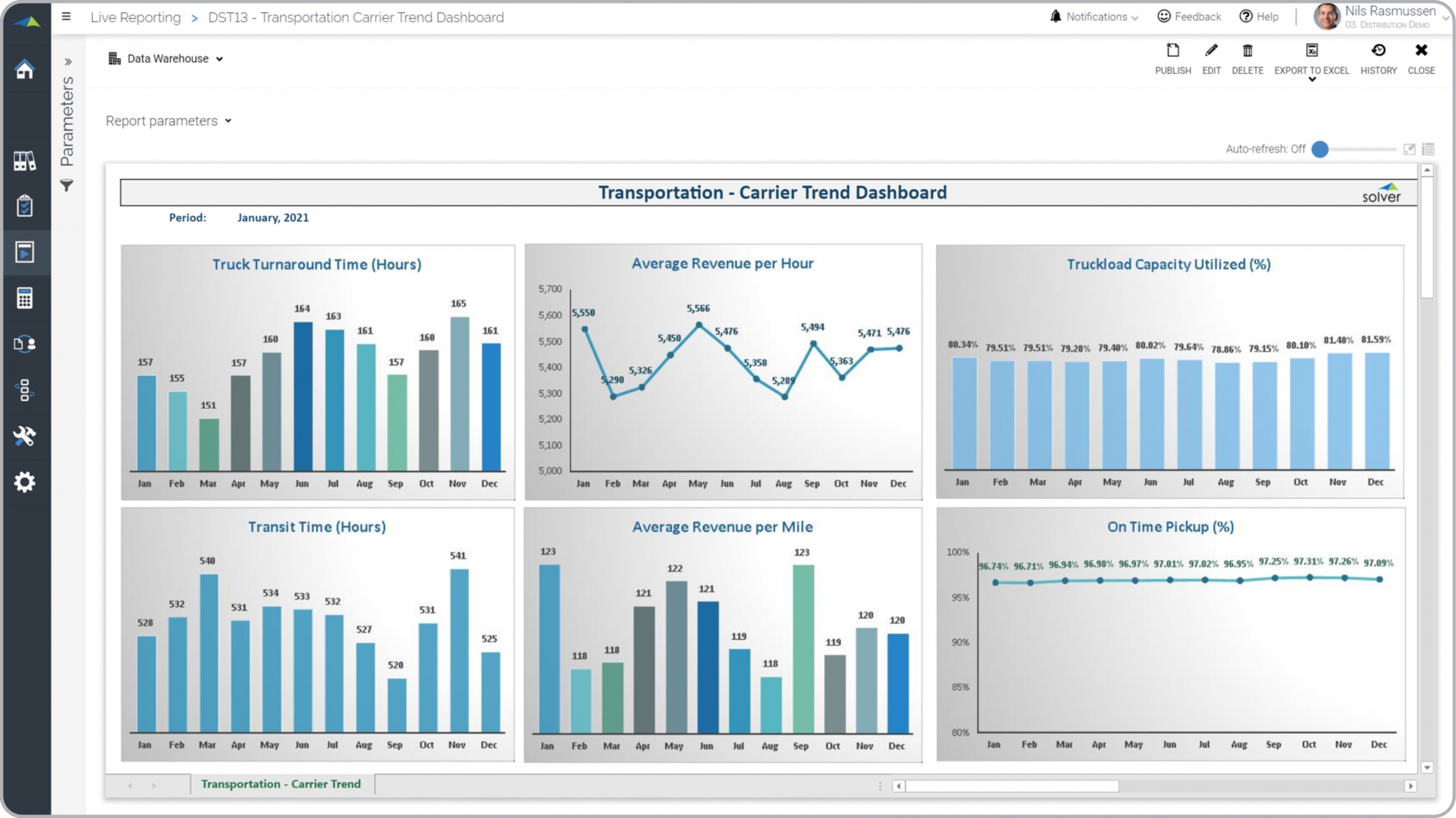
What is a Transportation Carrier Monthly Trend Dashboard? Carrier trend dashboards are considered valuable monthly analysis tools and are used by analysts and logistics managers to look for important trends in transportation KPIs. Some of the main functionality in this type of dashboard is that it provides graphical trend analysis for six key carrier metrics. These include monthly seasonality and exceptions in: 1) Truck turnaround time (hours), 2) Average revenue per hour, 3) Truckload capacity utilized, 4) Transit time (hours), 5) Average revenue per mile, and 6) On time pickup. You find an example of this type of dashboard below.
Purpose of Monthly Trend Dashboards for Transportation Carriers Distribution businesses use Trend Dashboards to analyze monthly seasonality and outliers. When used as part of good business practices in a Financial Planning & Analysis (FP&A) department, a company can improve its decision speed when important trends are discovered, and it can reduce the chances that managers don't quickly notice problems and outliers amongst their carriers.
Who Uses This Type of Dashboard? The typical users of this type of dashboard are: Analysts, Logistics managers, transportation executives, COOs. Other Dashboards Often Used in Conjunction with Monthly Trend Dashboards for Transportation Carriers Progressive Financial Planning & Analysis (FP&A) departments sometimes use several different Monthly Trend Dashboards for Transportation Carriers, along with inventory reports, demand forecasts, supplier reports, transportation rate forecasts, annual budgets and forecasts and other management and control tools.
Where Does the Data for Analysis Originate From? The Actual (historical transactions) data typically comes from management systems or enterprise resource planning (ERP) systems like: Microsoft Dynamics 365 (D365) Finance, Microsoft Dynamics 365 Business Central (D365 BC), Microsoft Dynamics AX, Microsoft Dynamics NAV, Microsoft Dynamics GP, Microsoft Dynamics SL, Sage Intacct, Sage 100, Sage 300, Sage 500, Sage X3, SAP Business One, SAP ByDesign, Acumatica, Netsuite and others. In analyses where budgets or forecasts are used, the planning data most often originates from in-house Excel spreadsheet models or from professional xFP&A solutions.
Built for distribution finance teams and aligned with Solver's xFP&A platform, this Solver report template connects directly to your ERP data via the Solver Data Warehouse, enabling near real-time analysis with minimal setup. Designed for QuickStart deployment, it can be activated rapidly so your team can focus on analysis and decisions — not data preparation.
What is the Distribution – Transportation Carrier Trend Analysis in Solver? The Distribution – Transportation Carrier Trend Analysis is a pre-built xFP&A report template in Solver designed for distribution organizations. It delivers key financial and operational metrics in a single, easy-to-use interface — purpose-built for distribution finance workflows.
Who uses this Solver report template? Finance leaders at distribution organizations — including CFOs, operations managers, and distribution finance teams — use this template to get fast, reliable answers without waiting on IT or building custom reports. It supports both day-to-day monitoring and strategic decision-making.
Where does the data come from? Data is sourced automatically from your ERP system through the Solver Data Warehouse, which integrates with platforms such as Microsoft Dynamics 365 Business Central, Dynamics 365 Finance, Acumatica, Sage Intacct, and other leading ERP solutions. Once connected, the template updates in near real-time with no manual data entry required.
To learn more, visit the Resource Library.