
Higher Ed – Student Analysis
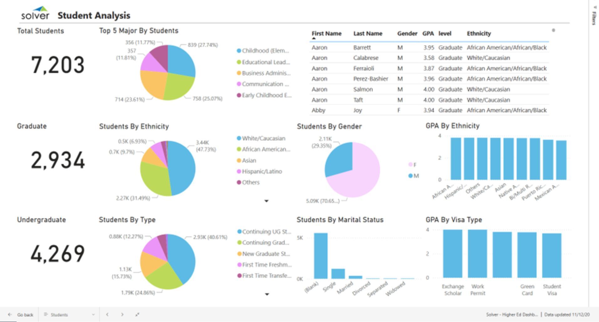
What is a Student Demographics and KPI Dashboard? Student Dashboards are considered operational analysis tools and are used by university executives, enrollment- and academic officers to get a single view of key metrics related to the student body. Some of the main functionality in this type of dashboard is that it provides analysis of student KPIs from nine different perspectives, including: 1) Total-, graduate and undergraduate student count, 2) Top five majors by student count, 3) Student count by ethnicity, 4) Student count by category (continuing graduate/undergraduate, transfer, first time), 5) Table with students by name, gender, GPA, level and ethnicity, 6) Students by gender, 7) Students by marital status, 8) GPA by ethnicity, and 9) GPA by visa type. You find an example of this type of dashboard below.
Purpose of Student Dashboards Universities and colleges use Student Demographic and KPI Dashboard to give officials an easy way to analyze their student body and potential emerging trends. When used as part of good business practices in Enrollment and Academic departments, an organization can improve its improve and speed up decisions and planning related to their student strategies, and it can reduce the chances that policies are sub-optimized due to lack of current, easily understandable data.
Who Uses This Type of Dashboard? The typical users of this type of dashboard are: University officials, boards, enrollment officers, academic officers, budget managers, strategic planners. Other Reports Often Used in Conjunction with Student Demographic and KPI Dashboards Progressive Enrollment and Academic departments sometimes use several different Student Dashboards, along with detailed enrollment reports, academic summary reports, financial dashboards, detailed budgets and other management and control tools.
Where Does the Data for Analysis Originate From? The Actual (historical transactions) data typically comes from enterprise resource planning (ERP) systems like: Microsoft Dynamics 365 (D365) Finance, Microsoft Dynamics 365 Business Central (D365 BC), Microsoft Dynamics AX, Microsoft Dynamics NAV, Microsoft Dynamics GP, Microsoft Dynamics SL, Sage Intacct, Sage 100, Sage 300, Sage 500, Sage X3, SAP Business One, SAP ByDesign, Acumatica, Netsuite and others. In analyses where budgets or forecasts are used, the planning data most often originates from in-house Excel spreadsheet models or from professional xFP&A solutions.
Built for higher education finance teams and aligned with Solver's xFP&A platform, this Solver report template connects directly to your ERP data via the Solver Data Warehouse, enabling near real-time analysis with minimal setup. Designed for QuickStart deployment, it can be activated rapidly so your team can focus on analysis and decisions — not data preparation.
What is the Higher Ed – Student Analysis in Solver? The Higher Ed – Student Analysis is a pre-built xFP&A report template in Solver designed for higher education organizations. It delivers key financial and operational metrics in a single, easy-to-use interface — purpose-built for higher education finance workflows.
Who uses this Solver report template? This template is primarily used by CFOs, controllers, and higher education finance teams in higher education organizations who need accurate, timely data to support planning, reporting, and decision-making. It is particularly valuable for higher education finance teams managing budgets, forecasts, and performance reviews.
Where does the data come from? Data is sourced automatically from your ERP system through the Solver Data Warehouse, which integrates with platforms such as Microsoft Dynamics 365 Business Central, Dynamics 365 Finance, Acumatica, Sage Intacct, and other leading ERP solutions. Once connected, the template updates in near real-time with no manual data entry required.
To learn more, visit the Resource Library.