

Government – Operating Budget Dashboard
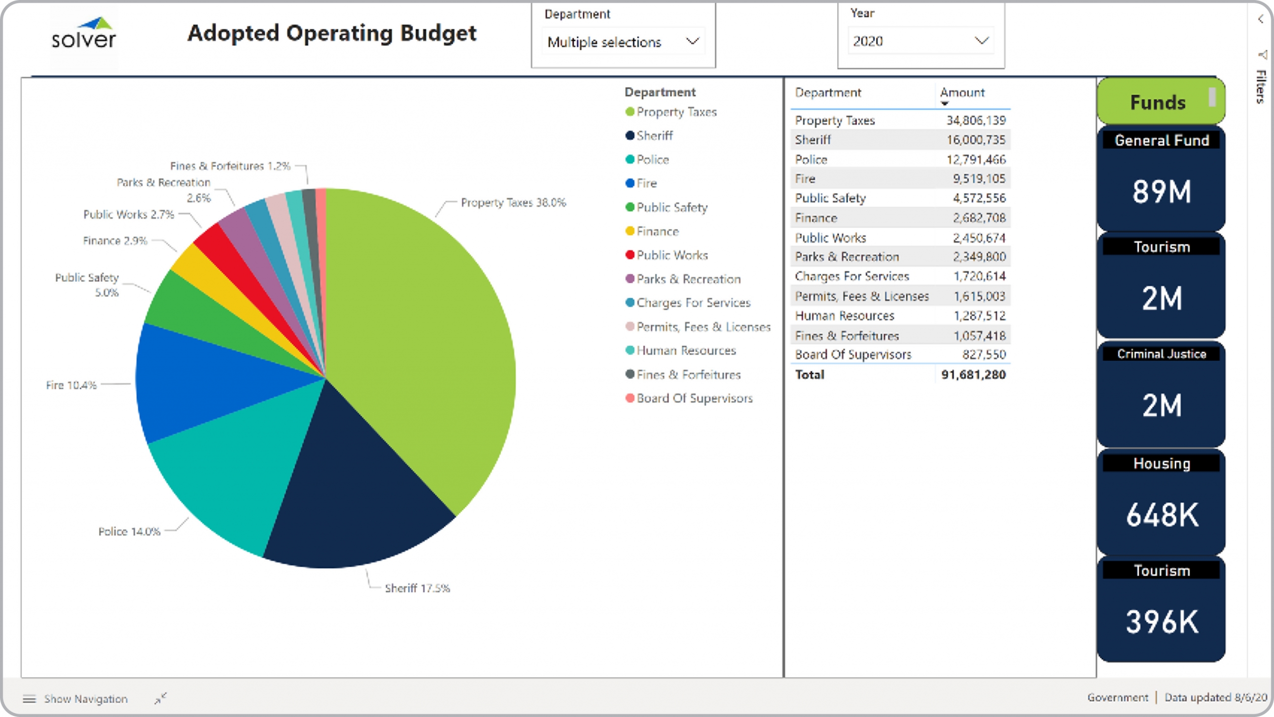
What is an Operating Budget Dashboard for Public Sector? Operating Budget Dashboards are considered budget analysis tools and are used by executives and budget managers to review the adopted budget. Some of the main functionality in this type of dashboard is that it gives the users a single view of the budget with a mix of figures, KPIs and graphics, including: 1) Pie chart with comparison of opex account categories, 2) Ranked list of annual budgeted expenses, and 3) Summary metrics by fund. The dashboard can be filtered by year, department and fund. You find an example of this type of dashboard below.
Purpose of Operating Budget Dashboards Government organizations use Operating Budget Dashboards to give finance teams and executives and clear and easy way to analyze the adopted annual budget. When used as part of good business practices in Financial Planning & Analysis (FP&A) departments, an organization can improve its budget accuracy, and it can reduce the chances that key decisionmakers lack good budgetary insight.
Who Uses This Type of Dashboard? The typical users of this type of dashboard are: Executives, boards, directors, budget officers, CFOs, analysts. Other Reports Often Used in Conjunction with Operating Budget Dashboards Progressive Financial Planning & Analysis (FP&A) departments sometimes use several different Operating Budget Dashboards, along with financial statements, annual budget reports, budget summary dashboards, detailed budget reports, budget input models and other management and control tools.
Where Does the Data for Analysis Originate From? The Actual (historical transactions) data typically comes from enterprise resource planning (ERP) systems like: Microsoft Dynamics 365 (D365) Finance, Microsoft Dynamics 365 Business Central (D365 BC), Microsoft Dynamics AX, Microsoft Dynamics NAV, Microsoft Dynamics GP, Microsoft Dynamics SL, Sage Intacct, Sage 100, Sage 300, Sage 500, Sage X3, SAP Business One, SAP ByDesign, Acumatica, Netsuite and others. In analyses where budgets or forecasts are used, the planning data most often originates from in-house Excel spreadsheet models or from professional xFP&A solutions.
Built for government finance teams and aligned with Solver's xFP&A platform, this Solver dashboard template connects directly to your ERP data via the Solver Data Warehouse, enabling near real-time analysis with minimal setup. Designed for QuickStart deployment, it can be activated rapidly so your team can focus on analysis and decisions — not data preparation.
What is the Government – Operating Budget Dashboard in Solver? The Government – Operating Budget Dashboard is a pre-built xFP&A dashboard template in Solver designed for government organizations. It delivers key financial and operational metrics in a single, easy-to-use interface — purpose-built for government finance workflows.
Who uses this Solver dashboard template? This template is primarily used by CFOs, controllers, and public sector finance teams in government organizations who need accurate, timely data to support planning, reporting, and decision-making. It is particularly valuable for government finance teams managing budgets, forecasts, and performance reviews.
Where does the data come from? Data is sourced automatically from your ERP system through the Solver Data Warehouse, which integrates with platforms such as Microsoft Dynamics 365 Business Central, Dynamics 365 Finance, Acumatica, Sage Intacct, and other leading ERP solutions. Once connected, the template updates in near real-time with no manual data entry required.
To learn more, visit the Resource Library.