
Liquidity Analysis
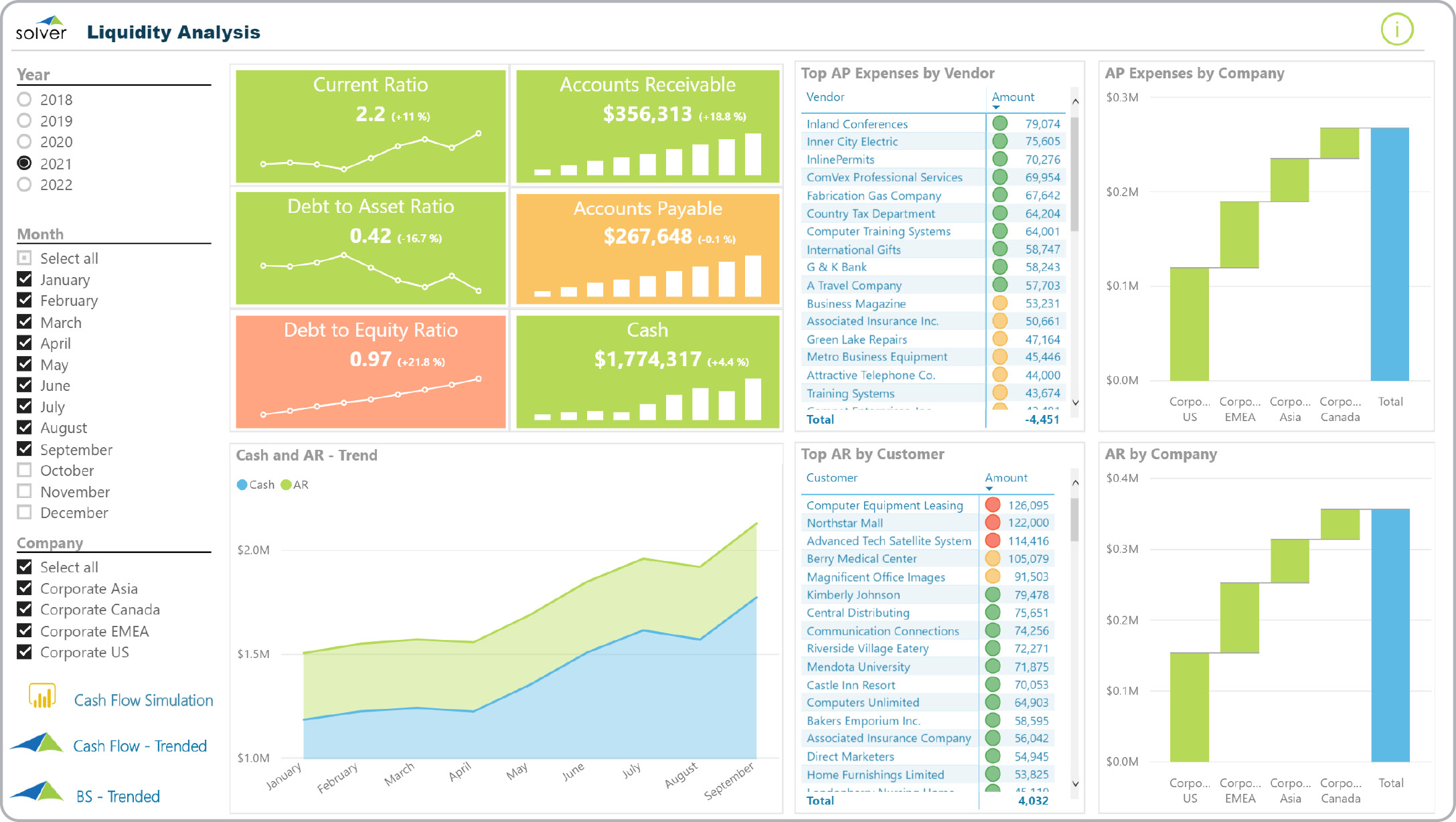
What is a Liquidity Analysis Dashboard? Liquidity visualization tools are considered financial dashboards and are often used by CFOs, controllers and treasurers to monitor and predict the company's liquidity. Key functionality in this type of dashboard shows trends in important metrics such as current ratio, debt-to-asset ratio, debt-to-equity ratio, receivables, payables and cash. It also displays rankings of top payables by vendor and top receivables by customer. The two charts on the right side show how each of the company's divisions contribute to the total consolidated AR and AP figures. The links in the lower left corner open supporting cash flow and balance sheet financial statements, as well as, a cash flow simulation. You will find an example of this type of dashboard below.
Purpose of Liquidity Dashboards Companies and organizations use Liquidity Dashboards to provide their financial managers with an easy way to monitor and predict the items that contribute to liquidity. When used as part of good business practices in a Financial Planning & Analysis (FP&A) department, a company can improve its liquidity, as well as, reduce the chances that the business runs into a situation where it has to scramble to seek additional funding.
Who Uses This Type of Dashboard? The typical users of this type of dashboard are: CFOs and financial managers. Other Dashboards Often Used in Conjunction with Liquidity Dashboards Progressive Financial Planning & Analysis (FP&A) Departments sometimes use several different Liquidity Dashboards, along with balance sheets and cash flow reports, detailed AR and AP reports and other management and control tools.
Where Does the Data for Analysis Originate From? The Actual (historical transactions) data typically comes from enterprise resource planning (ERP) systems like: Microsoft Dynamics 365 (D365) Finance, Microsoft Dynamics 365 Business Central (D365 BC), Microsoft Dynamics AX, Microsoft Dynamics NAV, Microsoft Dynamics GP, Microsoft Dynamics SL, Sage Intacct, Sage 100, Sage 300, Sage 500, Sage X3, SAP Business One, SAP ByDesign, Acumatica, Netsuite and others. In analyses where budgets or forecasts are used, the planning data most often originates from in-house Excel spreadsheet models or from professional xFP&A solutions.
This Solver report template connects directly to your ERP data via the Solver Data Warehouse, enabling near real-time analysis with minimal setup. Designed for QuickStart deployment, it can be activated rapidly so your team can focus on analysis and decisions — not data preparation.
What is the Liquidity Analysis in Solver? The Liquidity Analysis is a pre-built xFP&A report template in Solver that delivers key financial and operational metrics in a single, easy-to-use interface, eliminating the need for manual data work or custom report development.
Who uses this Solver report template? CFOs, FP&A managers, and controllers use this report template to support month-end close, variance analysis, and management reporting. It is designed to be self-service and require no custom development.
Where does the data come from? Data is sourced automatically from your ERP system through the Solver Data Warehouse, which integrates with platforms such as Microsoft Dynamics 365 Business Central, Dynamics 365 Finance, Acumatica, Sage Intacct, and other leading ERP solutions. Once connected, the template updates in near real-time with no manual data entry required.
To learn more, visit the Resource Library.