
Higher Ed – Expense Analysis
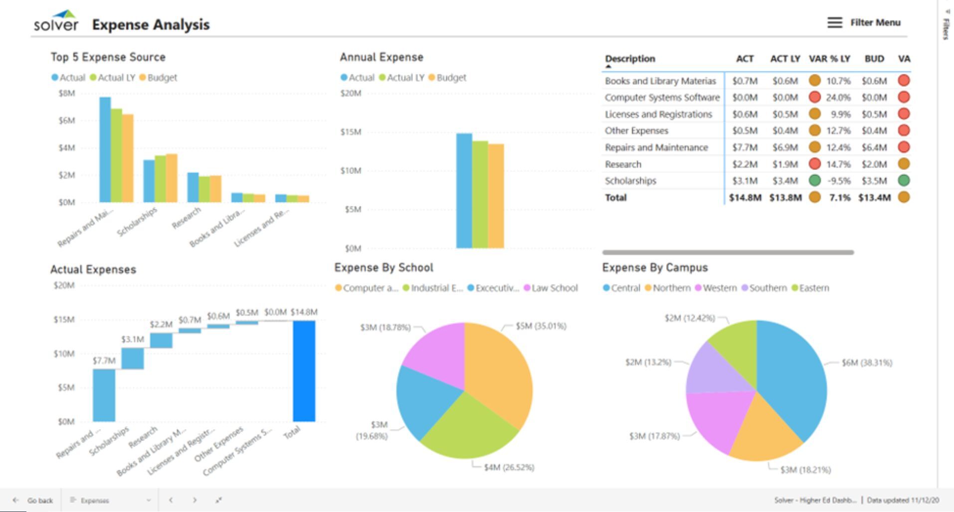
What is an Expense Analysis Dashboard for Higher Education? Expense Dashboard are considered financial analysis tools and are used by CFOs and Accounting Managers to quickly understand uses of funds and variances versus plan and prior year. Some of the main functionality in this type of dashboard is that it provides simple way to analyze operating expenses from six different perspectives: 1) Top five expense sources with comparison of actual, actual last year and budget. Sources listed in the example include: Repairs and maintenance, scholarships, research, books and library, licenses and other, 2) Total annual expenses with actual and budget comparison, 3) Table with ranked listing of all expense categories and comparison of actual figures with actual last year, variance (%), budget and budget variance, 4) Build up of components of actual expenses, 5) Total expenses by school, and 6) Expenses by campus. The user can apply filters using the "Filter Menu" on top of the screen. You find an example of this type of dashboard below.
Purpose of Expense Analysis Dashboards Universities and colleges use Expense Dashboards to provide executives with different ways to slice and compare operating expenses. When used as part of good business practices in Financial Planning & Analysis (FP&A) departments, an organization can improve its decision speed and surplus/deficit, and it can reduce the chances that leaders miss areas of unplanned overspending.
Who Uses This Type of Dashboard? The typical users of this type of dashboard are: CFO, accounting managers, budget managers, cost accountants. Other Reports Often Used in Conjunction with Expense Dashboards Progressive Financial Planning & Analysis (FP&A) departments sometimes use several different Expense Dashboards, along with Financial statements, detailed expense reports, annual budgets, KPI dashboards and other management and control tools.
Where Does the Data for Analysis Originate From? The Actual (historical transactions) data typically comes from enterprise resource planning (ERP) systems like: Microsoft Dynamics 365 (D365) Finance, Microsoft Dynamics 365 Business Central (D365 BC), Microsoft Dynamics AX, Microsoft Dynamics NAV, Microsoft Dynamics GP, Microsoft Dynamics SL, Sage Intacct, Sage 100, Sage 300, Sage 500, Sage X3, SAP Business One, SAP ByDesign, Acumatica, Netsuite and others. In analyses where budgets or forecasts are used, the planning data most often originates from in-house Excel spreadsheet models or from professional xFP&A solutions.
Built for higher education finance teams and aligned with Solver's xFP&A platform, this Solver report template connects directly to your ERP data via the Solver Data Warehouse, enabling near real-time analysis with minimal setup. Designed for QuickStart deployment, it can be activated rapidly so your team can focus on analysis and decisions — not data preparation.
What is the Higher Ed – Expense Analysis in Solver? The Higher Ed – Expense Analysis is a pre-built xFP&A report template in Solver designed for higher education organizations. It delivers key financial and operational metrics in a single, easy-to-use interface — purpose-built for higher education finance workflows.
Who uses this Solver report template? This template is primarily used by CFOs, controllers, and higher education finance teams in higher education organizations who need accurate, timely data to support planning, reporting, and decision-making. It is particularly valuable for higher education finance teams managing budgets, forecasts, and performance reviews.
Where does the data come from? Data is sourced automatically from your ERP system through the Solver Data Warehouse, which integrates with platforms such as Microsoft Dynamics 365 Business Central, Dynamics 365 Finance, Acumatica, Sage Intacct, and other leading ERP solutions. Once connected, the template updates in near real-time with no manual data entry required.
To learn more, visit the Resource Library.