
Mfg – Direct Labor Turnover Analysis
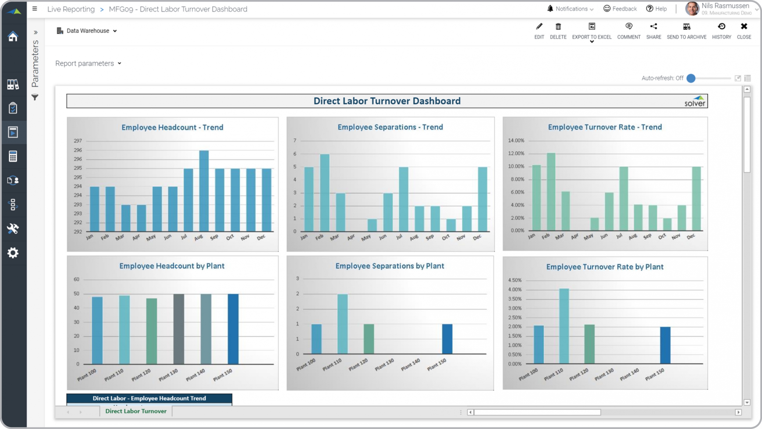
What is a Direct Labor Turnover Dashboard? Employee turnover reports are considered workforce analysis tools and are used by human resource (HR) and plant managers to monitor key metrics for their direct labor teams. Some of the main functionality in this type of dashboard report is that it provides graphical workforce analysis of monthly trends as well as KPI benchmarking across plants. The three charts on the top shows: 1) Employee headcount trend, 2) Employee separations trend, 3) Employee turnover rate trend. The three charts on the bottom displays: 1) Employee headcount by plant, 2) Employee separations by plant, 3) Employee turnover rate by plant. At the bottom of the report (not visible in the example) you find a report with the figures used in the charts. You find an example of this type of dashboard report below.
Purpose of Direct Labor Turnover Dashboards Manufacturers use Direct Labor Turnover Dashboards to easily monitor turnover metrics for their direct labor workforce. When used as part of good business practices in a HR department department, a company can improve its margins and efficiency as well as reduce the chances that executives don’t have good visibility to employee retention which can lead to higher costs and ultimately lower profitability.
Who Uses This Type of Dashboard report? The typical users of this type of dashboard report are: Plant managers, HR managers and executives. Other Dashboard reports Often Used in Conjunction with Direct Labor Turnover Dashboards Progressive HR department departments sometimes use several different Direct Labor Turnover Dashboards, along with general detailed HR transaction reports, workforce dashboards, workforce planning models, salary budgets and other management and control tools.
Where Does the Data for Analysis Originate From? The Actual (historical transactions) data typically comes from management systems or enterprise resource planning (ERP) systems like: Microsoft Dynamics 365 (D365) Finance, Microsoft Dynamics 365 Business Central (D365 BC), Microsoft Dynamics AX, Microsoft Dynamics NAV, Microsoft Dynamics GP, Microsoft Dynamics SL, Sage Intacct, Sage 100, Sage 300, Sage 500, Sage X3, SAP Business One, SAP ByDesign, Acumatica, Netsuite and others. In analyses where budgets or forecasts are used, the planning data most often originates from in-house Excel spreadsheet models or from professional xFP&A solutions.
Built for manufacturing finance teams and aligned with Solver's xFP&A platform, this Solver report template connects directly to your ERP data via the Solver Data Warehouse, enabling near real-time analysis with minimal setup. Designed for QuickStart deployment, it can be activated rapidly so your team can focus on analysis and decisions — not data preparation.
What is the Mfg – Direct Labor Turnover Analysis in Solver? The Mfg – Direct Labor Turnover Analysis is a pre-built xFP&A report template in Solver designed for manufacturing organizations. It delivers key financial and operational metrics in a single, easy-to-use interface — purpose-built for manufacturing finance workflows.
Who uses this Solver report template? This template is primarily used by CFOs, operations managers, and manufacturing finance teams in manufacturing organizations who need accurate, timely data to support planning, reporting, and decision-making. It is particularly valuable for manufacturing finance teams managing budgets, forecasts, and performance reviews.
Where does the data come from? Data is sourced automatically from your ERP system through the Solver Data Warehouse, which integrates with platforms such as Microsoft Dynamics 365 Business Central, Dynamics 365 Finance, Acumatica, Sage Intacct, and other leading ERP solutions. Once connected, the template updates in near real-time with no manual data entry required.
To learn more, visit the Resource Library.