

Distribution – Customer Rating Dashboard
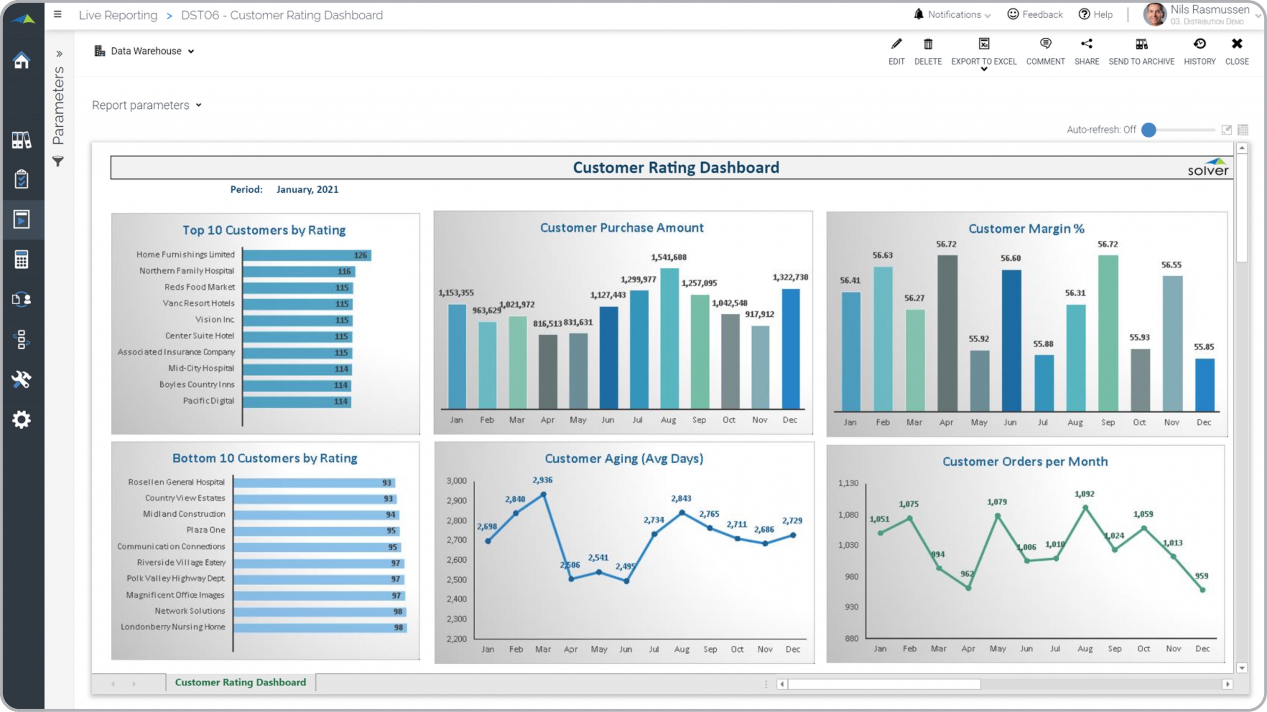
What is a Customer Rating Dashboard for a Distribution Company? Customer rating reports are considered rare and powerful analysis tools and are used by executives and sales managers to analyze sales performance metrics. Some of the main functionality in this type of dashboard report is that it gives a unique set of customer metrics that few companies currently have. The six charts provides analysis of: 1) Top 10 customer by rating, 2) Monthly average customer purchase amount, 3) Average monthly gross margin per customer deal, 4) Bottom 10 customers by rating, 5) Monthly trend of average days outstanding, and 6) Average customer order size trend. The "rating" is based on a formula that scores each customer base don multiple criteria such as payment time, AR aging and purchase amounts. You find an example of this type of dashboard report below.
Purpose of Customer Rating Dashboards Distribution businesses use Customer Rating Dashboards to give managers an objective view of the quality of the customer base and how this is trending. When used as part of good business practices in an sales department, a company can improve its sales, target market, accounting and product strategies, and it can reduce the chances that important policy and tactical decisions are delayed.
Who Uses This Type of Dashboard report? The typical users of this type of dashboard report are: Chief Revenue Officers and sales managers. Other Dashboard reports Often Used in Conjunction with Customer Rating Dashboards Progressive sales departments sometimes use several different Customer Rating Dashboards, along with customer 360 reports, AR and sales reports, sales dashboards, marketing reports and other management and control tools.
Where Does the Data for Analysis Originate From? The Actual (historical transactions) data typically comes from management systems or enterprise resource planning (ERP) systems like: Microsoft Dynamics 365 (D365) Finance, Microsoft Dynamics 365 Business Central (D365 BC), Microsoft Dynamics AX, Microsoft Dynamics NAV, Microsoft Dynamics GP, Microsoft Dynamics SL, Sage Intacct, Sage 100, Sage 300, Sage 500, Sage X3, SAP Business One, SAP ByDesign, Acumatica, Netsuite and others. In analyses where budgets or forecasts are used, the planning data most often originates from in-house Excel spreadsheet models or from professional xFP&A solutions.
Built for distribution finance teams and aligned with Solver's xFP&A platform, this Solver dashboard template connects directly to your ERP data via the Solver Data Warehouse, enabling near real-time analysis with minimal setup. Designed for QuickStart deployment, it can be activated rapidly so your team can focus on analysis and decisions — not data preparation.
What is the Distribution – Customer Rating Dashboard in Solver? The Distribution – Customer Rating Dashboard is a pre-built xFP&A dashboard template in Solver designed for distribution organizations. It delivers key financial and operational metrics in a single, easy-to-use interface — purpose-built for distribution finance workflows.
Who uses this Solver dashboard template? Cfos, operations managers, and distribution finance teams in distribution organizations rely on this Solver dashboard template to replace manual spreadsheet-based processes with automated, near real-time analysis. It is especially useful during month-end close, budget cycles, and board reporting.
Where does the data come from? Data is sourced automatically from your ERP system through the Solver Data Warehouse, which integrates with platforms such as Microsoft Dynamics 365 Business Central, Dynamics 365 Finance, Acumatica, Sage Intacct, and other leading ERP solutions. Once connected, the template updates in near real-time with no manual data entry required.
To learn more, visit the Resource Library.