

GL Dashboard – Business Comparison – Expenses
Who uses Expense Comparison Dashboards and What are Some Key Analytical Features? In today’s fast-paced business environment, CFOs are under high pressure to supply end users like managers and cost accountants with timely and concise Financial Dashboards. Companies use key features like the ones below to support their users with effective analysis that helps drive expense management and profit maximization:
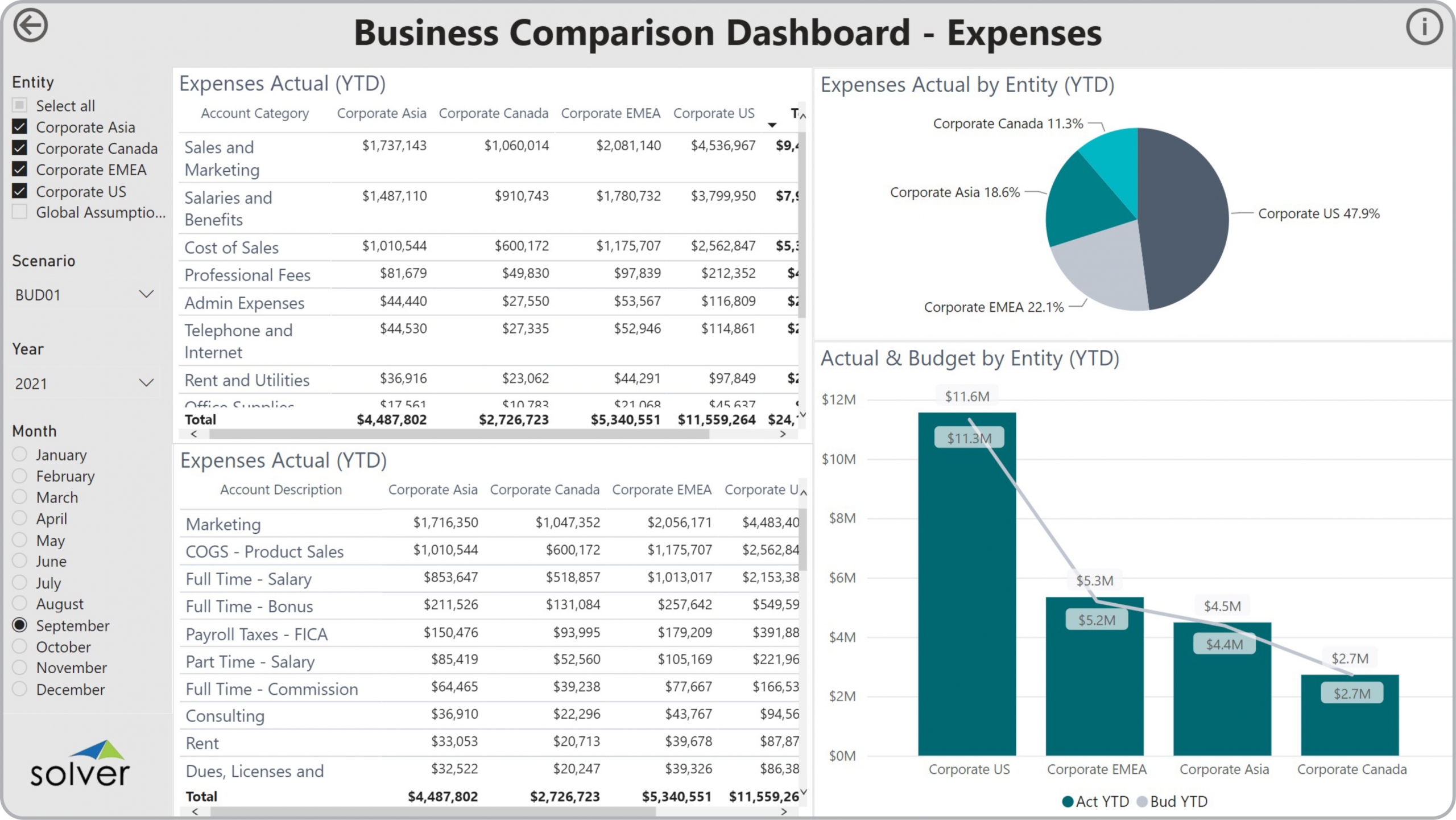
- Year-to-date (YTD) expense views by general ledger (GL) Category and Account
- Charts that compare and consolidate actual and budget expenses across subsidiaries
- Entity filter that enables the user to quickly exclude or include any subsidiary
A Brief Description of the Expense Comparison Dashboard Template Financial Dashboards like the one seen in the image above are interactive and parameter driven and typically contain sections with expense tables linked to comparative charts. One of the important features that aid the user in the analysis process is the ability to instantly zoom in on any expense Category or Account by clicking on a row in the tables and see that item represented by the charts. Expense Comparison Dashboards are often used in conjunction with expense trend and variance dashboards, KPI dashboards, profit & loss reports, and expense budget models.
Data Integration to Transaction Systems Most organizations these days want automated and streamlined planning, reporting and analysis. However, many of the benefits described earlier rely on best of breed extended financial planning and analysis (xFP&A) tools and/or Business Intelligence (BI) capabilities as well as data marts or data warehouses that use pre-built integrations to the organization’s ERP system. Oftentimes, they also need integrations to other key data sources like CRM, subscription systems, payroll tools, etc. Modern, cloud-based ERPs like Microsoft Dynamics 365 Finance (D365 Finance), Microsoft Dynamics 365 Business Central (D365 BC), Sage Intacct, Acumatica, Netsuite and SAP have robust APIs which allow for dynamic integrations to xFP&A and BI tools that are fully automated and flexible to run on a schedule or on-demand.
This Solver dashboard template connects directly to your ERP data via the Solver Data Warehouse, enabling near real-time analysis with minimal setup. Designed for QuickStart deployment, it can be activated rapidly so your team can focus on analysis and decisions — not data preparation.
What is the GL Dashboard – Business Comparison – Expenses in Solver? The GL Dashboard – Business Comparison – Expenses is a pre-built xFP&A dashboard template in Solver that delivers key financial and operational metrics in a single, easy-to-use interface, eliminating the need for manual data work or custom report development.
Who uses this Solver dashboard template? This template is primarily used by CFOs, FP&A managers, and business unit leaders who need fast, self-service access to key metrics without relying on IT or manual data pulls. It is also valuable for executives preparing for board meetings or quarterly reviews.
Where does the data come from? Data is sourced automatically from your ERP system through the Solver Data Warehouse, which integrates with platforms such as Microsoft Dynamics 365 Business Central, Dynamics 365 Finance, Acumatica, Sage Intacct, and other leading ERP solutions. Once connected, the template updates in near real-time with no manual data entry required.