

GL Dashboard – 36 Month KPI Trend
Who uses 36 Month KPI Trend Dashboards and What are Some Key Analytical Features? In today’s fast-paced business environment, CFOs are under high pressure to supply end users like executives and board members with timely and concise Financial Dashboards. Companies use key features like the ones below to support their users with effective analysis that helps drive faster and better decisions:
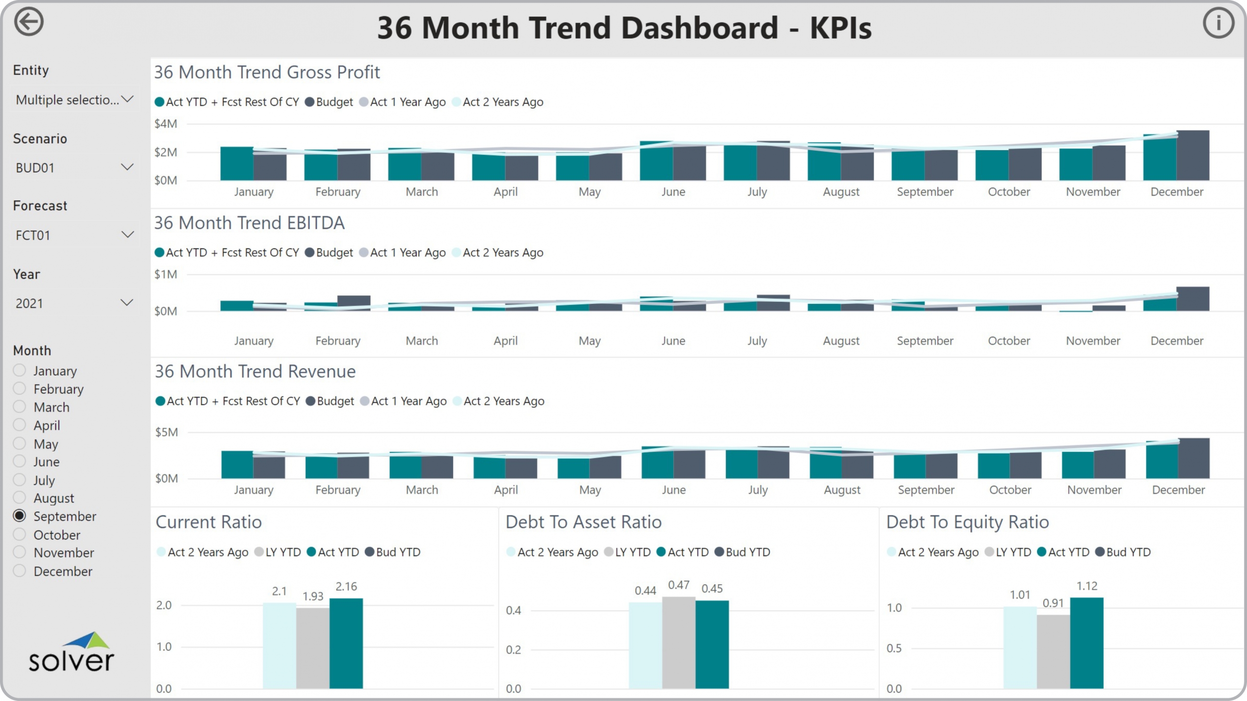
- Side-by-side, annual trend comparison of three key balance sheet ratios
- Monthly trends charts with budget and two years of history for revenue and profitability metrics
- Automated full year estimate based on actual year-to-date plus budget/forecast for the remainder of the year
A Brief Description of the 36 Month KPI Trend Dashboard Template Financial Dashboards like the one seen in the image above are interactive and parameter driven and typically contain sections with current ratio, debt-to-equity ratio and debt-to-asset ratio analysis along with revenue, gross profit and EBITDA metrics. One of the important features that aid the user in the analysis process is the ability to select parameters such as year, period and company and immediately see charts update with analysis. 36 Month KPI Trend Dashboards are often used in conjunction with profit & loss and balance sheet dashboards, financial reports and planning models.
Data Integration to Transaction Systems Most organizations these days want automated and streamlined planning, reporting and analysis. However, many of the benefits described earlier rely on best of breed extended financial planning and analysis (xFP&A) tools and/or Business Intelligence (BI) capabilities as well as data marts or data warehouses that use pre-built integrations to the organization’s ERP system. Oftentimes, they also need integrations to other key data sources like CRM, subscription systems, payroll tools, etc. Modern, cloud-based ERPs like Microsoft Dynamics 365 Finance (D365 Finance), Microsoft Dynamics 365 Business Central (D365 BC), Sage Intacct, Acumatica, Netsuite and SAP have robust APIs which allow for dynamic integrations to xFP&A and BI tools that are fully automated and flexible to run on a schedule or on-demand.
This Solver dashboard template connects directly to your ERP data via the Solver Data Warehouse, enabling near real-time analysis with minimal setup. Designed for QuickStart deployment, it can be activated rapidly so your team can focus on analysis and decisions — not data preparation.
What is the GL Dashboard – 36 Month KPI Trend in Solver? The GL Dashboard – 36 Month KPI Trend is a pre-built xFP&A dashboard template in Solver that delivers key financial and operational metrics in a single, easy-to-use interface, eliminating the need for manual data work or custom report development.
Who uses this Solver dashboard template? Executives, CFOs, FP&A managers, and business unit leaders, and business unit leaders use this dashboard to monitor performance trends and quickly identify areas needing attention. It is designed to surface the right information at the right level of detail.
Where does the data come from? Data is sourced automatically from your ERP system through the Solver Data Warehouse, which integrates with platforms such as Microsoft Dynamics 365 Business Central, Dynamics 365 Finance, Acumatica, Sage Intacct, and other leading ERP solutions. Once connected, the template updates in near real-time with no manual data entry required.