

Healthcare – Charge Summary Dashboard
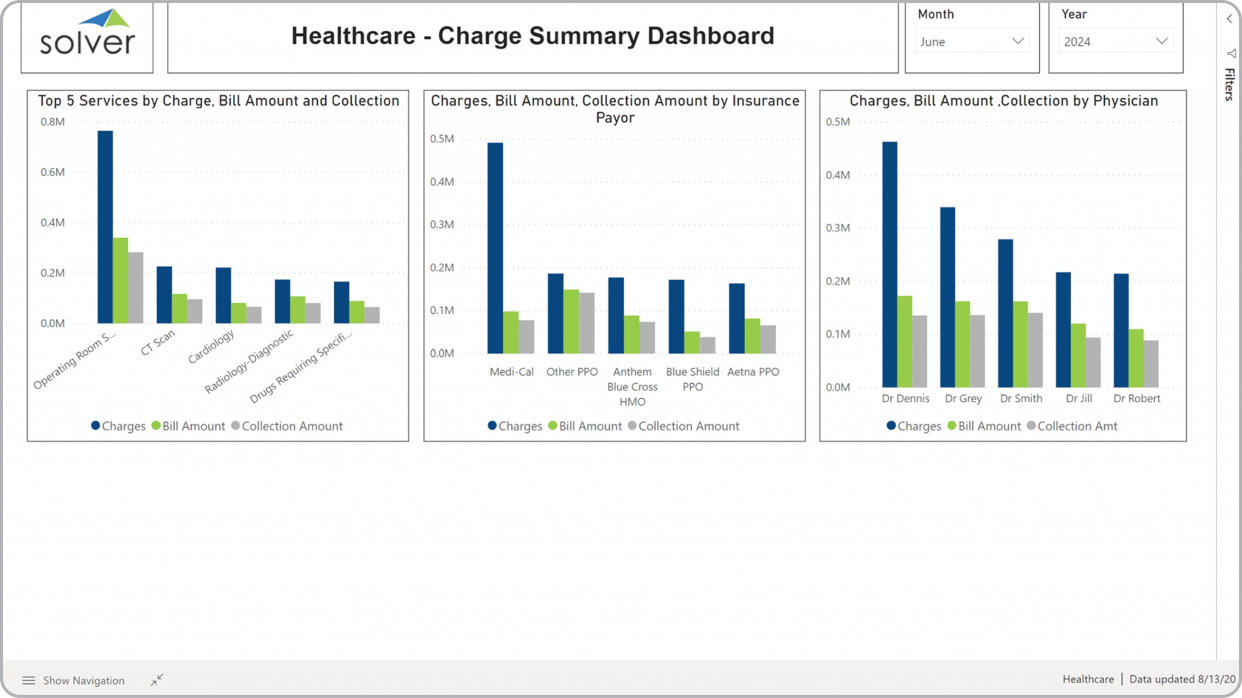
What is a Charge Summary Dashboard? Charge Summary Dashboards are considered revenue analysis tools and are used by CFOs and hospital executives to analyze charges, billings and collections from multiple angles. Some of the main functionality in this type of dashboard is that it provides analysis from three perspectives: 1) Charge amounts for the top five services ranked and compared to billed and collected amounts, 2) Charges, billings and collections by insurance payor, and 3) charges, billings and collections by physician. You find an example of this type of dashboard below.
Purpose of Charge Summary Dashboards Healthcare organizations use Charge Summary Dashboards to make it easy for managers to see the top services, payors and physicians when is comes to charges, billings and collections. When used as part of good business practices in Financial Planning & Analysis (FP&A) departments, an organization can improve its strategies as it relates to the parties involved with various revenue streams, and it can reduce the chances that the ratio of collected to charged amounts deteriorate.
Who Uses This Type of Dashboard? The typical users of this type of dashboard are: Executives, Chief Physician, CEOs, CFOs, analysts, board members. Other Reports Often Used in Conjunction with Charge Summary Dashboards Progressive Financial Planning & Analysis (FP&A) departments sometimes use several different Charge Summary Dashboards, along with profit & loss reports, balance sheets, cash flow statements, annual budgets and forecasts, revenue dashboards, scorecards, billing reports, charges reports, collections reports and other management and control tools.
Where Does the Data for Analysis Originate From? The Actual (historical transactions) data typically comes from enterprise resource planning (ERP) systems like: Microsoft Dynamics 365 (D365) Finance, Microsoft Dynamics 365 Business Central (D365 BC), Microsoft Dynamics AX, Microsoft Dynamics NAV, Microsoft Dynamics GP, Microsoft Dynamics SL, Sage Intacct, Sage 100, Sage 300, Sage 500, Sage X3, SAP Business One, SAP ByDesign, Acumatica, Netsuite and others. In analyses where budgets or forecasts are used, the planning data most often originates from in-house Excel spreadsheet models or from professional xFP&A solutions.
Built for healthcare finance teams and aligned with Solver's xFP&A platform, this Solver dashboard template connects directly to your ERP data via the Solver Data Warehouse, enabling near real-time analysis with minimal setup. Designed for QuickStart deployment, it can be activated rapidly so your team can focus on analysis and decisions — not data preparation.
What is the Healthcare – Charge Summary Dashboard in Solver? The Healthcare – Charge Summary Dashboard is a pre-built xFP&A dashboard template in Solver designed for healthcare organizations. It delivers key financial and operational metrics in a single, easy-to-use interface — purpose-built for healthcare finance workflows.
Who uses this Solver dashboard template? Finance leaders at healthcare organizations — including CFOs, healthcare finance managers, and controllers — use this template to get fast, reliable answers without waiting on IT or building custom reports. It supports both day-to-day monitoring and strategic decision-making.
Where does the data come from? Data is sourced automatically from your ERP system through the Solver Data Warehouse, which integrates with platforms such as Microsoft Dynamics 365 Business Central, Dynamics 365 Finance, Acumatica, Sage Intacct, and other leading ERP solutions. Clinical and revenue cycle management systems can also be integrated for a complete financial and operational picture. Once connected, the template updates in near real-time with no manual data entry required.
To learn more, visit the Resource Library.