
What is a
Yield Loss and Variance Dashboard
? Yield Dashboards are considered operational analysis tools and are used by Cost Accountants and Production Managers to analyze scrap-related metrics from the manufacturing of their products. Some of the main functionality in this type of dashboard is that it provides yield loss and variance analysis from four different perspectives. These include: 1) Monthly trend in yield loss for selected plant and for the company total, 2) Yield variance per product with metrics for produced quantity, input cost actual, input cost budget, actual yield, standard yield, material used, input cost per unit, yield loss amount and yield loss percent, 3) Yield loss with benchmark comparison across selected plants and % of company total, and 4) Yield loss per plant with loss % and loss amount and grand total. The user can select plant(s) and years on the top of the dashboard. You find an example of this type of dashboard below.
Purpose of
Yield Loss and Yield Variance Dashboards Manufacturing companies use scrap-related dashboards to give managers an easy to understand and graphical analysis of yield loss metrics. When used as part of good business practices in Financial Planning & Analysis (FP&A) and manufacturing operations departments, an organization can improve its decisions related to cost and production efficiency, and it can reduce the chances that managers miss any trends or outliers.
Example of a
Yield Loss Dashboard Here is an example of a Yield Loss and Variance Dashboard with cross plant comparison and trend analysis. [caption id="" align="alignnone" width="2560"]
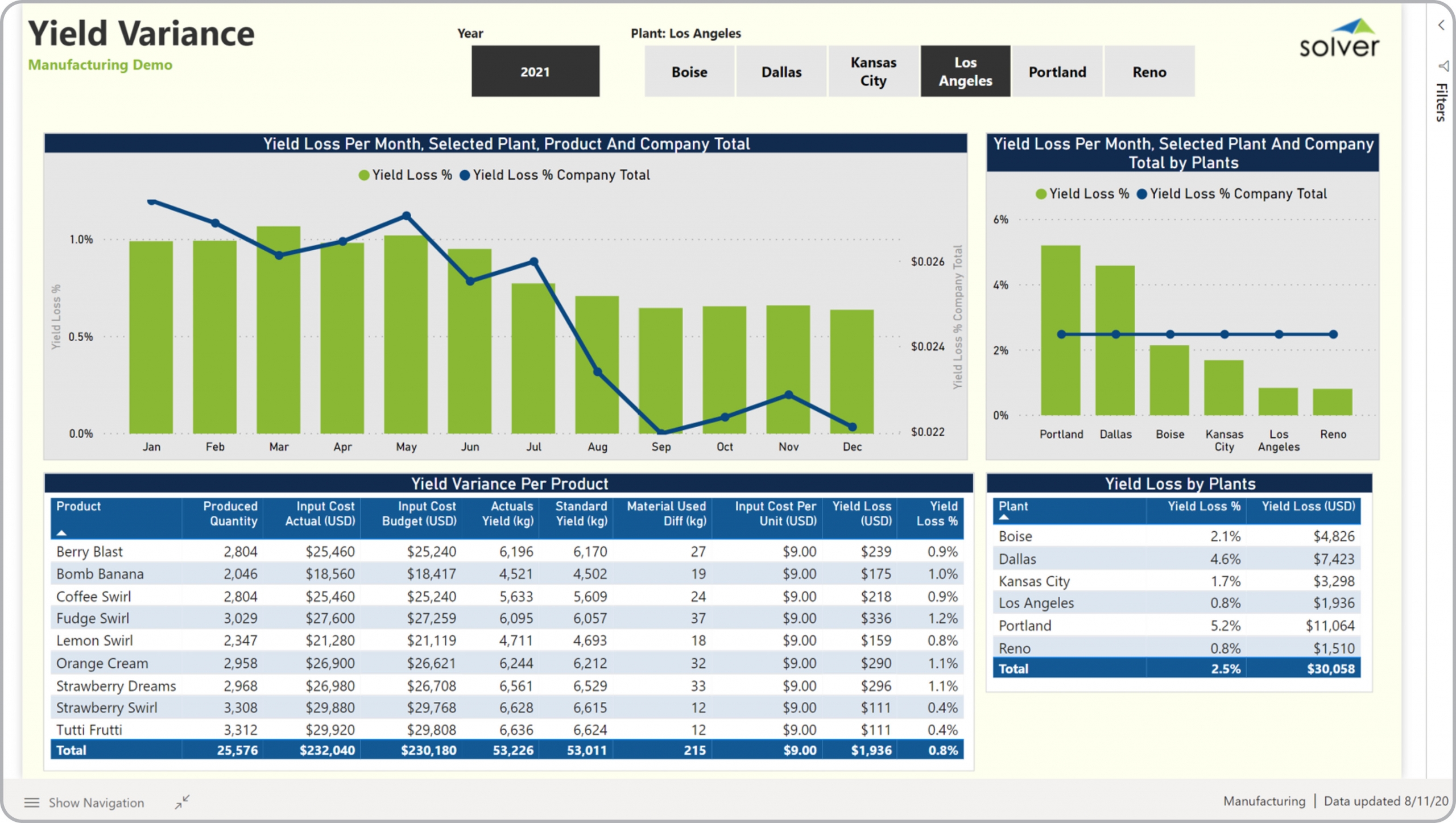 Example of a Yield Variance Dashboard for Manufacturing Companies[/caption] You can find hundreds of additional examples
here
Who Uses This Type of
Dashboard
? The typical users of this type of dashboard are: Analysts, plant managers, production managers, cost accountants, budget managers.
Other Reports Often Used in Conjunction with
Yield Loss Dashboards Progressive Financial Planning & Analysis (FP&A) and manufacturing operations departments sometimes use several different Yield Loss Dashboards, along with manufacturing dashboards, profit & loss reports, annual budgets, expense variance reports and other management and control tools.
Where Does the Data for Analysis Originate From? The Actual (historical transactions) data typically comes from enterprise resource planning (ERP) systems like: Microsoft Dynamics 365 (D365) Finance, Microsoft Dynamics 365 Business Central (D365 BC), Microsoft Dynamics AX, Microsoft Dynamics NAV, Microsoft Dynamics GP, Microsoft Dynamics SL, Sage Intacct, Sage 100, Sage 300, Sage 500, Sage X3, SAP Business One, SAP ByDesign, Acumatica, Netsuite and others. In analyses where budgets or forecasts are used, the planning data most often originates from in-house Excel spreadsheet models or from professional corporate performance management (CPM/EPM) solutions.
What Tools are Typically used for Reporting, Planning and Dashboards? Examples of business software used with the data and ERPs mentioned above are:
Example of a Yield Variance Dashboard for Manufacturing Companies[/caption] You can find hundreds of additional examples
here
Who Uses This Type of
Dashboard
? The typical users of this type of dashboard are: Analysts, plant managers, production managers, cost accountants, budget managers.
Other Reports Often Used in Conjunction with
Yield Loss Dashboards Progressive Financial Planning & Analysis (FP&A) and manufacturing operations departments sometimes use several different Yield Loss Dashboards, along with manufacturing dashboards, profit & loss reports, annual budgets, expense variance reports and other management and control tools.
Where Does the Data for Analysis Originate From? The Actual (historical transactions) data typically comes from enterprise resource planning (ERP) systems like: Microsoft Dynamics 365 (D365) Finance, Microsoft Dynamics 365 Business Central (D365 BC), Microsoft Dynamics AX, Microsoft Dynamics NAV, Microsoft Dynamics GP, Microsoft Dynamics SL, Sage Intacct, Sage 100, Sage 300, Sage 500, Sage X3, SAP Business One, SAP ByDesign, Acumatica, Netsuite and others. In analyses where budgets or forecasts are used, the planning data most often originates from in-house Excel spreadsheet models or from professional corporate performance management (CPM/EPM) solutions.
What Tools are Typically used for Reporting, Planning and Dashboards? Examples of business software used with the data and ERPs mentioned above are:
- Native ERP report writers and query tools
- Spreadsheets (for example Microsoft Excel)
- Corporate Performance Management (CPM) tools (for example Solver)
- Dashboards (for example Microsoft Power BI and Tableau)
- View 100’s of reporting, consolidations, planning, budgeting, forecasting and dashboard examples here
- View a Manufacturing white paper and other industry-specific information here
- See how reports are designed in a modern report writer using a cloud-connected Excel add-in writer
- Discover how the Solver CPM solution delivers financial and operational reporting
- Discover how the Solver CPM solution delivers planning, budgeting and forecasting
- Watch demo videos of reporting, planning and dashboards
April 5, 2021
TAGS: Reporting, Solver, plant, report writer, Microsoft, manufacturing, template, practice, Acumatica, visualization, Netsuite, Finance, planning, GP, dashboard, Business Central, excel, ax, forecast, Budget, Dynamics 365, analysis, budgeting, Cloud, Software, product, Tableau, SAP, example, best, Sage, BC, D365, NAV, Intacct, facility, CPM, report, SL, Management, dynamics, Power BI, monthly yield, scrap