
What is
a
Win Loss Dashboard Report by Person, Deal and Industry
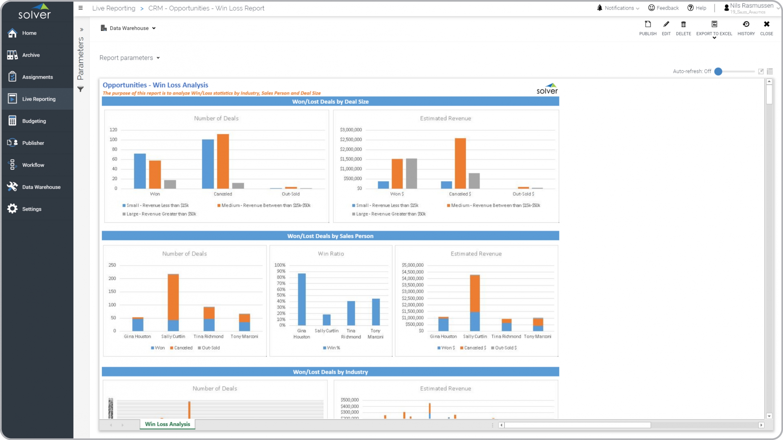
? Win Loss dashboard reports are considered strategic sales improvement tools and are often used by sales executives and sales team members to analyze why and where deals are won and lost. Some of the key functionality in this type of dashboard report is that it provides both graphical and transactional views of the sales data. The information analyzed is based on the deal status field on the closed opportunity transactions in the CRM system. The report slices the win loss information into three categories: 1) Won/Lost deals by size, 2) Won/Lost deals by sales person, 3) Won/lost deals by industry. Metrics include the number of deals, win/loss ratio per sales person, and the amount of revenue that was won or lost. The bottom of the report (not visible in the screenshot below) contains all the individual transactions for more in-depth drill down. You find an example of this type of dashboard report below.
Purpose of
Win Loss Analysis Dashboard Reports Companies and organizations use Win Loss Reports to understand which type of deals are won or lost and to analyze the ability of the sales team to close deals. When used as part of good business practices in a sales department, a company can improve its sales revenues and win ratio as well as reduce the chances that weak spots in products, teams or sales strategies are not quickly detected and improved upon.
Win Loss Analysis Dashboard Report
Example Here is an example of a Win Loss Report by Deal Size, Sales Person and Industry. [caption id="" align="alignnone" width="2560"]
 Win Loss Dashboard Report Example by Person and Deal Size and Industry[/caption] You can find hundreds of additional examples
here
Who Uses This Type of
Dashboard report
? The typical users of this type of dashboard report are: Sales managers, sales team members.
Other
Dashboard report
s Often Used in Conjunction with
Win Loss Analysis Dashboard Reports Progressive Sales Departments sometimes use several different Win Loss Analysis Dashboard Reports, along with pipeline funnel reports, marketing and sales KPI reports, opportunity dashboards, sales forecasts and other management and control tools.
Where Does the Data for Analysis Originate From? The Actual (historical transactions) data typically comes from CRM and enterprise resource planning (ERP) systems like: Microsoft Dynamics 365 (D365) Finance, Microsoft Dynamics 365 Business Central (D365 BC), Microsoft Dynamics 365 (CRM), Microsoft Dynamics AX, Microsoft Dynamics NAV, Microsoft Dynamics GP, Microsoft Dynamics SL, Sage Intacct, Sage 100, Sage 300, Sage 500, Sage X3, SAP Business One, SAP ByDesign, Acumatica, Netsuite, Salesforce, Hubspot and others. In analyses where budgets or forecasts are used, the planning data most often originates from in-house Excel spreadsheet models or from professional corporate performance management (CPM/EPM) solutions.
What Tools are Typically used for Reporting, Planning and Dashboards? Examples of business software used with the data and ERPs mentioned above are:
Win Loss Dashboard Report Example by Person and Deal Size and Industry[/caption] You can find hundreds of additional examples
here
Who Uses This Type of
Dashboard report
? The typical users of this type of dashboard report are: Sales managers, sales team members.
Other
Dashboard report
s Often Used in Conjunction with
Win Loss Analysis Dashboard Reports Progressive Sales Departments sometimes use several different Win Loss Analysis Dashboard Reports, along with pipeline funnel reports, marketing and sales KPI reports, opportunity dashboards, sales forecasts and other management and control tools.
Where Does the Data for Analysis Originate From? The Actual (historical transactions) data typically comes from CRM and enterprise resource planning (ERP) systems like: Microsoft Dynamics 365 (D365) Finance, Microsoft Dynamics 365 Business Central (D365 BC), Microsoft Dynamics 365 (CRM), Microsoft Dynamics AX, Microsoft Dynamics NAV, Microsoft Dynamics GP, Microsoft Dynamics SL, Sage Intacct, Sage 100, Sage 300, Sage 500, Sage X3, SAP Business One, SAP ByDesign, Acumatica, Netsuite, Salesforce, Hubspot and others. In analyses where budgets or forecasts are used, the planning data most often originates from in-house Excel spreadsheet models or from professional corporate performance management (CPM/EPM) solutions.
What Tools are Typically used for Reporting, Planning and Dashboards? Examples of business software used with the data and ERPs mentioned above are:
- Native ERP report writers and query tools
- Spreadsheets (for example Microsoft Excel)
- Corporate Performance Management (CPM) tools (for example Solver)
- Dashboards (for example Microsoft Power BI and Tableau)
- View 100’s of reporting, consolidations, planning, budgeting, forecasting and dashboard examples here
- See how reports are designed in a modern report writer using a cloud-connected Excel add-in writer
- Discover how the Solver CPM solution delivers financial and operational reporting
- Discover how the Solver CPM solution delivers planning, budgeting and forecasting
- Watch demo videos of reporting, planning and dashboards
October 27, 2020
TAGS: Reporting, Solver, report writer, Microsoft, template, Acumatica, Netsuite, Finance, GP, dashboard, Business Central, excel, hubspot, ax, person, pipeline, Salesforce, forecast, Budget, forecasting, analysis, budgeting, Cloud, Software, Tableau, SAP, example, best, Sage, BC, D365, NAV, Intacct, loss, CRM, report, SL, Management, dynamics, sales, Power BI, opportunity, dynamics 365 sales