
What is a
Support and Service Level Dashboard
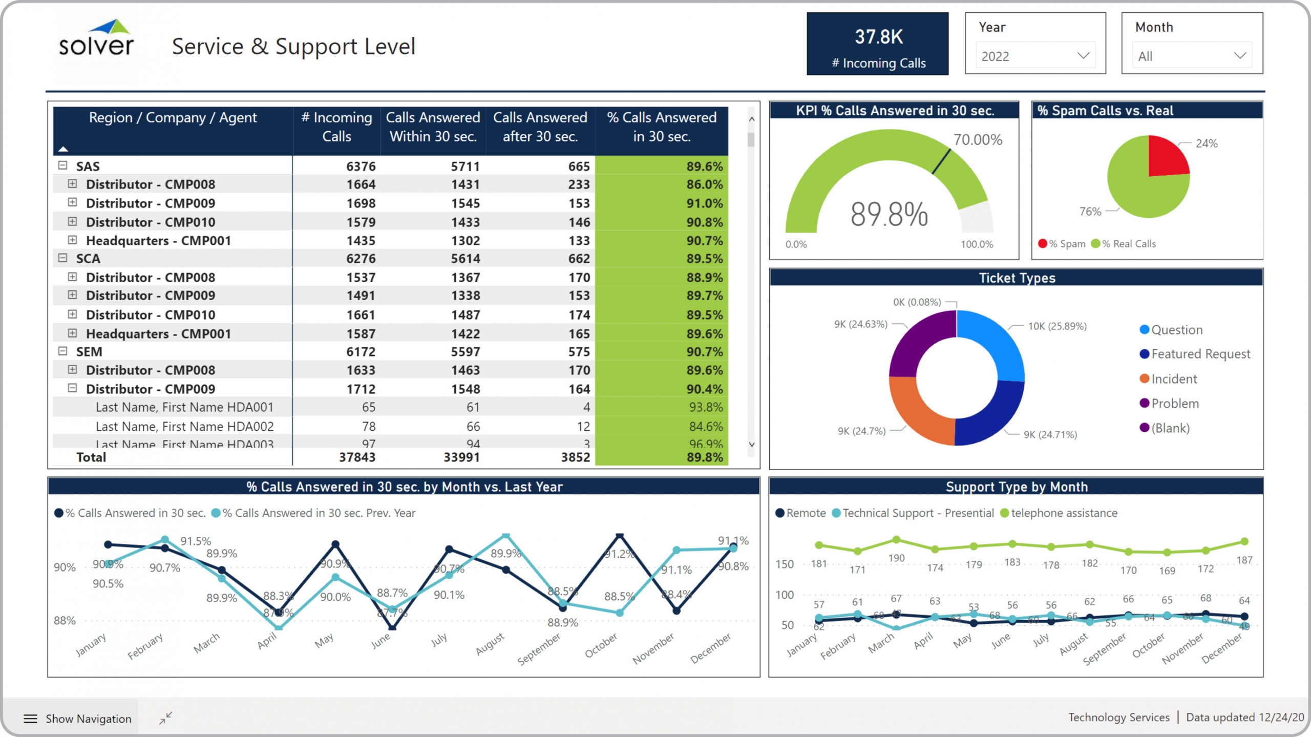
? Support and Service Dashboards are considered helpdesk analysis tools and are used by COO's and Helpdesk Managers to track ticket volumes and performance of support teams. Some of the main functionality in this type of dashboard is that it provides an easy way for leaders to analyze helpdesk metrics from seven different perspectives, including: 1) Table with support agent by department and location and with metrics for Number of incoming calls and Calls answered within or after 30 seconds, 2) Monthly trend in calls answered within 30 seconds, 3) Total incoming calls, 4) Percent of calls answered within 30 seconds, 5) Percent spam calls versus real calls, 6) Tickets by type, and 7) Monthly trend in support types. You find an example of this type of dashboard below.
Purpose of
Support and Service Level Dashboards Tech companies use Support and Service Level Dashboards to give helpdesk managers an easy way to monitor KPIs for their support teams. When used as part of good business practices in Helpdesk departments, an organization can improve its service levels and internal (or external) customer satisfaction, and it can reduce the chances that lack of metrics and measurement hides performance issues that later can result in escalating problems.
Example of a
Support and Service Level Dashboard Here is an example of a Support and Service Level Dashboard with KPIs and trends for call types and performance statistics. [caption id="" align="alignnone" width="2560"]
 Example of a Support and Service Level Dashboard for Technology Companies[/caption] You can find hundreds of additional examples
here
Who Uses This Type of
Dashboard
? The typical users of this type of dashboard are: Helpdesk/support managers, Global helpdesk executives, support team leaders.
Other Reports Often Used in Conjunction with
Support and Service Level Dashboards Progressive Helpdesk departments sometimes use several different Support and Service Level Dashboards, along with Detailed support reports per team and individual, scorecards, staff and payroll planning models and other management and control tools.
Where Does the Data for Analysis Originate From? The Actual (historical transactions) data typically comes from helpdesk systems and enterprise resource planning (ERP) systems like: Microsoft Dynamics 365 (D365) Finance, Microsoft Dynamics 365 Business Central (D365 BC), Microsoft Dynamics AX, Microsoft Dynamics NAV, Microsoft Dynamics GP, Microsoft Dynamics SL, Sage Intacct, Sage 100, Sage 300, Sage 500, Sage X3, SAP Business One, SAP ByDesign, Acumatica, Netsuite and others. In analyses where budgets or forecasts are used, the planning data most often originates from in-house Excel spreadsheet models or from professional corporate performance management (CPM/EPM) solutions.
What Tools are Typically used for Reporting, Planning and Dashboards? Examples of business software used with the data and ERPs mentioned above are:
Example of a Support and Service Level Dashboard for Technology Companies[/caption] You can find hundreds of additional examples
here
Who Uses This Type of
Dashboard
? The typical users of this type of dashboard are: Helpdesk/support managers, Global helpdesk executives, support team leaders.
Other Reports Often Used in Conjunction with
Support and Service Level Dashboards Progressive Helpdesk departments sometimes use several different Support and Service Level Dashboards, along with Detailed support reports per team and individual, scorecards, staff and payroll planning models and other management and control tools.
Where Does the Data for Analysis Originate From? The Actual (historical transactions) data typically comes from helpdesk systems and enterprise resource planning (ERP) systems like: Microsoft Dynamics 365 (D365) Finance, Microsoft Dynamics 365 Business Central (D365 BC), Microsoft Dynamics AX, Microsoft Dynamics NAV, Microsoft Dynamics GP, Microsoft Dynamics SL, Sage Intacct, Sage 100, Sage 300, Sage 500, Sage X3, SAP Business One, SAP ByDesign, Acumatica, Netsuite and others. In analyses where budgets or forecasts are used, the planning data most often originates from in-house Excel spreadsheet models or from professional corporate performance management (CPM/EPM) solutions.
What Tools are Typically used for Reporting, Planning and Dashboards? Examples of business software used with the data and ERPs mentioned above are:
- Native ERP report writers and query tools
- Spreadsheets (for example Microsoft Excel)
- Corporate Performance Management (CPM) tools (for example Solver)
- Dashboards (for example Microsoft Power BI and Tableau)
- View 100’s of reporting, consolidations, planning, budgeting, forecasting and dashboard examples here
- View a Technology industry white paper and other industry-specific information here
- See how reports are designed in a modern report writer using a cloud-connected Excel add-in writer
- Discover how the Solver CPM solution delivers financial and operational reporting
- Discover how the Solver CPM solution delivers planning, budgeting and forecasting
- Watch demo videos of reporting, planning and dashboards
May 13, 2021
TAGS: Reporting, Solver, report writer, Microsoft, template, practice, Acumatica, Netsuite, Finance, planning, GP, dashboard, Business Central, tech, excel, ax, forecast, Budget, technology, Dynamics 365, analysis, budgeting, KPI, Cloud, Software, Tableau, SAP, example, best, Sage, BC, D365, NAV, Intacct, CPM, report, SL, Management, dynamics, Power BI, tech company dashboard, helpdesk, support ticket, helpdesk dashboard, support dashboard, service level, call metrics, call volume