
What is a
Subscriber Dashboard
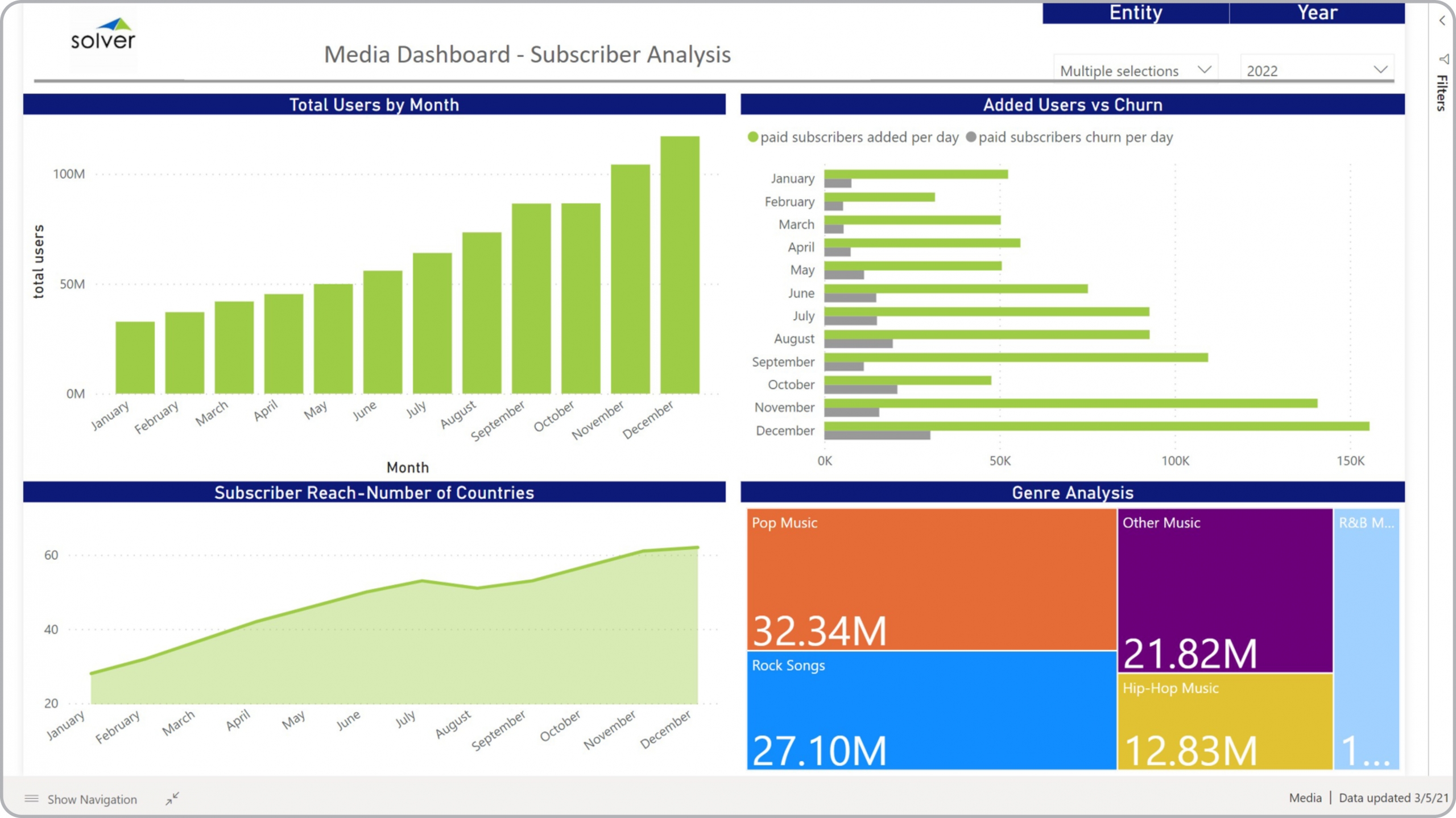
? Subscriber Dashboards are considered operational analysis tools and are used by executives, media and marketing managers to get important insights into subscriber KPIs, content preferences and trends. Some of the main functionality in this type of dashboard is that it provides analysis of user KPIs from four different perspectives, including: 1) Monthly trend in total number of users, 2) Number of added users and churn per day, 3) Subscriber reach by country (region/geography), and 4) Number of subscribers per genre. The filters on top of the dashboard enables slicing by year and station/business unit. You find an example of this type of dashboard below.
Purpose of
Subscriber Analysis Dashboard Media companies use Subscriber Analysis Dashboard to get a clear picture of the key user (subscriber) trends that drives the success of the company. When used as part of good business practices in Product and Marketing departments, a company can grow revenues by improving offerings and Go-To-Market tactics, and it can reduce the chances that managers are lacking visibility to subscriber churn and content preferences.
Example of a
Subscriber Dashboard Here is an example of a Subscriber Dashboard with trends in user KPIs as well as genre metrics. [caption id="" align="alignnone" width="2560"]
 Example of a Subscriber Dashboard for Media Companies[/caption] You can find hundreds of additional examples
here
Who Uses This Type of
Dashboard
? The typical users of this type of dashboard are: Executives, category managers, media managers, sales managers, marketing managers.
Other Reports Often Used in Conjunction with
Subscriber Analysis Dashboard Progressive Product and Marketing departments sometimes use several different Subscriber Analysis Dashboard, along with detailed subscriber reports, churn reports, financial statements, financial dashboards, sales forecasts, annual budgets and other management and control tools.
Where Does the Data for Analysis Originate From? The Actual (historical transactions) data typically comes from media traffic systems and enterprise resource planning (ERP) systems like: Microsoft Dynamics 365 (D365) Finance, Microsoft Dynamics 365 Business Central (D365 BC), Microsoft Dynamics AX, Microsoft Dynamics NAV, Microsoft Dynamics GP, Microsoft Dynamics SL, Sage Intacct, Sage 100, Sage 300, Sage 500, Sage X3, SAP Business One, SAP ByDesign, Acumatica, Netsuite and others. In analyses where budgets or forecasts are used, the planning data most often originates from in-house Excel spreadsheet models or from professional corporate performance management (CPM/EPM) solutions.
What Tools are Typically used for Reporting, Planning and Dashboards? Examples of business software used with the data and ERPs mentioned above are:
Example of a Subscriber Dashboard for Media Companies[/caption] You can find hundreds of additional examples
here
Who Uses This Type of
Dashboard
? The typical users of this type of dashboard are: Executives, category managers, media managers, sales managers, marketing managers.
Other Reports Often Used in Conjunction with
Subscriber Analysis Dashboard Progressive Product and Marketing departments sometimes use several different Subscriber Analysis Dashboard, along with detailed subscriber reports, churn reports, financial statements, financial dashboards, sales forecasts, annual budgets and other management and control tools.
Where Does the Data for Analysis Originate From? The Actual (historical transactions) data typically comes from media traffic systems and enterprise resource planning (ERP) systems like: Microsoft Dynamics 365 (D365) Finance, Microsoft Dynamics 365 Business Central (D365 BC), Microsoft Dynamics AX, Microsoft Dynamics NAV, Microsoft Dynamics GP, Microsoft Dynamics SL, Sage Intacct, Sage 100, Sage 300, Sage 500, Sage X3, SAP Business One, SAP ByDesign, Acumatica, Netsuite and others. In analyses where budgets or forecasts are used, the planning data most often originates from in-house Excel spreadsheet models or from professional corporate performance management (CPM/EPM) solutions.
What Tools are Typically used for Reporting, Planning and Dashboards? Examples of business software used with the data and ERPs mentioned above are:
- Native ERP report writers and query tools
- Spreadsheets (for example Microsoft Excel)
- Corporate Performance Management (CPM) tools (for example Solver)
- Dashboards (for example Microsoft Power BI and Tableau)
- View 100’s of reporting, consolidations, planning, budgeting, forecasting and dashboard examples here
- View a Media industry white paper and other industry-specific information here
- See how reports are designed in a modern report writer using a cloud-connected Excel add-in writer
- Discover how the Solver CPM solution delivers financial and operational reporting
- Discover how the Solver CPM solution delivers planning, budgeting and forecasting
- Watch demo videos of reporting, planning and dashboards
May 28, 2021
TAGS: Reporting, Solver, report writer, Microsoft, template, practice, Acumatica, Netsuite, TV, streaming, Finance, planning, GP, dashboard, Business Central, excel, radio, ax, forecast, Budget, Dynamics 365, analysis, budgeting, Cloud, Software, Tableau, SAP, example, media, best, Sage, BC, D365, NAV, Intacct, broadcast, online, CPM, report, SL, Management, dynamics, internet, Power BI, churn, subscriber dashboard, genre, subscriber reach, content, added users