
What is
a
Sales Trend by Product Class Report
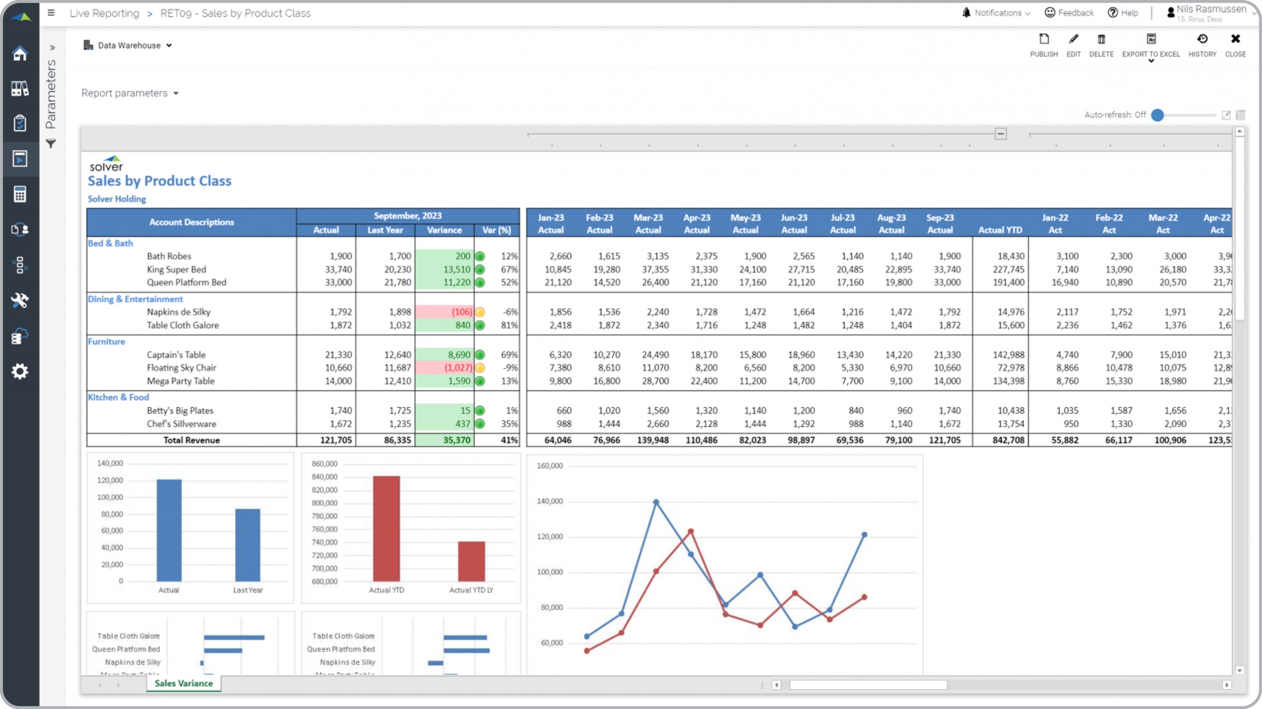
? Sales trend reports are considered critical management tools and are used by sales and product category managers to better understand year-over-year variances and monthly trends. Some of the main functionality in this type of dashboard report is that it combines detailed monthly metrics with powerful analytical charts. The top section of the report shows two years of monthly sales in addition to variances in amounts and percent. The traffic lights helps focus the user's attention to significant variances. The rows display products by category. The bottom portion of the report provides trend and variance charts. You find an example of this type of dashboard report below.
Purpose of
Sales Trend by Product Class Reports Retail businesses use Sales by Product Class reports to give managers a multi-year overview of sales for each of its product categories. When used as part of good business practices in retail operations, a company can improve its product decisions related to sales performance as well as reduce the chances that important product sales trends go undetected.
Sales Trend by Product Class Report
Example Here is an example of a Sales Trend by Product Class report with detailed monthly figures for current and prior year as well as a section for graphical analysis. [caption id="" align="alignnone" width="2560"]
 Example of a Sales Trend by Product Class Report for a Retail Company[/caption] You can find hundreds of additional examples
here
Who Uses This Type of
Dashboard report
? The typical users of this type of dashboard report are: Executives, store and regional managers, category managers.
Other
Dashboard and Report
s Often Used in Conjunction with
Sales by Product Class Reports Progressive retail operations departments sometimes use several different Sales by Product Class Reports, along with general sales forecasts and budgets, sales dashboards, KPI dashboards and other management and control tools.
Where Does the Data for Analysis Originate From? The Actual (historical transactions) data typically comes from management systems or enterprise resource planning (ERP) systems like: Microsoft Dynamics 365 (D365) Finance, Microsoft Dynamics 365 Business Central (D365 BC), Microsoft Dynamics AX, Microsoft Dynamics NAV, Microsoft Dynamics GP, Microsoft Dynamics SL, Sage Intacct, Sage 100, Sage 300, Sage 500, Sage X3, SAP Business One, SAP ByDesign, Acumatica, Netsuite and others. In analyses where budgets or forecasts are used, the planning data most often originates from in-house Excel spreadsheet models or from professional corporate performance management (CPM/EPM) solutions.
What Tools are Typically used for Reporting, Planning and Dashboards? Examples of business software used with the data and ERPs mentioned above are:
Example of a Sales Trend by Product Class Report for a Retail Company[/caption] You can find hundreds of additional examples
here
Who Uses This Type of
Dashboard report
? The typical users of this type of dashboard report are: Executives, store and regional managers, category managers.
Other
Dashboard and Report
s Often Used in Conjunction with
Sales by Product Class Reports Progressive retail operations departments sometimes use several different Sales by Product Class Reports, along with general sales forecasts and budgets, sales dashboards, KPI dashboards and other management and control tools.
Where Does the Data for Analysis Originate From? The Actual (historical transactions) data typically comes from management systems or enterprise resource planning (ERP) systems like: Microsoft Dynamics 365 (D365) Finance, Microsoft Dynamics 365 Business Central (D365 BC), Microsoft Dynamics AX, Microsoft Dynamics NAV, Microsoft Dynamics GP, Microsoft Dynamics SL, Sage Intacct, Sage 100, Sage 300, Sage 500, Sage X3, SAP Business One, SAP ByDesign, Acumatica, Netsuite and others. In analyses where budgets or forecasts are used, the planning data most often originates from in-house Excel spreadsheet models or from professional corporate performance management (CPM/EPM) solutions.
What Tools are Typically used for Reporting, Planning and Dashboards? Examples of business software used with the data and ERPs mentioned above are:
- Native ERP report writers and query tools
- Spreadsheets (for example Microsoft Excel)
- Corporate Performance Management (CPM) tools (for example Solver)
- Dashboards (for example Microsoft Power BI and Tableau)
- View 100’s of reporting, consolidations, planning, budgeting, forecasting and dashboard examples here
- Read more about Retail solutions here
- See how reports are designed in a modern report writer using a cloud-connected Excel add-in writer
- Discover how the Solver CPM solution delivers financial and operational reporting
- Discover how the Solver CPM solution delivers planning, budgeting and forecasting
- Watch demo videos of reporting, planning and dashboards
January 21, 2021
TAGS: Reporting, Solver, report writer, Microsoft, template, practice, Acumatica, Netsuite, Finance, planning, GP, Business Central, excel, item, ax, forecast, Budget, month, Dynamics 365, budgeting, Cloud, Software, product, Tableau, SAP, example, best, Sage, BC, store, D365, NAV, Intacct, product class, Variance, chain, Retail, CPM, sales trend report, retail sales by product, report, SL, Management, dynamics, sales, Power BI