
What is a
Revenue and Contribution Margin per Square Foot Dashboard
? Revenue and Margin per Square Foot Dashboards are considered retail area analysis tools and are used by financial analysts, regional and store managers to analyze KPIs related to stores and retail space. Some of the main functionality in this type of dashboard is that it provides analysis of revenue and contribution margin from three different perspectives as well as with three KPI indicators: 1) Report matrix with total revenue, sales area, average contribution margin per square foot, average revenue per square foot, 2) Map with performance-based color coding per region where stores are located, 3) Square feet of sales area and revenue per square foot by store. The three KPIs show: Total revenue per square foot, Total average margin per square foot, and Sales area measured in square feet. The parameter slider in the top left corner enables the user to see all the dashboard values for any given date range. You find an example of this type of dashboard below.
Purpose of
Revenue and Contribution Margin per Square Foot Dashboards Retail organizations use Revenue and Contribution Margin per Square Foot Dashboards to make is easy to analyze revenue and margins as it relates to retail space. When used as part of good business practices in Financial Planning & Analysis (FP&A) and product/sales departments, an organization can improve and speed up its store space strategies and related revenues, and it can reduce the chances of poor performing retail configurations.
Example of a
Revenue and Contribution Margin per Square Foot Dashboard Here is an example of a Revenue and Contribution Margin by Square Foot Dashboard with store benchmarking. [caption id="" align="alignnone" width="2233"]
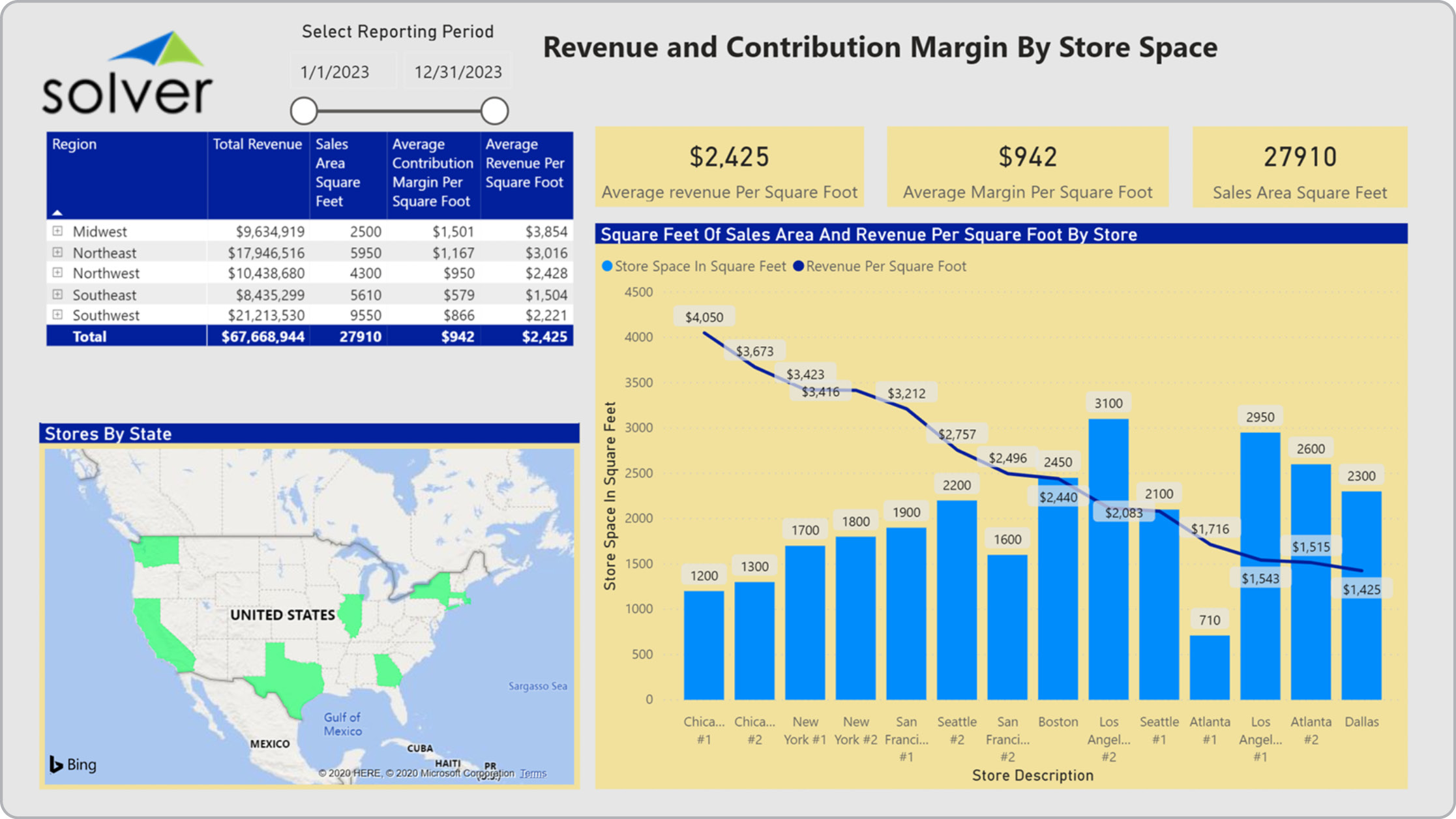 Example of a Revenue and Contribution Margin per Square Foot Dashboard for Retail Companies[/caption] You can find hundreds of additional examples
here
Who Uses This Type of
Dashboard
? The typical users of this type of dashboard are: CFOs, analysts, regional managers, store managers, store designers.
Other Reports Often Used in Conjunction with
Revenue and Contribution Margin per Square Foot Dashboards Progressive Financial Planning & Analysis (FP&A) departments sometimes use several different Revenue and Contribution Margin Dashboards, along with financial dashboards, consolidated and store-level profit & loss reports, sales reports, sales forecast, annual budgets and other management and control tools.
Where Does the Data for Analysis Originate From? The Actual (historical transactions) data typically comes from enterprise resource planning (ERP) systems like: Microsoft Dynamics 365 (D365) Finance, Microsoft Dynamics 365 Business Central (D365 BC), Microsoft Dynamics AX, Microsoft Dynamics NAV, Microsoft Dynamics GP, Microsoft Dynamics SL, Sage Intacct, Sage 100, Sage 300, Sage 500, Sage X3, SAP Business One, SAP ByDesign, Acumatica, Netsuite and others. In analyses where budgets or forecasts are used, the planning data most often originates from in-house Excel spreadsheet models or from professional corporate performance management (CPM/EPM) solutions.
What Tools are Typically used for Reporting, Planning and Dashboards? Examples of business software used with the data and ERPs mentioned above are:
Example of a Revenue and Contribution Margin per Square Foot Dashboard for Retail Companies[/caption] You can find hundreds of additional examples
here
Who Uses This Type of
Dashboard
? The typical users of this type of dashboard are: CFOs, analysts, regional managers, store managers, store designers.
Other Reports Often Used in Conjunction with
Revenue and Contribution Margin per Square Foot Dashboards Progressive Financial Planning & Analysis (FP&A) departments sometimes use several different Revenue and Contribution Margin Dashboards, along with financial dashboards, consolidated and store-level profit & loss reports, sales reports, sales forecast, annual budgets and other management and control tools.
Where Does the Data for Analysis Originate From? The Actual (historical transactions) data typically comes from enterprise resource planning (ERP) systems like: Microsoft Dynamics 365 (D365) Finance, Microsoft Dynamics 365 Business Central (D365 BC), Microsoft Dynamics AX, Microsoft Dynamics NAV, Microsoft Dynamics GP, Microsoft Dynamics SL, Sage Intacct, Sage 100, Sage 300, Sage 500, Sage X3, SAP Business One, SAP ByDesign, Acumatica, Netsuite and others. In analyses where budgets or forecasts are used, the planning data most often originates from in-house Excel spreadsheet models or from professional corporate performance management (CPM/EPM) solutions.
What Tools are Typically used for Reporting, Planning and Dashboards? Examples of business software used with the data and ERPs mentioned above are:
- Native ERP report writers and query tools
- Spreadsheets (for example Microsoft Excel)
- Corporate Performance Management (CPM) tools (for example Solver)
- Dashboards (for example Microsoft Power BI and Tableau)
- View 100’s of reporting, consolidations, planning, budgeting, forecasting and dashboard examples here
- View a Retail white paper and other industry-specific information here
- See how reports are designed in a modern report writer using a cloud-connected Excel add-in writer
- Discover how the Solver CPM solution delivers financial and operational reporting
- Discover how the Solver CPM solution delivers planning, budgeting and forecasting
- Watch demo videos of reporting, planning and dashboards
March 20, 2021
TAGS: Reporting, Solver, report writer, Microsoft, template, practice, Acumatica, visualization, Netsuite, Finance, planning, GP, dashboard, Business Central, excel, ax, contribution margin, forecast, Budget, Dynamics 365, budgeting, revenue, Cloud, Software, Tableau, SAP, example, ecommerce, best, Sage, BC, store, D365, NAV, Intacct, online, Retail, CPM, report, SL, Management, dynamics, Power BI, sales area, revenue per squarefoot, foot, square