
What is
Project Revenue and Expense Dashboard
? Project Dashboards are considered operational analysis tools and are used by project leaders and executives to monitor billing trends and expenses. Some of the main functionality in this type of dashboard is that it is parameter driven and users can run it for any month and year to see relevant data. The four charts in the dashboards show: 1) Monthly trend in project billing, 2) Billable versus non-billable hours by client, 3) Top ten clients ranked by billing amount, and 4) Reimbursable expenses by category. At the bottom of the report (not visible in the example) there is a a table section with the metrics that supports the charts. You find an example of this type of dashboard below.
Purpose of
Project Revenue and Expense Dashboards Professional Services organizations use Project Revenue and Expense Dashboards to give managers in the Project Management Office (PMO) a self-service tool to monitor key billing and utilization information by client. When used as part of good business practices in FP&A and PMO departments, a company can improve its project strategies and profitability, and it can reduce the chances that project/client outliers or trends are missed due to lack of visibility to real-time performance metrics.
Example of a
Project Revenue and Expense Dashboard Here is an example of a Project Revenue and Expense Dashboard with billing trends and expense analysis. [caption id="" align="alignnone" width="2560"]
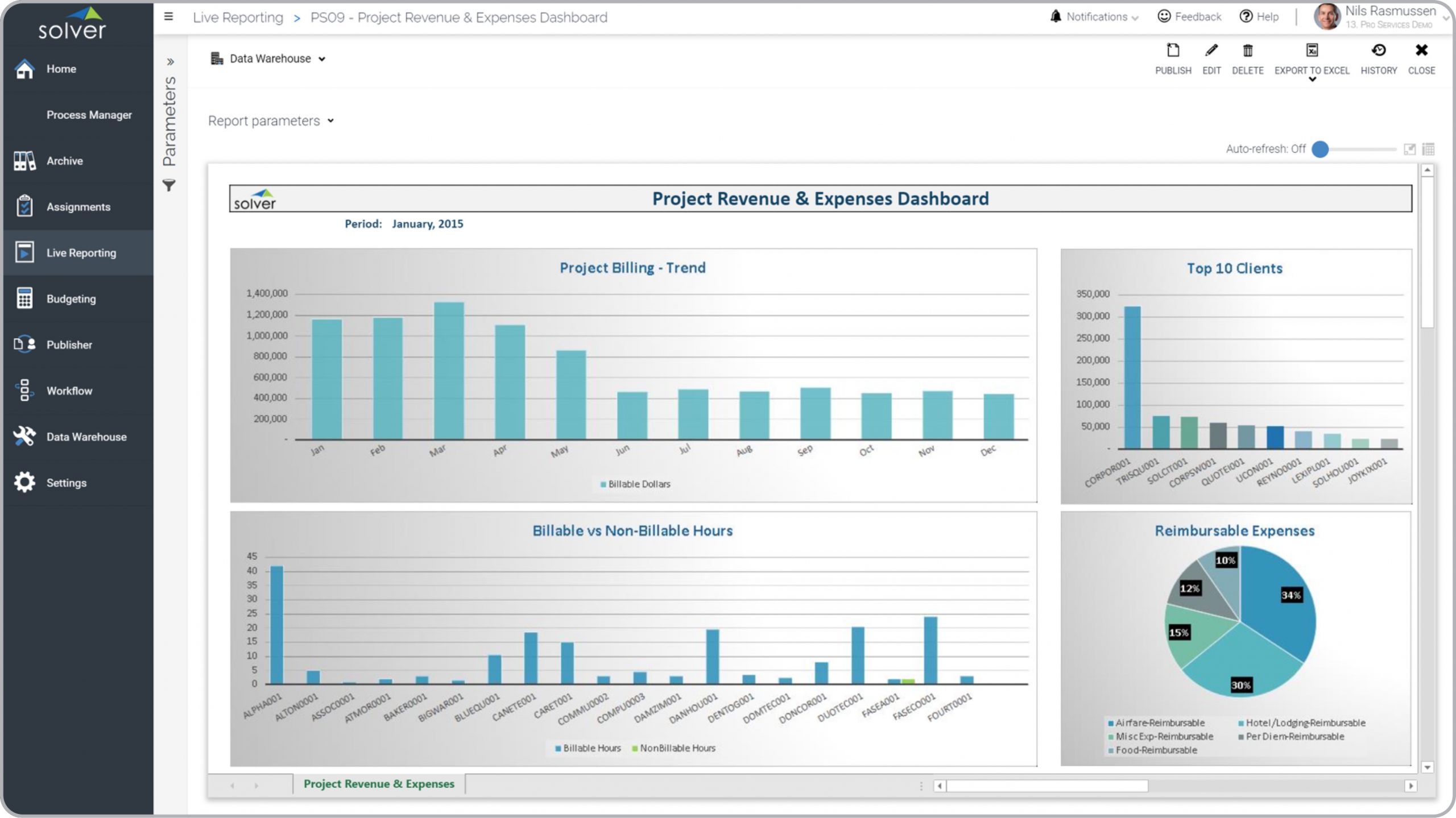 Example of a Project Revenue and Expense Dashboard for a Professional Services Company[/caption] You can find hundreds of additional examples
here
Who Uses This Type of
Dashboard
? The typical users of this type of dashboard are: Service Leaders, CFOs, Project Managers.
Other Reports Often Used in Conjunction with
Project Revenue and Expense Dashboards Progressive FP&A and PMO departments sometimes use several different Project Revenue and Expense Dashboards, along with detailed project reports, project dashboards, project budgets, project forecast models, utilization reports, billing reports, financial statements and other management and control tools.
Where Does the Data for Analysis Originate From? The Actual (historical transactions) data typically comes from enterprise resource planning (ERP) systems like: Microsoft Dynamics 365 (D365) Finance, Microsoft Dynamics 365 Business Central (D365 BC), Microsoft Dynamics AX, Microsoft Dynamics NAV, Microsoft Dynamics GP, Microsoft Dynamics SL, Sage Intacct, Sage 100, Sage 300, Sage 500, Sage X3, SAP Business One, SAP ByDesign, Acumatica, Netsuite and others. In analyses where budgets or forecasts are used, the planning data most often originates from in-house Excel spreadsheet models or from professional corporate performance management (CPM/EPM) solutions.
What Tools are Typically used for Reporting, Planning and Dashboards? Examples of business software used with the data and ERPs mentioned above are:
Example of a Project Revenue and Expense Dashboard for a Professional Services Company[/caption] You can find hundreds of additional examples
here
Who Uses This Type of
Dashboard
? The typical users of this type of dashboard are: Service Leaders, CFOs, Project Managers.
Other Reports Often Used in Conjunction with
Project Revenue and Expense Dashboards Progressive FP&A and PMO departments sometimes use several different Project Revenue and Expense Dashboards, along with detailed project reports, project dashboards, project budgets, project forecast models, utilization reports, billing reports, financial statements and other management and control tools.
Where Does the Data for Analysis Originate From? The Actual (historical transactions) data typically comes from enterprise resource planning (ERP) systems like: Microsoft Dynamics 365 (D365) Finance, Microsoft Dynamics 365 Business Central (D365 BC), Microsoft Dynamics AX, Microsoft Dynamics NAV, Microsoft Dynamics GP, Microsoft Dynamics SL, Sage Intacct, Sage 100, Sage 300, Sage 500, Sage X3, SAP Business One, SAP ByDesign, Acumatica, Netsuite and others. In analyses where budgets or forecasts are used, the planning data most often originates from in-house Excel spreadsheet models or from professional corporate performance management (CPM/EPM) solutions.
What Tools are Typically used for Reporting, Planning and Dashboards? Examples of business software used with the data and ERPs mentioned above are:
- Native ERP report writers and query tools
- Spreadsheets (for example Microsoft Excel)
- Corporate Performance Management (CPM) tools (for example Solver)
- Dashboards (for example Microsoft Power BI and Tableau)
- View 100’s of reporting, consolidations, planning, budgeting, forecasting and dashboard examples here
- View a Professional Services white paper and other industry-specific information here
- See how reports are designed in a modern report writer using a cloud-connected Excel add-in writer
- Discover how the Solver CPM solution delivers financial and operational reporting
- Discover how the Solver CPM solution delivers planning, budgeting and forecasting
- Watch demo videos of reporting, planning and dashboards
July 13, 2021
TAGS: Reporting, Solver, report writer, Microsoft, template, practice, Acumatica, Netsuite, Finance, planning, GP, dashboard, Business Central, excel, ax, expense, forecast, Budget, non-billable, Professional Services, Dynamics 365, analysis, budgeting, revenue, Cloud, Software, Tableau, SAP, example, best, Sage, BC, D365, NAV, Intacct, services, project, CPM, report, SL, Management, dynamics, Power BI, project dashboard, reimbursable, billable, billing trend