
What is a
Project Dashboard for a Professional Services Company
? Project Dashboards are considered operational monitoring tools and are used by executives and project managers to analyze consulting resources and project performance. Some of the main functionality in this type of dashboard is that it enables analysis of KPIs and other metrics from six different perspectives: 1) Project manager ranked by billings and with billable amount, billable hours and nonbillable hours, 2) Consultants ranked by billable amount and with billable hours and nonbillable hours, 3) Number of projects by project manager (PM), 4) Percent of projects with green, yellow and red status, 5) Monthly trend in billable amounts, and 6) Monthly trend in billable hours. You find an example of this type of dashboard below.
Purpose of
Project Dashboards Professional service organizations use Project Dashboards to gives consulting leaders an easy way to understand how project managers, consultants and projects are performing. When used as part of good business practices in Financial Planning & Analysis (FP&A) and Consulting departments, an organization can improve its decision speed as it relates to projects and professional resources, and it can reduce the chances that poor performance goes undetected with likely resulting loss in revenues.
Example of a
Project Dashboard Here is an example of a Project Dashboard with metrics of PMs and their team members as well as project status. [caption id="" align="alignnone" width="2560"]
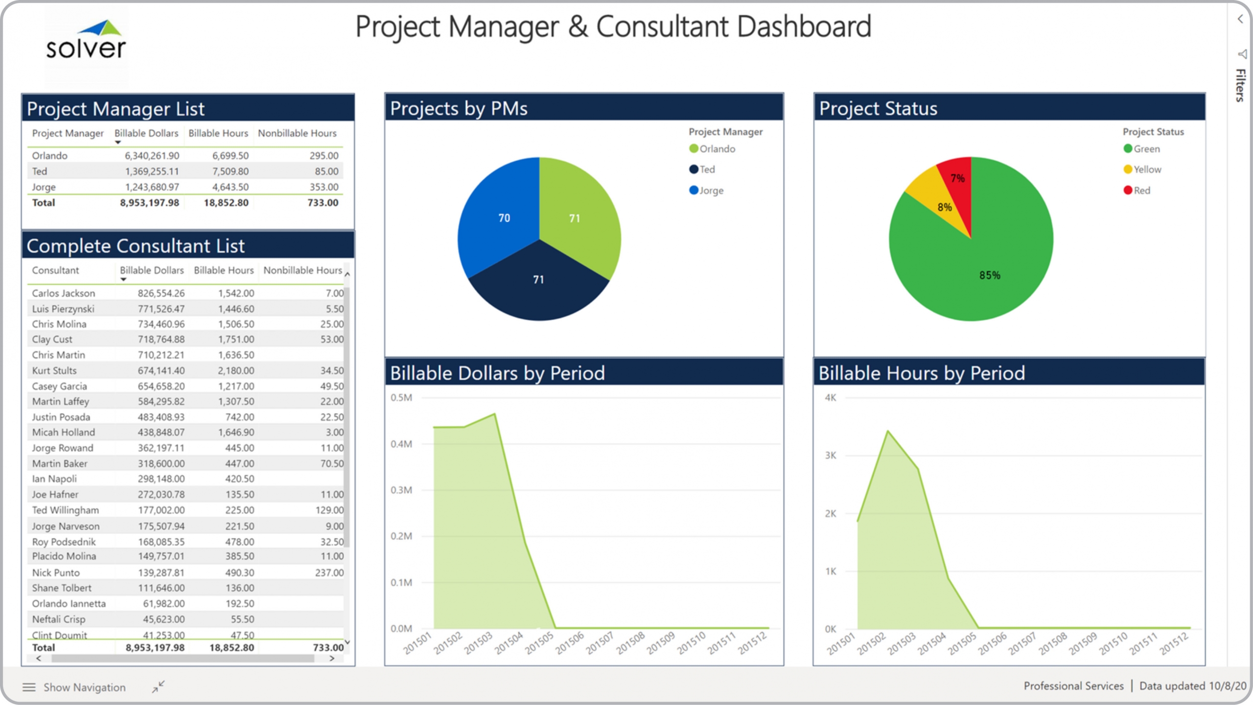 Example of a Project Dashboard for a Professional Services Company[/caption] You can find hundreds of additional examples
here
Who Uses This Type of
Dashboard
? The typical users of this type of dashboard are: Executives, CFOs, consulting managers, project managers.
Other Reports Often Used in Conjunction with
Project Dashboards Progressive Financial Planning & Analysis (FP&A) and Consulting departments sometimes use several different Project Dashboards, along with profit & loss reports, project dashboards, revenue dashboards, detailed billing and utilization reports, project budget models, billing forecast models and other management and control tools.
Where Does the Data for Analysis Originate From? The Actual (historical transactions) data typically comes from enterprise resource planning (ERP) systems like: Microsoft Dynamics 365 (D365) Finance, Microsoft Dynamics 365 Business Central (D365 BC), Microsoft Dynamics AX, Microsoft Dynamics NAV, Microsoft Dynamics GP, Microsoft Dynamics SL, Sage Intacct, Sage 100, Sage 300, Sage 500, Sage X3, SAP Business One, SAP ByDesign, Acumatica, Netsuite and others. In analyses where budgets or forecasts are used, the planning data most often originates from in-house Excel spreadsheet models or from professional corporate performance management (CPM/EPM) solutions.
What Tools are Typically used for Reporting, Planning and Dashboards? Examples of business software used with the data and ERPs mentioned above are:
Example of a Project Dashboard for a Professional Services Company[/caption] You can find hundreds of additional examples
here
Who Uses This Type of
Dashboard
? The typical users of this type of dashboard are: Executives, CFOs, consulting managers, project managers.
Other Reports Often Used in Conjunction with
Project Dashboards Progressive Financial Planning & Analysis (FP&A) and Consulting departments sometimes use several different Project Dashboards, along with profit & loss reports, project dashboards, revenue dashboards, detailed billing and utilization reports, project budget models, billing forecast models and other management and control tools.
Where Does the Data for Analysis Originate From? The Actual (historical transactions) data typically comes from enterprise resource planning (ERP) systems like: Microsoft Dynamics 365 (D365) Finance, Microsoft Dynamics 365 Business Central (D365 BC), Microsoft Dynamics AX, Microsoft Dynamics NAV, Microsoft Dynamics GP, Microsoft Dynamics SL, Sage Intacct, Sage 100, Sage 300, Sage 500, Sage X3, SAP Business One, SAP ByDesign, Acumatica, Netsuite and others. In analyses where budgets or forecasts are used, the planning data most often originates from in-house Excel spreadsheet models or from professional corporate performance management (CPM/EPM) solutions.
What Tools are Typically used for Reporting, Planning and Dashboards? Examples of business software used with the data and ERPs mentioned above are:
- Native ERP report writers and query tools
- Spreadsheets (for example Microsoft Excel)
- Corporate Performance Management (CPM) tools (for example Solver)
- Dashboards (for example Microsoft Power BI and Tableau)
- View 100’s of reporting, consolidations, planning, budgeting, forecasting and dashboard examples here
- View a Professional Services industry white paper and other industry-specific information here
- See how reports are designed in a modern report writer using a cloud-connected Excel add-in writer
- Discover how the Solver CPM solution delivers financial and operational reporting
- Discover how the Solver CPM solution delivers planning, budgeting and forecasting
- Watch demo videos of reporting, planning and dashboards
May 5, 2021
TAGS: Reporting, Solver, consultant, report writer, Microsoft, template, consulting, practice, Acumatica, visualization, Netsuite, Finance, planning, GP, dashboard, Business Central, excel, professional, ax, forecast, Budget, billable hours, Dynamics 365, budgeting, KPI, project status, Cloud, Software, Tableau, SAP, example, best, Sage, BC, D365, NAV, Intacct, services, professional services dashboard, project, CPM, report, SL, Management, dynamics, Power BI, project dashboard, project manager