
What is
a
Profit & Loss Report with KPIs
? Profit & Loss (P&L) reports with KPIs are considered powerful monthly management analysis tools and are used by CFOs and other executives to analyze both financial and operational performance in a single view. Some of the main functionality in this type of dashboard report is that it uses parameters so the user can run it for any month and one or many facilities. The top section shows two KPIs: 1) Total admits and 2) Average patient charge. The middle section shows summary P&L rows and each row can be expanded to see the underlying general ledger (GL) accounts and amounts. The bottom of the report displays additional KPIs for Discharges and RVUs, as well as two charts for graphical analysis. You find an example of this type of dashboard report below.
Purpose of
P&L Report with KPIs Healthcare providers use P&L Report with KPIs to provide executives with an easy to read format that offers essential performance information. When used as part of good business practices in a Financial Planning & Analysis (FP&A) department, an organization can improve its decision-making capabilities as well as reduce the chances that managers miss the big picture with too many detailed reports being put in front of them every month.
P&L Report with KPI
Example Here is an example of a Monthly Profit & Loss Financial Report that includes KPIs for the current month and year-to-date. [caption id="" align="alignnone" width="2560"]
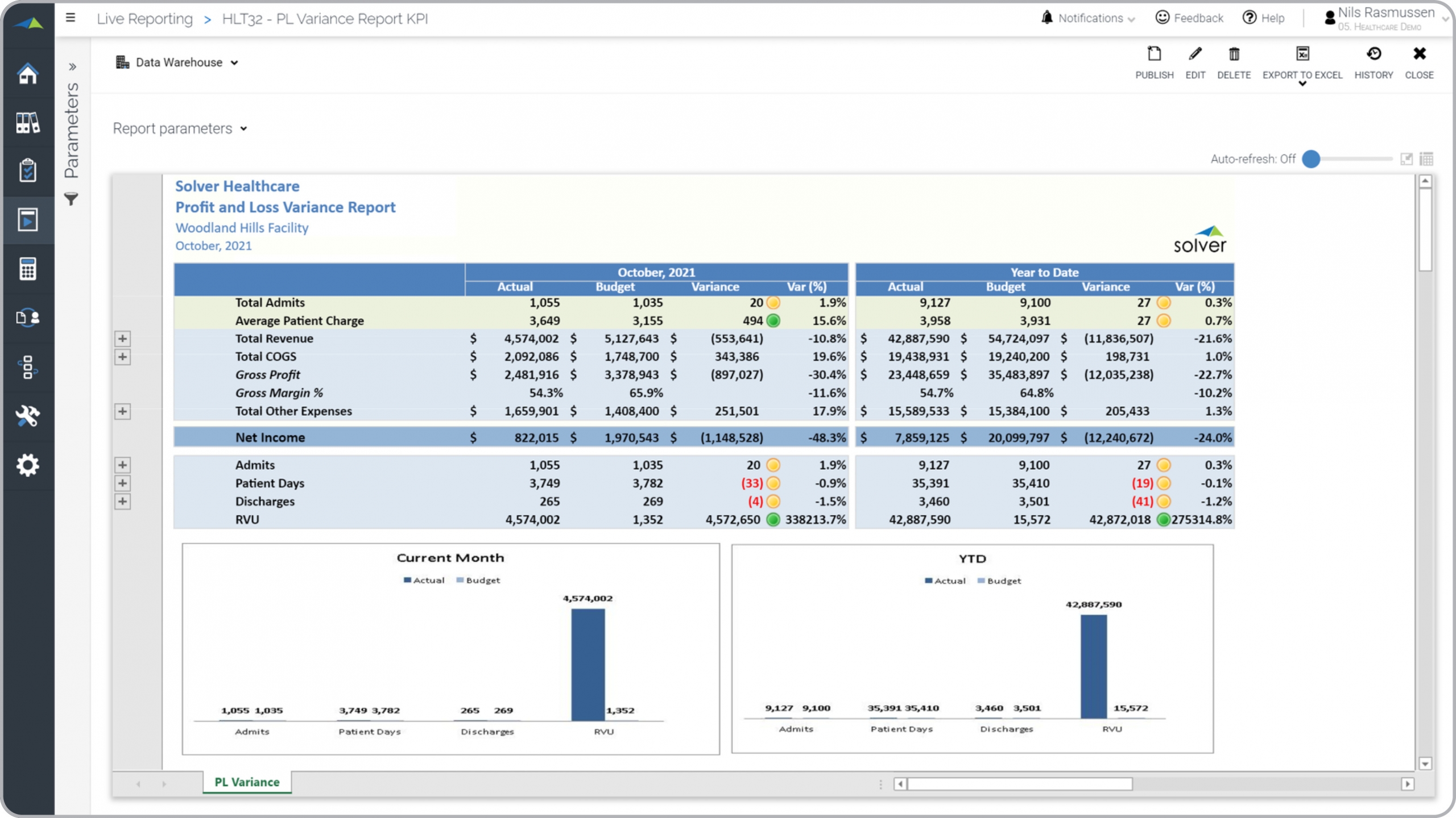 Example of a Profit & Loss Report with KPIs for a Healthcare Provider[/caption] You can find hundreds of additional examples
here
Who Uses This Type of
Dashboard report
? The typical users of this type of dashboard report are: Boards, CFOs, COOs, group controllers and analysts.
Other
Report
s Often Used in Conjunction with
P&L Report with KPIs Progressive Financial Planning & Analysis (FP&A) departments sometimes use several different P&L Reports with KPIs, along with Financial dashboards, trend reports, balance sheets, cash flow statements and other management and control tools.
Where Does the Data for Analysis Originate From? The Actual (historical transactions) data comes from management systems or enterprise resource planning (ERP) systems like: Microsoft Dynamics 365 (D365) Finance, Microsoft Dynamics 365 Business Central (D365 BC), Microsoft Dynamics AX, Microsoft Dynamics NAV, Microsoft Dynamics GP, Microsoft Dynamics SL, Sage Intacct, Sage 100, Sage 300, Sage 500, Sage X3, SAP Business One, SAP ByDesign, Acumatica, Netsuite and others. In analyses where budgets or forecasts are used, the planning data most often originates from in-house Excel spreadsheet models or from professional corporate performance management (CPM/EPM) solutions.
What Tools are Typically used for Reporting, Planning and Dashboards? Examples of business software used with the data and ERPs mentioned above are:
Example of a Profit & Loss Report with KPIs for a Healthcare Provider[/caption] You can find hundreds of additional examples
here
Who Uses This Type of
Dashboard report
? The typical users of this type of dashboard report are: Boards, CFOs, COOs, group controllers and analysts.
Other
Report
s Often Used in Conjunction with
P&L Report with KPIs Progressive Financial Planning & Analysis (FP&A) departments sometimes use several different P&L Reports with KPIs, along with Financial dashboards, trend reports, balance sheets, cash flow statements and other management and control tools.
Where Does the Data for Analysis Originate From? The Actual (historical transactions) data comes from management systems or enterprise resource planning (ERP) systems like: Microsoft Dynamics 365 (D365) Finance, Microsoft Dynamics 365 Business Central (D365 BC), Microsoft Dynamics AX, Microsoft Dynamics NAV, Microsoft Dynamics GP, Microsoft Dynamics SL, Sage Intacct, Sage 100, Sage 300, Sage 500, Sage X3, SAP Business One, SAP ByDesign, Acumatica, Netsuite and others. In analyses where budgets or forecasts are used, the planning data most often originates from in-house Excel spreadsheet models or from professional corporate performance management (CPM/EPM) solutions.
What Tools are Typically used for Reporting, Planning and Dashboards? Examples of business software used with the data and ERPs mentioned above are:
- Native ERP report writers and query tools
- Spreadsheets (for example Microsoft Excel)
- Corporate Performance Management (CPM) tools (for example Solver)
- Dashboards (for example Microsoft Power BI and Tableau)
- View 100’s of reporting, consolidations, planning, budgeting, forecasting and dashboard examples here
- Read more about Healthcare provider solutions here
- See how reports are designed in a modern report writer using a cloud-connected Excel add-in writer
- Discover how the Solver CPM solution delivers financial and operational reporting
- Discover how the Solver CPM solution delivers planning, budgeting and forecasting
- Watch demo videos of reporting, planning and dashboards
December 20, 2020
TAGS: Reporting, Solver, report writer, Microsoft, template, practice, Acumatica, Netsuite, Finance, GP, hospital, profit & loss, Business Central, excel, ax, healthcare, income statement, forecast, Budget, month, clinic, Dynamics 365, KPI, Cloud, Software, Tableau, SAP, example, best, Sage, BC, P&L, D365, NAV, Intacct, Variance, provider, CPM, report, SL, Management, dynamics, Power BI