
What is
a
Print Media Circulation Dashboard
? Print Media Circulation Dashboards are considered operational analysis tools and are used by media executives to monitor circulation variances and compare metrics. Some of the main functionality in this type of dashboard is that it displays KPIs from four different perspectives: 1) Current year (CY) and Prior year (CY) Press Run metrics by publication, 2) CY versus PY average paid distribution by publication, 3) Average controlled distribution by publication, and 4) Average paid digital distribution by publication. You find an example of this type of dashboard below.
Purpose of
Print Media Circulation Dashboards Media companies use Print Media Circulation Dashboards to give managers an easy way to see how each of their publications perform as compared to the prior year metrics. When used as part of good business practices in Media and Publication departments, a company can improve its marketing and product strategies, and it can reduce the chances that subscriptions fall due to lack of timely information to drive important management decisions.
Example of a
Print Media Circulation Dashboard Here is an example of a Print Media Circulation Dashboard for year-over-year comparisons. [caption id="" align="alignnone" width="2560"]
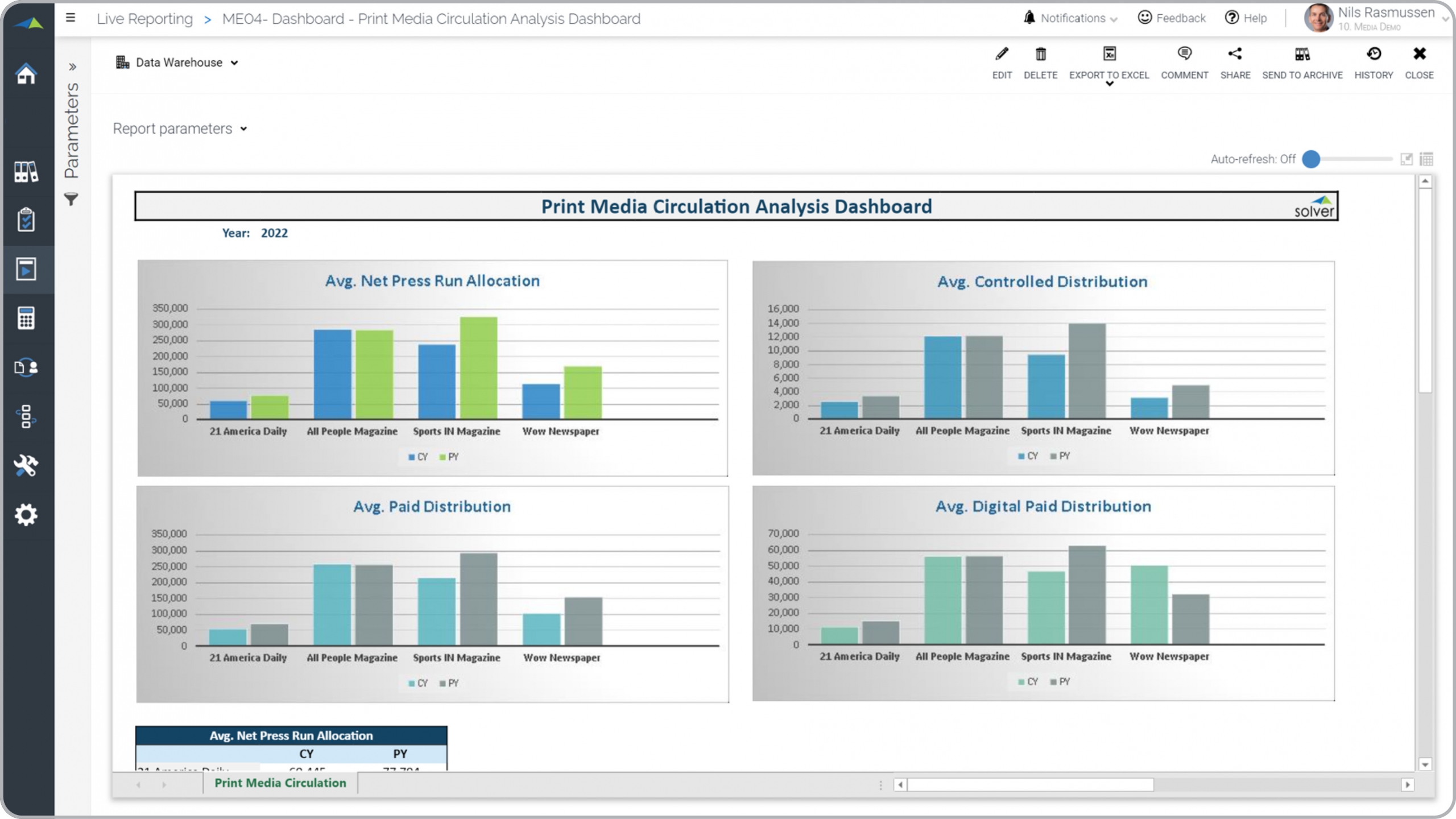 Example of a Print Circulation Dashboard for Media Companies[/caption] You can find hundreds of additional examples
here
Who Uses This Type of
Dashboard
? The typical users of this type of dashboard are: Executives, Publication Managers, Marketing Managers, Sales Managers, Budget Managers.
Other Reports Often Used in Conjunction with
Print Media Circulation Dashboards Progressive Media and Publication departments sometimes use several different Print Media Circulation Dashboards, along with sales dashboards, sales forecasts, consolidating profit & loss reports, annual budgets, financial dashboards, KPI dashboards and other management and control tools.
Where Does the Data for Analysis Originate From? The Actual (historical transactions) data typically comes from enterprise resource planning (ERP) systems like: Microsoft Dynamics 365 (D365) Finance, Microsoft Dynamics 365 Business Central (D365 BC), Microsoft Dynamics AX, Microsoft Dynamics NAV, Microsoft Dynamics GP, Microsoft Dynamics SL, Sage Intacct, Sage 100, Sage 300, Sage 500, Sage X3, SAP Business One, SAP ByDesign, Acumatica, Netsuite and others. In analyses where budgets or forecasts are used, the planning data most often originates from in-house Excel spreadsheet models or from professional corporate performance management (CPM/EPM) solutions.
What Tools are Typically used for Reporting, Planning and Dashboards? Examples of business software used with the data and ERPs mentioned above are:
Example of a Print Circulation Dashboard for Media Companies[/caption] You can find hundreds of additional examples
here
Who Uses This Type of
Dashboard
? The typical users of this type of dashboard are: Executives, Publication Managers, Marketing Managers, Sales Managers, Budget Managers.
Other Reports Often Used in Conjunction with
Print Media Circulation Dashboards Progressive Media and Publication departments sometimes use several different Print Media Circulation Dashboards, along with sales dashboards, sales forecasts, consolidating profit & loss reports, annual budgets, financial dashboards, KPI dashboards and other management and control tools.
Where Does the Data for Analysis Originate From? The Actual (historical transactions) data typically comes from enterprise resource planning (ERP) systems like: Microsoft Dynamics 365 (D365) Finance, Microsoft Dynamics 365 Business Central (D365 BC), Microsoft Dynamics AX, Microsoft Dynamics NAV, Microsoft Dynamics GP, Microsoft Dynamics SL, Sage Intacct, Sage 100, Sage 300, Sage 500, Sage X3, SAP Business One, SAP ByDesign, Acumatica, Netsuite and others. In analyses where budgets or forecasts are used, the planning data most often originates from in-house Excel spreadsheet models or from professional corporate performance management (CPM/EPM) solutions.
What Tools are Typically used for Reporting, Planning and Dashboards? Examples of business software used with the data and ERPs mentioned above are:
- Native ERP report writers and query tools
- Spreadsheets (for example Microsoft Excel)
- Corporate Performance Management (CPM) tools (for example Solver)
- Dashboards (for example Microsoft Power BI and Tableau)
- View 100’s of reporting, consolidations, planning, budgeting, forecasting and dashboard examples here
- View a Media Industry white paper and other industry-specific information here
- See how reports are designed in a modern report writer using a cloud-connected Excel add-in writer
- Discover how the Solver CPM solution delivers financial and operational reporting
- Discover how the Solver CPM solution delivers planning, budgeting and forecasting
- Watch demo videos of reporting, planning and dashboards
July 26, 2021
TAGS: Reporting, Solver, print, report writer, Microsoft, template, practice, Acumatica, Netsuite, TV, streaming, Finance, planning, GP, Business Central, excel, radio, ax, forecast, Budget, Dynamics 365, budgeting, Cloud, Software, Tableau, SAP, example, media, best, Sage, BC, D365, NAV, Intacct, broadcast, online, CPM, report, SL, Management, dynamics, Power BI, media dashboard, digital distribution, paid distribution, circulation, print media, circulation dasboard