
What is a
Patient Satisfaction Dashboard
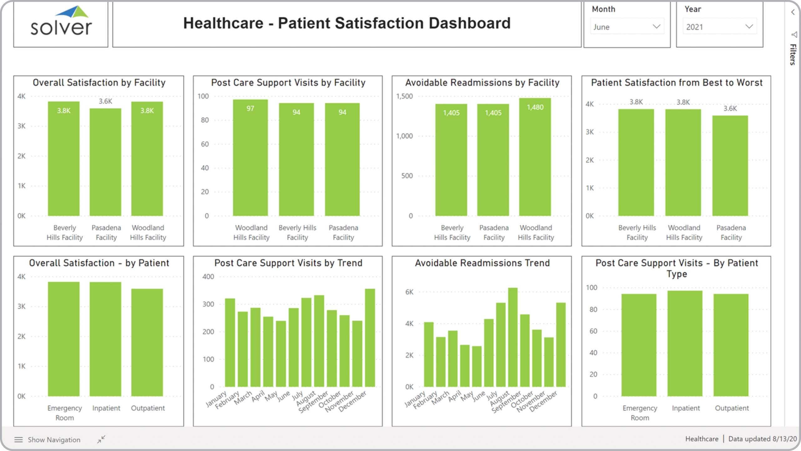
? Patient Satisfaction Dashboards are considered operational analysis tools and are used by hospital executives to analyze the results of patient experience surveys and other patient metrics. Some of the main functionality in this type of dashboard is that it provides analysis from these eight perspectives: 1) Overall satisfaction by facility, 2) Post care support visits by facility, 3) Avoidable readmissions by facility, 4) Patient satisfaction from best to worst, 5) Overall satisfaction by patient, 6) Monthly trend in post care support visits, 7) Monthly trend in avoidable readmissions, and 8) Post care support visits by patient type You find an example of this type of dashboard below.
 Purpose of
Patient Satisfaction
Dashboards Healthcare organizations use Patient Satisfaction Dashboards to monitor feedback on patient experience and to benchmark satisfaction metrics across facilities. When used as part of good business practices in executive departments, an organization can improve its recurring patient revenues and referrals, and it can reduce the chances that of a poor reputation and potential litigations.
Example of a
Patient Satisfaction Dashboards Here is an example of a Patient Satisfaction Dashboard with monthly trends, survey metrics and facility benchmarking. [caption id="" align="alignnone" width="2560"]
Purpose of
Patient Satisfaction
Dashboards Healthcare organizations use Patient Satisfaction Dashboards to monitor feedback on patient experience and to benchmark satisfaction metrics across facilities. When used as part of good business practices in executive departments, an organization can improve its recurring patient revenues and referrals, and it can reduce the chances that of a poor reputation and potential litigations.
Example of a
Patient Satisfaction Dashboards Here is an example of a Patient Satisfaction Dashboard with monthly trends, survey metrics and facility benchmarking. [caption id="" align="alignnone" width="2560"]
 Example of a Patient Satisfaction Dashboard for healthcare providers[/caption] You can find hundreds of additional examples
here
Who Uses This Type of
Dashboard
? The typical users of this type of dashboard are: Chief physician, CEOs, CFOs, management.
Other Reports Often Used in Conjunction with
Patient Satisfaction Dashboards Progressive executive departments sometimes use several different Patient Satisfaction Dashboards, along with financial statements, claims reports, hospital KPI dashboards, executive dashboards, complaint reports and other management and control tools.
Example of a Patient Satisfaction Dashboard for healthcare providers[/caption] You can find hundreds of additional examples
here
Who Uses This Type of
Dashboard
? The typical users of this type of dashboard are: Chief physician, CEOs, CFOs, management.
Other Reports Often Used in Conjunction with
Patient Satisfaction Dashboards Progressive executive departments sometimes use several different Patient Satisfaction Dashboards, along with financial statements, claims reports, hospital KPI dashboards, executive dashboards, complaint reports and other management and control tools.
 Where Does the Data for Analysis Originate From? The Actual (historical transactions) data typically comes from patient systems, survey tools and enterprise resource planning (ERP) systems like: Microsoft Dynamics 365 (D365) Finance, Microsoft Dynamics 365 Business Central (D365 BC), Microsoft Dynamics AX, Microsoft Dynamics NAV, Microsoft Dynamics GP, Microsoft Dynamics SL, Sage Intacct, Sage 100, Sage 300, Sage 500, Sage X3, SAP Business One, SAP ByDesign, Acumatica, Netsuite and others. In analyses where budgets or forecasts are used, the planning data most often originates from in-house Excel spreadsheet models or from professional corporate performance management (CPM/EPM) solutions.
What Tools are Typically used for Reporting, Planning and Dashboards? Examples of business software used with the data and ERPs mentioned above are:
Corporate Performance Management (CPM) Cloud Solutions and More Examples
Where Does the Data for Analysis Originate From? The Actual (historical transactions) data typically comes from patient systems, survey tools and enterprise resource planning (ERP) systems like: Microsoft Dynamics 365 (D365) Finance, Microsoft Dynamics 365 Business Central (D365 BC), Microsoft Dynamics AX, Microsoft Dynamics NAV, Microsoft Dynamics GP, Microsoft Dynamics SL, Sage Intacct, Sage 100, Sage 300, Sage 500, Sage X3, SAP Business One, SAP ByDesign, Acumatica, Netsuite and others. In analyses where budgets or forecasts are used, the planning data most often originates from in-house Excel spreadsheet models or from professional corporate performance management (CPM/EPM) solutions.
What Tools are Typically used for Reporting, Planning and Dashboards? Examples of business software used with the data and ERPs mentioned above are:
Corporate Performance Management (CPM) Cloud Solutions and More Examples
Purpose of
Patient Satisfaction
Dashboards Healthcare organizations use Patient Satisfaction Dashboards to monitor feedback on patient experience and to benchmark satisfaction metrics across facilities. When used as part of good business practices in executive departments, an organization can improve its recurring patient revenues and referrals, and it can reduce the chances that of a poor reputation and potential litigations.
Example of a
Patient Satisfaction Dashboards Here is an example of a Patient Satisfaction Dashboard with monthly trends, survey metrics and facility benchmarking. [caption id="" align="alignnone" width="2560"]
 Example of a Patient Satisfaction Dashboard for healthcare providers[/caption] You can find hundreds of additional examples
here
Who Uses This Type of
Dashboard
? The typical users of this type of dashboard are: Chief physician, CEOs, CFOs, management.
Other Reports Often Used in Conjunction with
Patient Satisfaction Dashboards Progressive executive departments sometimes use several different Patient Satisfaction Dashboards, along with financial statements, claims reports, hospital KPI dashboards, executive dashboards, complaint reports and other management and control tools.
Where Does the Data for Analysis Originate From? The Actual (historical transactions) data typically comes from patient systems, survey tools and enterprise resource planning (ERP) systems like: Microsoft Dynamics 365 (D365) Finance, Microsoft Dynamics 365 Business Central (D365 BC), Microsoft Dynamics AX, Microsoft Dynamics NAV, Microsoft Dynamics GP, Microsoft Dynamics SL, Sage Intacct, Sage 100, Sage 300, Sage 500, Sage X3, SAP Business One, SAP ByDesign, Acumatica, Netsuite and others. In analyses where budgets or forecasts are used, the planning data most often originates from in-house Excel spreadsheet models or from professional corporate performance management (CPM/EPM) solutions.
What Tools are Typically used for Reporting, Planning and Dashboards? Examples of business software used with the data and ERPs mentioned above are:
Example of a Patient Satisfaction Dashboard for healthcare providers[/caption] You can find hundreds of additional examples
here
Who Uses This Type of
Dashboard
? The typical users of this type of dashboard are: Chief physician, CEOs, CFOs, management.
Other Reports Often Used in Conjunction with
Patient Satisfaction Dashboards Progressive executive departments sometimes use several different Patient Satisfaction Dashboards, along with financial statements, claims reports, hospital KPI dashboards, executive dashboards, complaint reports and other management and control tools.
Where Does the Data for Analysis Originate From? The Actual (historical transactions) data typically comes from patient systems, survey tools and enterprise resource planning (ERP) systems like: Microsoft Dynamics 365 (D365) Finance, Microsoft Dynamics 365 Business Central (D365 BC), Microsoft Dynamics AX, Microsoft Dynamics NAV, Microsoft Dynamics GP, Microsoft Dynamics SL, Sage Intacct, Sage 100, Sage 300, Sage 500, Sage X3, SAP Business One, SAP ByDesign, Acumatica, Netsuite and others. In analyses where budgets or forecasts are used, the planning data most often originates from in-house Excel spreadsheet models or from professional corporate performance management (CPM/EPM) solutions.
What Tools are Typically used for Reporting, Planning and Dashboards? Examples of business software used with the data and ERPs mentioned above are:
- Native ERP report writers and query tools
- Spreadsheets (for example Microsoft Excel)
- Corporate Performance Management (CPM) tools (for example Solver)
- Dashboards (for example Microsoft Power BI and Tableau)
Corporate Performance Management (CPM) Cloud Solutions and More Examples
- View 100’s of reporting, consolidations, planning, budgeting, forecasting and dashboard examples here
- View a Healthcare white paper and other industry-specific information here
- See how reports are designed in a modern report writer using a cloud-connected Excel add-in writer
- Discover how the Solver CPM solution delivers financial and operational reporting
- Discover how the Solver CPM solution delivers planning, budgeting and forecasting
- Watch demo videos of reporting, planning and dashboards
April 12, 2021
TAGS: Reporting, Solver, report writer, Microsoft, template, practice, Acumatica, visualization, Netsuite, Finance, planning, GP, dashboard, Business Central, excel, ax, healthcare, forecast, Budget, clinic, Dynamics 365, analysis, budgeting, KPI, Cloud, Software, healthcare dashboard, Tableau, SAP, example, best, Sage, BC, D365, NAV, Intacct, provider, CPM, report, SL, Management, dynamics, Power BI, patient, ALOS, patient dashboard, admission, patient satisfaction, post care