
What is
a
Department Dashboard for a Hospitality Company
? Departmental Dashboards are often considered revenue and expense analysis tools and are used by Finance and Department Managers to review major general ledger (GL) performance metrics and budget variances. Some of the main functionality in this type of report is that it can be filtered by department and it contains both a graphical section as well as figures (not visible in the screenshot below). The report shows three charts and include: 1) Top revenue categories ranked, 2) Top expense categories ranked, and 3) Monthly actual and budget revenue trend. You find an example of this type of report below.
Purpose of
Departmental Dashboards Hospitality companies use Departmental Dashboards to give managers an easily readable and quick snapshot of the key revenue and expense indicators. When used as part of good business practices by FP&A and by Department Managers, a company can improve its cost - and profit center tactics, and it can reduce the chances that over- or under performance in any particular department go undetected.
Example of a
Departmental Dashboard Here is an example of a Departmental Dashboard with revenue and expense analysis. [caption id="" align="alignnone" width="2560"]
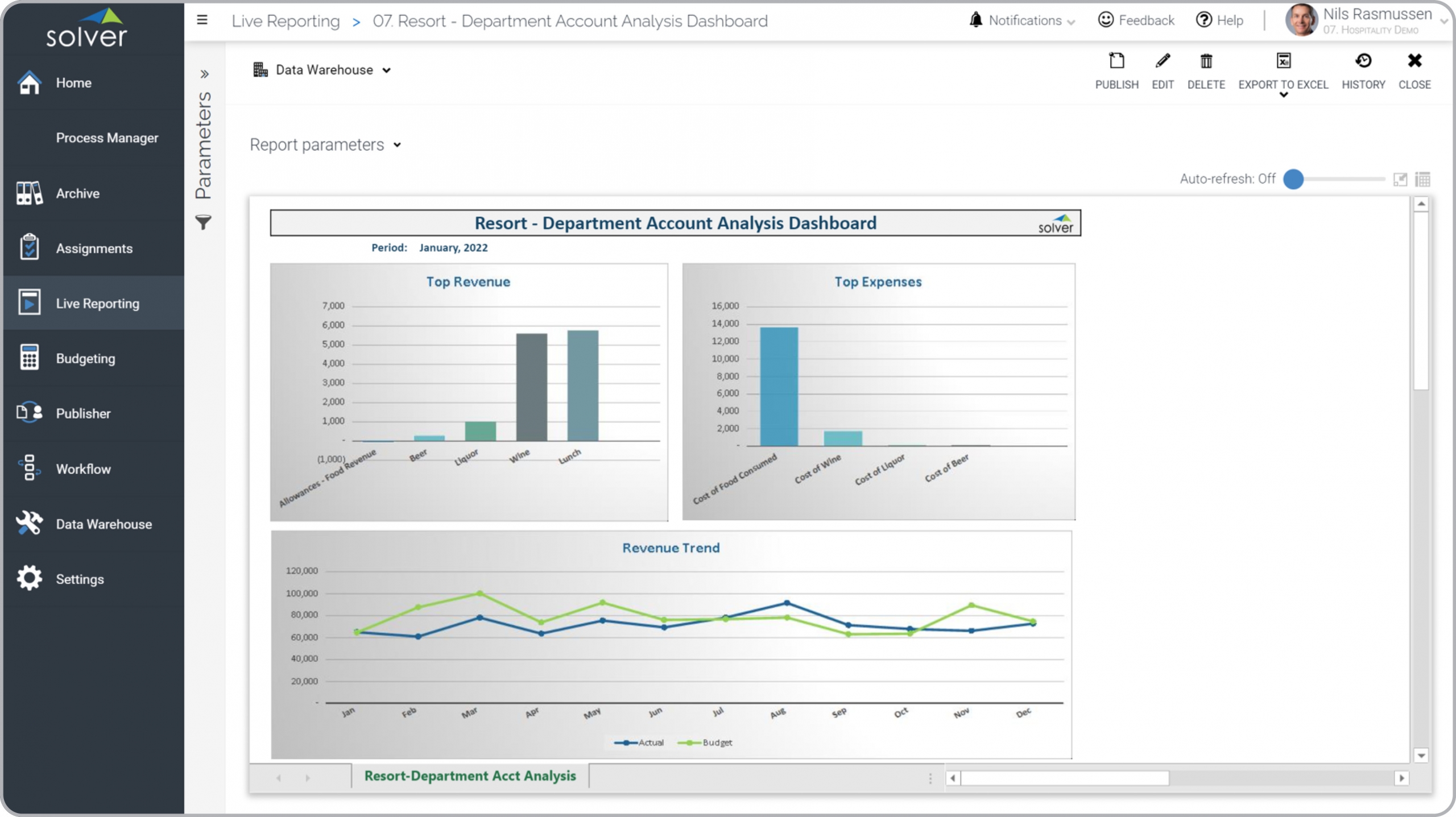 Example of a Department Dashboard for a Hospitality Company[/caption] You can find hundreds of additional examples
here
Who Uses This Type of
Report
? The typical users of this type of report are: CFOs, analysts, budget managers, department managers.
Other Reports Often Used in Conjunction with
Departmental Dashboards Progressive FP&A and Department Managers departments sometimes use several different Departmental Dashboards, along with detailed F&B reports, financial statements, trail balance reports, forecast models, budgets, KPI scorecards and other management and control tools.
Where Does the Data for Analysis Originate From? The Actual (historical transactions) data typically comes from enterprise resource planning (ERP) systems like: Microsoft Dynamics 365 (D365) Finance, Microsoft Dynamics 365 Business Central (D365 BC), Microsoft Dynamics AX, Microsoft Dynamics NAV, Microsoft Dynamics GP, Microsoft Dynamics SL, Sage Intacct, Sage 100, Sage 300, Sage 500, Sage X3, SAP Business One, SAP ByDesign, Acumatica, Netsuite and others. In analyses where budgets or forecasts are used, the planning data most often originates from in-house Excel spreadsheet models or from professional corporate performance management (CPM/EPM) solutions.
What Tools are Typically used for Reporting, Planning and Dashboards? Examples of business software used with the data and ERPs mentioned above are:
Example of a Department Dashboard for a Hospitality Company[/caption] You can find hundreds of additional examples
here
Who Uses This Type of
Report
? The typical users of this type of report are: CFOs, analysts, budget managers, department managers.
Other Reports Often Used in Conjunction with
Departmental Dashboards Progressive FP&A and Department Managers departments sometimes use several different Departmental Dashboards, along with detailed F&B reports, financial statements, trail balance reports, forecast models, budgets, KPI scorecards and other management and control tools.
Where Does the Data for Analysis Originate From? The Actual (historical transactions) data typically comes from enterprise resource planning (ERP) systems like: Microsoft Dynamics 365 (D365) Finance, Microsoft Dynamics 365 Business Central (D365 BC), Microsoft Dynamics AX, Microsoft Dynamics NAV, Microsoft Dynamics GP, Microsoft Dynamics SL, Sage Intacct, Sage 100, Sage 300, Sage 500, Sage X3, SAP Business One, SAP ByDesign, Acumatica, Netsuite and others. In analyses where budgets or forecasts are used, the planning data most often originates from in-house Excel spreadsheet models or from professional corporate performance management (CPM/EPM) solutions.
What Tools are Typically used for Reporting, Planning and Dashboards? Examples of business software used with the data and ERPs mentioned above are:
- Native ERP report writers and query tools
- Spreadsheets (for example Microsoft Excel)
- Corporate Performance Management (CPM) tools (for example Solver)
- Dashboards (for example Microsoft Power BI and Tableau)
- View 100’s of reporting, consolidations, planning, budgeting, forecasting and dashboard examples here
- View a Hospitality industry white paper and other industry-specific information here
- See how reports are designed in a modern report writer using a cloud-connected Excel add-in writer
- Discover how the Solver CPM solution delivers financial and operational reporting
- Discover how the Solver CPM solution delivers planning, budgeting and forecasting
- Watch demo videos of reporting, planning and dashboards
August 11, 2021
TAGS: Reporting, Solver, report writer, Microsoft, golf, template, practice, Acumatica, hospitality, expenses, Netsuite, Finance, planning, GP, dashboard, Business Central, excel, restaurant, resort, spa, ax, hotel, forecast, Budget, Dynamics 365, analysis, budgeting, KPI, revenue, Cloud, Software, casino, Tableau, SAP, example, best, Sage, BC, D365, NAV, Intacct, Variance, department, GL, CPM, report, SL, Management, dynamics, Power BI, departmental dashboard