
What is
a
Customer 360 Degree Analysis Report
? Customer 360 degree reports are considered one of the most important analysis tools in a company and are often used by customer-facing employees and managers to quickly get a complete picture of a specific customer without having to manually assemble data from different systems. Some of the key functionality in this type of dashboard report is that it combines data from the company's systems that hold customer information. These typically include sales and receivables data from the ERP system, pipeline data from CRM and support data from the helpdesk system. The report is a single page, easy to read format that combines customer metrics with charts for easy analysis. The report is parameter driven and the user can run it for any customer and date range. You find an example of this type of dashboard report below.
Purpose of
360 Degree Customer Reports Companies and organizations use 360 Degree Customer Reports to speed up decisions by providing employees and managers with a very quick and easy way to see everything going on with a customer. When used as part of good business practices in a customer-facing department, a company can improve its customer-related decisions as well as reduce the chances that revenues are lost because employees make decisions without a complete customer picture.
360 Degree Customer Report
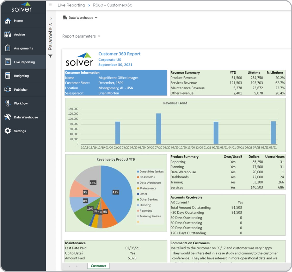
Example Here is an example of a Customer360 report that combines data from multiple data sources. [caption id="" align="alignnone" width="1129"]
 Customer 360 Degree Analysis Report Example[/caption] You can find hundreds of additional examples
here
Who Uses This Type of
Dashboard report
? The typical users of this type of dashboard report are: Support teams, Sales teams, Managers.
Other
Dashboard Report
s Often Used in Conjunction with
360 Degree Customer Reports Progressive customer-facing Departments sometimes use several different 360 Degree Customer Reports, along with sales reports, receivables reports, support reports, customer dashboards and other management and control tools.
Where Does the Data for Analysis Originate From? The Actual (historical transactions) data typically comes from helpdesk, CRM and enterprise resource planning (ERP) systems like: Microsoft Dynamics 365 (D365) Finance, Microsoft Dynamics 365 Business Central (D365 BC), Microsoft Dynamics AX, Microsoft Dynamics NAV, Microsoft Dynamics GP, Microsoft Dynamics SL, Microsoft Dynamics 365 (CRM), Salesforce, Hubspot, Zendesk, Sage Intacct, Sage 100, Sage 300, Sage 500, Sage X3, SAP Business One, SAP ByDesign, Acumatica, Netsuite and others. In analyses where budgets or forecasts are used, the planning data most often originates from in-house Excel spreadsheet models or from professional corporate performance management (CPM/EPM) solutions.
What Tools are Typically used for Reporting, Planning and Dashboards? Examples of business software used with the data and ERPs mentioned above are:
Customer 360 Degree Analysis Report Example[/caption] You can find hundreds of additional examples
here
Who Uses This Type of
Dashboard report
? The typical users of this type of dashboard report are: Support teams, Sales teams, Managers.
Other
Dashboard Report
s Often Used in Conjunction with
360 Degree Customer Reports Progressive customer-facing Departments sometimes use several different 360 Degree Customer Reports, along with sales reports, receivables reports, support reports, customer dashboards and other management and control tools.
Where Does the Data for Analysis Originate From? The Actual (historical transactions) data typically comes from helpdesk, CRM and enterprise resource planning (ERP) systems like: Microsoft Dynamics 365 (D365) Finance, Microsoft Dynamics 365 Business Central (D365 BC), Microsoft Dynamics AX, Microsoft Dynamics NAV, Microsoft Dynamics GP, Microsoft Dynamics SL, Microsoft Dynamics 365 (CRM), Salesforce, Hubspot, Zendesk, Sage Intacct, Sage 100, Sage 300, Sage 500, Sage X3, SAP Business One, SAP ByDesign, Acumatica, Netsuite and others. In analyses where budgets or forecasts are used, the planning data most often originates from in-house Excel spreadsheet models or from professional corporate performance management (CPM/EPM) solutions.
What Tools are Typically used for Reporting, Planning and Dashboards? Examples of business software used with the data and ERPs mentioned above are:
- Native ERP report writers and query tools
- Spreadsheets (for example Microsoft Excel)
- Corporate Performance Management (CPM) tools (for example Solver)
- Dashboards (for example Microsoft Power BI and Tableau)
- View 100’s of reporting, consolidations, planning, budgeting, forecasting and dashboard examples here
- See how reports are designed in a modern report writer using a cloud-connected Excel add-in writer
- Discover how the Solver CPM solution delivers financial and operational reporting
- Discover how the Solver CPM solution delivers planning, budgeting and forecasting
- Watch demo videos of reporting, planning and dashboards
November 21, 2020
TAGS: Reporting, Solver, report writer, Microsoft, template, customer dashboard, practice, Acumatica, expenses, customer, Netsuite, Finance, GP, activity, Business Central, excel, ax, forecast, Budget, forecasting, 360 degree report, budgeting, Cloud, Software, customer 360, Tableau, SAP, example, best, Sage, BC, D365, revenues, NAV, Intacct, CPM, report, SL, Management, dynamics, support, customer analysis, Power BI