
What is a
Consulting Time Dashboard for Technology Companies
? Time analysis dashboards are considered operational reports and are used by Executives and Consulting Leaders to track estimated and reported hours across clients and projects. Some of the main functionality in this type of dashboard is that it provides monitoring of hours across five different perspectives: 1) Table by region/project/consultant and with metrics for Estimated hours, reported hours and variance, 2) Monthly trend with estimated and reported hours, 3) Reported hours by region (geographical map), 4) Ranked hours by customer, and 5) Ranked hours by project. You find an example of this type of dashboard below.
Purpose of
Consulting Time Dashboards Tech companies use Consulting Time Dashboards to give managers an easy was to slice and dice their use of hours by customer, region and project. When used as part of good business practices in Professional Services and Financial Planning & Analysis (FP&A) departments, an organization can improve its utilization strategies and related revenue, and it can reduce the chances that available capacity is wasted due to poor insight to trends and actual performance.
Example of a
Consulting Time Dashboard Here is an example of a Consulting Time Dashboards with metrics and trends related to actual and estimated hours. [caption id="" align="alignnone" width="2560"]
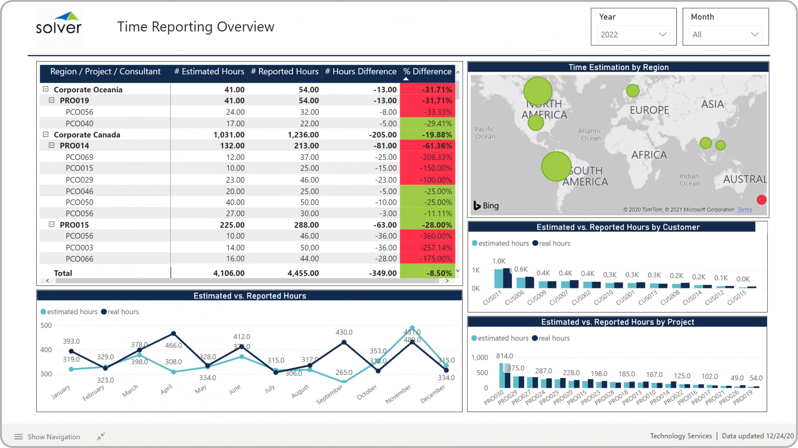 Example of a Consulting Time Dashboard for Technology Companies[/caption] You can find hundreds of additional examples
here
Who Uses This Type of
Dashboard
? The typical users of this type of dashboard are: Executives, Consulting Managers, Consulting Team Leaders.
Other Reports Often Used in Conjunction with
Consulting Time Dashboards Progressive Consulting and Financial Planning & Analysis (FP&A) departments sometimes use several different Consulting Dashboards, along with detailed utilization reports, billing reports, financial reports, financial KPI dashboards, project forecasts, budget models and other management and control tools.
Where Does the Data for Analysis Originate From? The Actual (historical transactions) data typically comes from enterprise resource planning (ERP) systems like: Microsoft Dynamics 365 (D365) Finance, Microsoft Dynamics 365 Business Central (D365 BC), Microsoft Dynamics AX, Microsoft Dynamics NAV, Microsoft Dynamics GP, Microsoft Dynamics SL, Sage Intacct, Sage 100, Sage 300, Sage 500, Sage X3, SAP Business One, SAP ByDesign, Acumatica, Netsuite and others. In analyses where budgets or forecasts are used, the planning data most often originates from in-house Excel spreadsheet models or from professional corporate performance management (CPM/EPM) solutions.
What Tools are Typically used for Reporting, Planning and Dashboards? Examples of business software used with the data and ERPs mentioned above are:
Example of a Consulting Time Dashboard for Technology Companies[/caption] You can find hundreds of additional examples
here
Who Uses This Type of
Dashboard
? The typical users of this type of dashboard are: Executives, Consulting Managers, Consulting Team Leaders.
Other Reports Often Used in Conjunction with
Consulting Time Dashboards Progressive Consulting and Financial Planning & Analysis (FP&A) departments sometimes use several different Consulting Dashboards, along with detailed utilization reports, billing reports, financial reports, financial KPI dashboards, project forecasts, budget models and other management and control tools.
Where Does the Data for Analysis Originate From? The Actual (historical transactions) data typically comes from enterprise resource planning (ERP) systems like: Microsoft Dynamics 365 (D365) Finance, Microsoft Dynamics 365 Business Central (D365 BC), Microsoft Dynamics AX, Microsoft Dynamics NAV, Microsoft Dynamics GP, Microsoft Dynamics SL, Sage Intacct, Sage 100, Sage 300, Sage 500, Sage X3, SAP Business One, SAP ByDesign, Acumatica, Netsuite and others. In analyses where budgets or forecasts are used, the planning data most often originates from in-house Excel spreadsheet models or from professional corporate performance management (CPM/EPM) solutions.
What Tools are Typically used for Reporting, Planning and Dashboards? Examples of business software used with the data and ERPs mentioned above are:
- Native ERP report writers and query tools
- Spreadsheets (for example Microsoft Excel)
- Corporate Performance Management (CPM) tools (for example Solver)
- Dashboards (for example Microsoft Power BI and Tableau)
- View 100’s of reporting, consolidations, planning, budgeting, forecasting and dashboard examples here
- View a Technology industry white paper and other industry-specific information here
- See how reports are designed in a modern report writer using a cloud-connected Excel add-in writer
- Discover how the Solver CPM solution delivers financial and operational reporting
- Discover how the Solver CPM solution delivers planning, budgeting and forecasting
- Watch demo videos of reporting, planning and dashboards
May 15, 2021
TAGS: Reporting, Solver, report writer, Microsoft, template, practice, Acumatica, Netsuite, Finance, planning, GP, dashboard, Business Central, tech, excel, ax, forecast, Budget, billable hours, technology, Professional Services, Dynamics 365, analysis, budgeting, KPI, Cloud, Software, Tableau, utilization, SAP, example, best, Sage, BC, D365, NAV, Intacct, hours, CPM, report, SL, Management, dynamics, Power BI, tech company dashboard, project hours, reported, estimated hours, consulting dashboard