
What is a
Collections to Charge Rate Dashboard
? Collections to Charge Rate Dashboards are considered billing process and collection optimization analysis tools and are used by CFOs and collections managers to analyze the rate at which the organization is able to collect versus how much it charges. Some of the main functionality in this type of dashboard is that it provides analysis from three perspectives: 1) Collection to charge rate per individual biller, 2) Collection to charge rate by insurance company (payor), 3) Collection to charge rate by patient (using patient number). The user can choose month and year filter from the drop down boxes on the top of the screen. You find an example of this type of dashboard below.
 Purpose of
Collections to Charge Rate Dashboards Healthcare organizations use Collections to Charge Rate Dashboards to analyze how well (or not) they are able to collect versus what they charge. When used as part of good business practices in Financial Planning & Analysis (FP&A) and collections departments, an organization can improve its revenues and related cash flow, and it can reduce the chances that elements of pricing, billing, charging or collections processes are not overhauled when systemic problems are discovered.
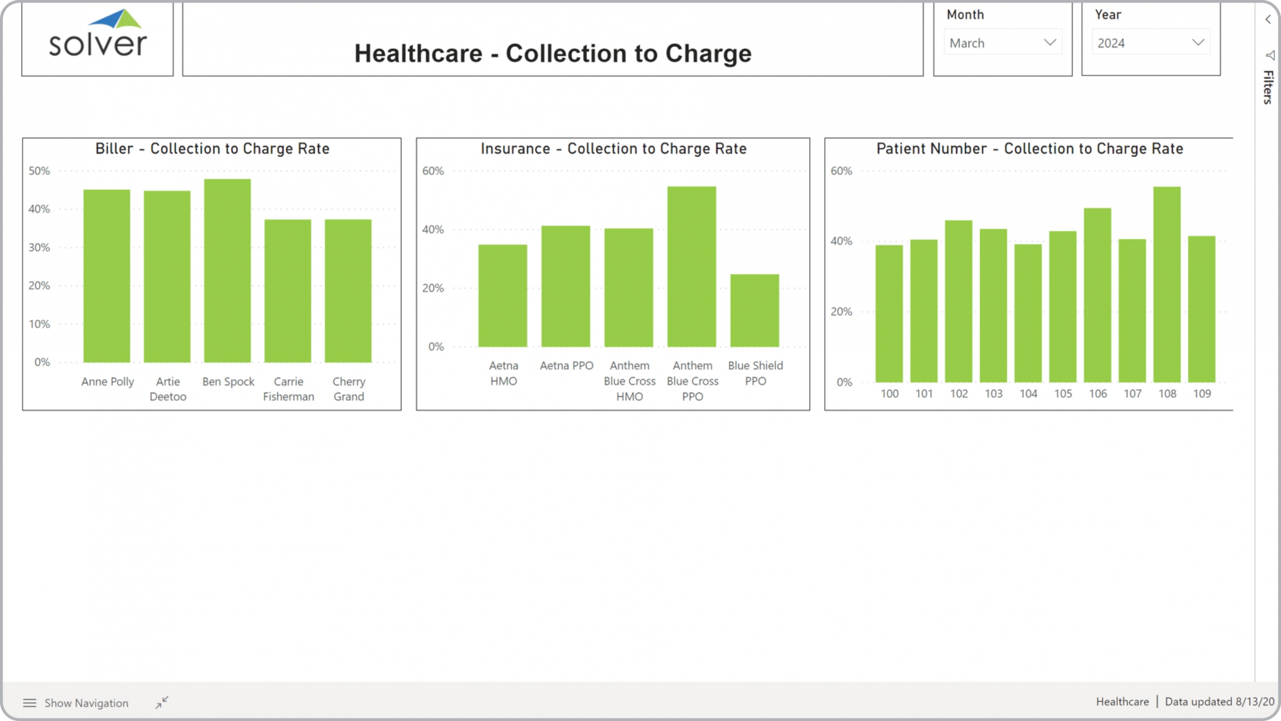
Example of a
Collections to Charge Rate Dashboard Here is an example of a Collections to Charge Rate Dashboard with analysis of collection rate by biller, insurance company and patient. [caption id="" align="alignnone" width="2560"]
Purpose of
Collections to Charge Rate Dashboards Healthcare organizations use Collections to Charge Rate Dashboards to analyze how well (or not) they are able to collect versus what they charge. When used as part of good business practices in Financial Planning & Analysis (FP&A) and collections departments, an organization can improve its revenues and related cash flow, and it can reduce the chances that elements of pricing, billing, charging or collections processes are not overhauled when systemic problems are discovered.
Example of a
Collections to Charge Rate Dashboard Here is an example of a Collections to Charge Rate Dashboard with analysis of collection rate by biller, insurance company and patient. [caption id="" align="alignnone" width="2560"]
 Example of a Collections to Charge Rate Dashboard for Healthcare Providers[/caption] You can find hundreds of additional examples
here
Who Uses This Type of
Dashboard
? The typical users of this type of dashboard are: CFOs, collections manager, accountants, analysts.
Other Reports Often Used in Conjunction with
Collection to Charge Rate Dashboards Progressive Financial Planning & Analysis (FP&A) and collections departments sometimes use several different Collections to Charge Rate Dashboards, along with profit & loss reports, balance sheets, cash flow statements, annual budgets and forecasts, revenue dashboards, billing reports, charges reports, collections reports, aged receivables (AR) reports and other management and control tools.
Example of a Collections to Charge Rate Dashboard for Healthcare Providers[/caption] You can find hundreds of additional examples
here
Who Uses This Type of
Dashboard
? The typical users of this type of dashboard are: CFOs, collections manager, accountants, analysts.
Other Reports Often Used in Conjunction with
Collection to Charge Rate Dashboards Progressive Financial Planning & Analysis (FP&A) and collections departments sometimes use several different Collections to Charge Rate Dashboards, along with profit & loss reports, balance sheets, cash flow statements, annual budgets and forecasts, revenue dashboards, billing reports, charges reports, collections reports, aged receivables (AR) reports and other management and control tools.
 Where Does the Data for Analysis Originate From? The Actual (historical transactions) data typically comes from enterprise resource planning (ERP) systems like: Microsoft Dynamics 365 (D365) Finance, Microsoft Dynamics 365 Business Central (D365 BC), Microsoft Dynamics AX, Microsoft Dynamics NAV, Microsoft Dynamics GP, Microsoft Dynamics SL, Sage Intacct, Sage 100, Sage 300, Sage 500, Sage X3, SAP Business One, SAP ByDesign, Acumatica, Netsuite and others. In analyses where budgets or forecasts are used, the planning data most often originates from in-house Excel spreadsheet models or from professional corporate performance management (CPM/EPM) solutions.
What Tools are Typically used for Reporting, Planning and Dashboards? Examples of business software used with the data and ERPs mentioned above are:
Corporate Performance Management (CPM) Cloud Solutions and More Examples
Where Does the Data for Analysis Originate From? The Actual (historical transactions) data typically comes from enterprise resource planning (ERP) systems like: Microsoft Dynamics 365 (D365) Finance, Microsoft Dynamics 365 Business Central (D365 BC), Microsoft Dynamics AX, Microsoft Dynamics NAV, Microsoft Dynamics GP, Microsoft Dynamics SL, Sage Intacct, Sage 100, Sage 300, Sage 500, Sage X3, SAP Business One, SAP ByDesign, Acumatica, Netsuite and others. In analyses where budgets or forecasts are used, the planning data most often originates from in-house Excel spreadsheet models or from professional corporate performance management (CPM/EPM) solutions.
What Tools are Typically used for Reporting, Planning and Dashboards? Examples of business software used with the data and ERPs mentioned above are:
Corporate Performance Management (CPM) Cloud Solutions and More Examples
Purpose of
Collections to Charge Rate Dashboards Healthcare organizations use Collections to Charge Rate Dashboards to analyze how well (or not) they are able to collect versus what they charge. When used as part of good business practices in Financial Planning & Analysis (FP&A) and collections departments, an organization can improve its revenues and related cash flow, and it can reduce the chances that elements of pricing, billing, charging or collections processes are not overhauled when systemic problems are discovered.
Example of a
Collections to Charge Rate Dashboard Here is an example of a Collections to Charge Rate Dashboard with analysis of collection rate by biller, insurance company and patient. [caption id="" align="alignnone" width="2560"]
 Example of a Collections to Charge Rate Dashboard for Healthcare Providers[/caption] You can find hundreds of additional examples
here
Who Uses This Type of
Dashboard
? The typical users of this type of dashboard are: CFOs, collections manager, accountants, analysts.
Other Reports Often Used in Conjunction with
Collection to Charge Rate Dashboards Progressive Financial Planning & Analysis (FP&A) and collections departments sometimes use several different Collections to Charge Rate Dashboards, along with profit & loss reports, balance sheets, cash flow statements, annual budgets and forecasts, revenue dashboards, billing reports, charges reports, collections reports, aged receivables (AR) reports and other management and control tools.
Where Does the Data for Analysis Originate From? The Actual (historical transactions) data typically comes from enterprise resource planning (ERP) systems like: Microsoft Dynamics 365 (D365) Finance, Microsoft Dynamics 365 Business Central (D365 BC), Microsoft Dynamics AX, Microsoft Dynamics NAV, Microsoft Dynamics GP, Microsoft Dynamics SL, Sage Intacct, Sage 100, Sage 300, Sage 500, Sage X3, SAP Business One, SAP ByDesign, Acumatica, Netsuite and others. In analyses where budgets or forecasts are used, the planning data most often originates from in-house Excel spreadsheet models or from professional corporate performance management (CPM/EPM) solutions.
What Tools are Typically used for Reporting, Planning and Dashboards? Examples of business software used with the data and ERPs mentioned above are:
Example of a Collections to Charge Rate Dashboard for Healthcare Providers[/caption] You can find hundreds of additional examples
here
Who Uses This Type of
Dashboard
? The typical users of this type of dashboard are: CFOs, collections manager, accountants, analysts.
Other Reports Often Used in Conjunction with
Collection to Charge Rate Dashboards Progressive Financial Planning & Analysis (FP&A) and collections departments sometimes use several different Collections to Charge Rate Dashboards, along with profit & loss reports, balance sheets, cash flow statements, annual budgets and forecasts, revenue dashboards, billing reports, charges reports, collections reports, aged receivables (AR) reports and other management and control tools.
Where Does the Data for Analysis Originate From? The Actual (historical transactions) data typically comes from enterprise resource planning (ERP) systems like: Microsoft Dynamics 365 (D365) Finance, Microsoft Dynamics 365 Business Central (D365 BC), Microsoft Dynamics AX, Microsoft Dynamics NAV, Microsoft Dynamics GP, Microsoft Dynamics SL, Sage Intacct, Sage 100, Sage 300, Sage 500, Sage X3, SAP Business One, SAP ByDesign, Acumatica, Netsuite and others. In analyses where budgets or forecasts are used, the planning data most often originates from in-house Excel spreadsheet models or from professional corporate performance management (CPM/EPM) solutions.
What Tools are Typically used for Reporting, Planning and Dashboards? Examples of business software used with the data and ERPs mentioned above are:
- Native ERP report writers and query tools
- Spreadsheets (for example Microsoft Excel)
- Corporate Performance Management (CPM) tools (for example Solver)
- Dashboards (for example Microsoft Power BI and Tableau)
Corporate Performance Management (CPM) Cloud Solutions and More Examples
- View 100’s of reporting, consolidations, planning, budgeting, forecasting and dashboard examples here
- View a Healthcare white paper and other industry-specific information here
- See how reports are designed in a modern report writer using a cloud-connected Excel add-in writer
- Discover how the Solver CPM solution delivers financial and operational reporting
- Discover how the Solver CPM solution delivers planning, budgeting and forecasting
- Watch demo videos of reporting, planning and dashboards
April 19, 2021
TAGS: Reporting, Solver, insurance, report writer, Microsoft, template, practice, Acumatica, visualization, Netsuite, Finance, planning, GP, dashboard, collections, Business Central, excel, ax, healthcare, forecast, Budget, clinic, Dynamics 365, analysis, budgeting, KPI, Cloud, Software, healthcare dashboard, Tableau, SAP, example, best, Sage, BC, D365, NAV, Intacct, provider, CPM, report, SL, Management, dynamics, Power BI, collection rate, collections dashboard, payor, patient, biller, charge, collections to charge dashboard