
Higher Ed – Enrollment Dashboard
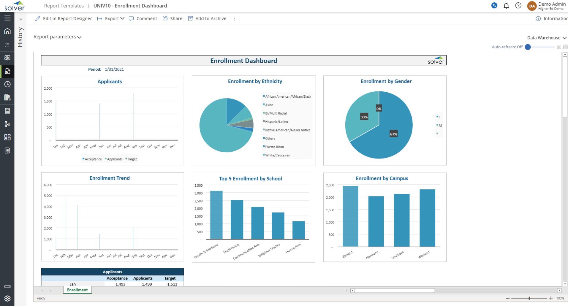
What is a Student Enrollment Dashboard? Student Enrollment Dashboards are considered operational analysis tools and are used by enrollment officers and dean of students to analyze student demographics and expected headcount. Some of the main functionality in this type of visualization report is that it provides insight into student statistics from six different KPI perspectives: 1) Applicants by semester/quarter, 2) Enrollment by ethnicity, 3) Enrollment by gender, 4) Enrollment trend, 5) Top 5 enrollment figures by school, 6) Enrollment by campus. All the figures from the charts are also listed below the dashboard in a tabular report format. You find an example of this type of visualization report below.
Purpose of Student Enrollment Dashboards Universities and colleges use Student Enrollment Dashboards to provide their decisionmakers with an easy way to understand enrollment data. When used as part of good business practices in a Student Recruiting and Enrollment department, a higher education institution can improve its strategies and initiatives related to student headcount and demographics as well as associated financial planning. It can also reduce the chances that the employees make inferior decisions because they lack quick and easy access to these key statistics.
Who Uses This Type of Visualization report? The typical users of this type of visualization report are: Enrollment officers, Dean of Students, School administrators and Planners. Other Visualization Reports Often Used in Conjunction with Student Enrollment Dashboards Progressive Student Recruiting and Enrollment departments sometimes use several different Student Enrollment Dashboards, along with detailed enrollment reports, student dashboards, staff and tuition revenue budgets and other management and control tools.
Where Does the Data for Analysis Originate From? The Actual (historical transactions) data typically comes from admission and enrollment management software, student information systems as well as enterprise resource planning (ERP) systems like: Microsoft Dynamics 365 (D365) Finance, Microsoft Dynamics 365 Business Central (D365 BC), Microsoft Dynamics AX, Microsoft Dynamics NAV, Microsoft Dynamics GP, Microsoft Dynamics SL, Sage Intacct, Sage 100, Sage 300, Sage 500, Sage X3, SAP Business One, SAP ByDesign, Acumatica, Netsuite and others. In analyses where budgets or forecasts are used, the planning data most often originates from in-house Excel spreadsheet models or from professional xFP&A solutions.
Built for higher education finance teams and aligned with Solver's xFP&A platform, this Solver dashboard template connects directly to your ERP data via the Solver Data Warehouse, enabling near real-time analysis with minimal setup. Designed for QuickStart deployment, it can be activated rapidly so your team can focus on analysis and decisions — not data preparation.
What is the Higher Ed – Enrollment Dashboard in Solver? The Higher Ed – Enrollment Dashboard is a pre-built xFP&A dashboard template in Solver designed for higher education organizations. It delivers key financial and operational metrics in a single, easy-to-use interface — purpose-built for higher education finance workflows.
Who uses this Solver dashboard template? This template is primarily used by CFOs, controllers, and higher education finance teams in higher education organizations who need accurate, timely data to support planning, reporting, and decision-making. It is particularly valuable for higher education finance teams managing budgets, forecasts, and performance reviews.
Where does the data come from? Data is sourced automatically from your ERP system through the Solver Data Warehouse. Once connected, the template updates in near real-time with no manual data entry required.
To learn more, visit the Resource Library.