
Top Data Visualization Principles for Power BI Dashboards (Not Another Blog About Design)
Here Are the Basics You’re Looking for When It Comes to Dashboard Data Visualization Principles
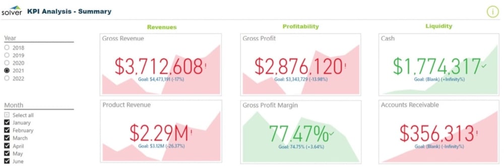
Microsoft Power BI is a powerful tool that can help business leaders view “the story” of their organization’s data (as Microsoft likes to put it). This helps leaders quickly identify and act on trends.
But you know what? There are a lot of bad Power BI dashboards out there. A lot.
Avoid creating bad dashboards. Use these top data visualization principles to create good financial dashboards in Power BI.
1. Focus on Accuracy
You know what kills a Power BI dashboard faster than anything else? Inaccurate data. Misleading data is a problem too – and don’t fool yourself into thinking that misleading data is anything but inaccurate. The purpose of a dashboard is to inform, not to persuade.
The best dashboards are ones that help your company make fast, effective decisions. You need accurate, objective data to do that.
When designing your dashboards, make sure you integrate Power BI directly to your reporting and planning software, so you don’t make poor decisions due to manual data-entry errors. While you’re at it, consider whether you want to see static data (for a snapshot) or dynamic data (for a rolling trend analysis). You can choose your preference for each dashboard in Power BI and always ensure you’re looking at the right dataset.
2. Consider Your Audience
You may be the kind of person who loves a lot of detail. You might get your kicks from mining data to answer complex questions. In fact, considering that your company nominated you to handle the project of creating Power BI dashboards (or you volunteered), we’d be willing to bet that you really enjoy mastering technology to have it present you with all the details.
Yeah, most people aren’t you. (Poor them.)
Remember that you’re building dashboards for other people. In fact, you’re building dashboards for the people who disliked this task so much that they made you do it. Present those people with the data they need and only the data they need. To meet a Goldilocks-like middle ground of simplicity plus detail, we recommend you make your dashboards interactive. Here are some examples of interactive dashboards.
Quick tip: Want a great reason to keep your data presentation simple? That one person in the office who you know is going to call you up every morning and waste your time asking about little details they found in your dashboard. This person is the one who asks you plaintively, “But why did that salesperson offer a 10% discount on this specific line item?” Don’t give that person ammunition to ruin your day: keep your dashboards simple.
3. Follow Data Visualization Principles for Design
You’ve been researching online about how to build your Power BI dashboards using data visualization principles. That means you’ve already run across all those millions of articles that focus solely on design. Lucky you! Those blogs are nice… but we feel design is Step 3, not the end-all, be-all of the Power BI process. A pretty dashboard that presents inaccuracies to the wrong audience is what we in the dashboard industry call “a total failure.” (Everybody calls it that actually, not just us.)
Design is important once you have the fundamentals down from Steps 1 and 2, so let’s cover these fast:
- Use a clean layout. Less is more when presenting data. White space is great.
- Highlight important data. Make answers ridiculously easy to find.
- Make sure the form follows the function. Ask yourself, “What one question should each element answer?” and then make sure the form you choose does.
- Use the right type of visualizations. Different charts and graphs are best for different types of data display. (Tip: those weird, angled 3D views on Excel’s pie charts are bad for every type of data display.) If you don’t know whether a histogram or a bar chart would be better for presenting specific data on your dashboard (or you don’t know what those things are), try ‘em both out on a test dashboard and see which one works better for you and your audience.
Top Tip: Don’t Get Held Up by Data Visualization Principles
The most important thing to remember when creating your dashboards is to try things out and have fun, you data-minded person, you. Analysis paralysis is completely unnecessary when building a Power BI dashboard because you can always change your visualizations to make them better.
In fact, you should change your visualizations and make them better! As your company grows, and as you figure out the true power behind Power BI, you’ll have lots of great ideas on how your dashboards can evolve with your needs.
As data visualization expert Edward Tufte said, “There are two goals when presenting data: convey your story and establish credibility.” With accurate, audience-oriented dashboards (featuring some nice design), you’ll accomplish these goals with ease.
Connect Your Data to Dashboards in One Day with Solver’s QuickStart
We all know Everything Can Change in a Day, yet only Solver delivers a one-day rapid deployment, including free and instant access to $100K of value available on Day 1 through the Solver Marketplace. Solver is committed to helping you with all your advanced planning and reporting needs, so you can Accelerate Better Decisions and stay ahead of the pack.
February 28, 2023