
This article is part 4 of an 8-part series on evaluating the best CPM tools for your business. Part 4 focuses on evaluating the range of dashboard features within the best CPM software applications.
While the financial reporting, consolidations, and budgeting functionality of
Corporate Performance Management (CPM) tools are highly valuable to accounting and finance professionals, most executives want to also see the organization’s key figures represented graphically. Graphical analysis tools generally fall into two categories: 1) Static charts; and 2) Interactive dashboards. Both can be desirable because static charts can significantly highlight the most important information in financial reports such as revenues, profits, and margins, while well-designed interactive dashboards provide deep, user-guided analysis. When you are looking to acquire a new
financial reporting or planning solution and you are comparing your vendor finalists, it is important to review which of the above graphical analysis methods they provide.
Here are some of the top dashboard architectures to look for in the best CPM software solutions In general, one or more of these three types of graphical analyses below are provided by leading CPM vendors:
 How much does a dashboard solution cost? While it is important to do your homework to ensure that the vendor you choose has the key features needed for a successful deployment, the total savings in time and effort as well as improved decision-making capabilities are just as important. Here are some things to think about when you get prices from your vendor finalists:
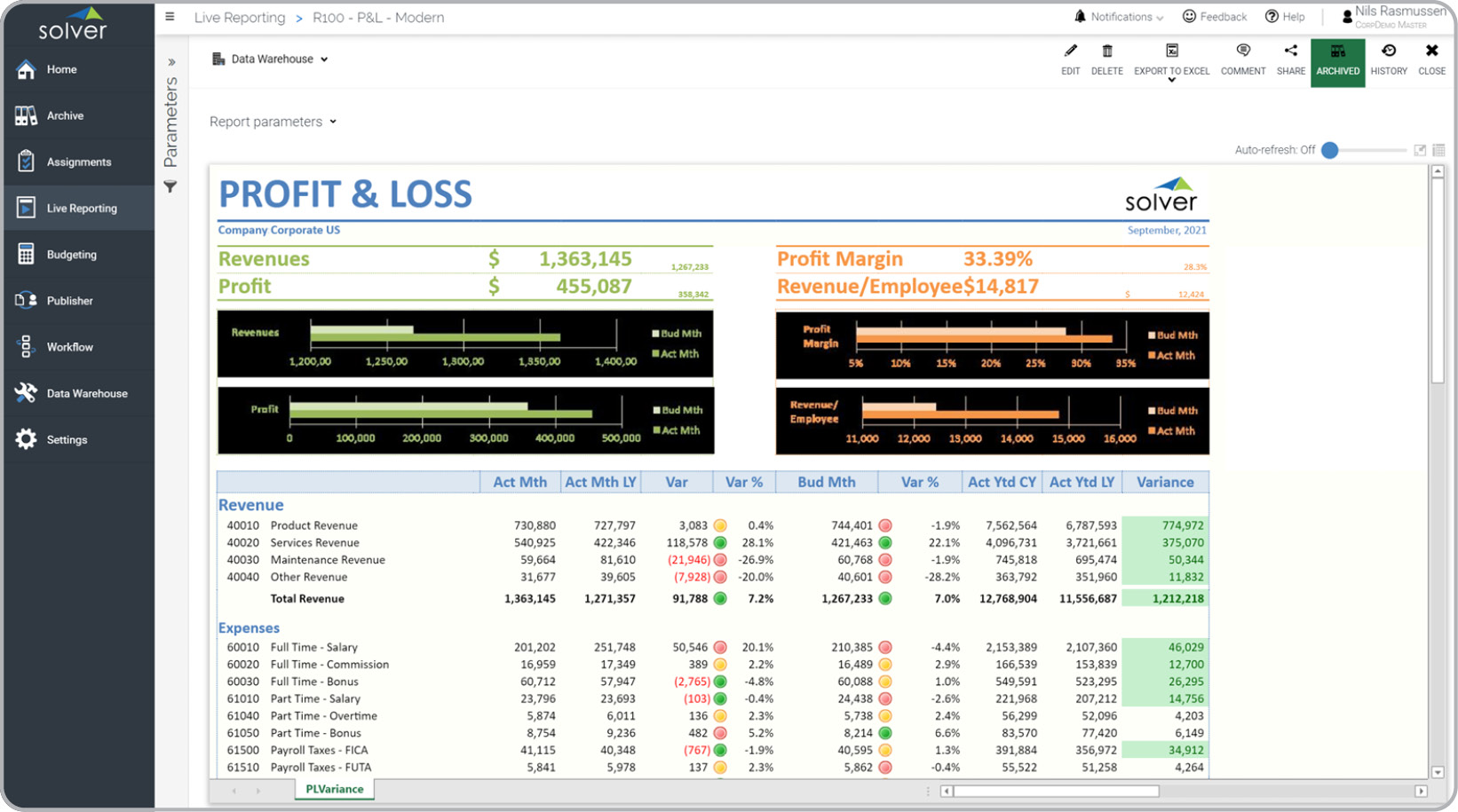
- Charts embedded inside financial reports
- Native dashboards in CPM portal
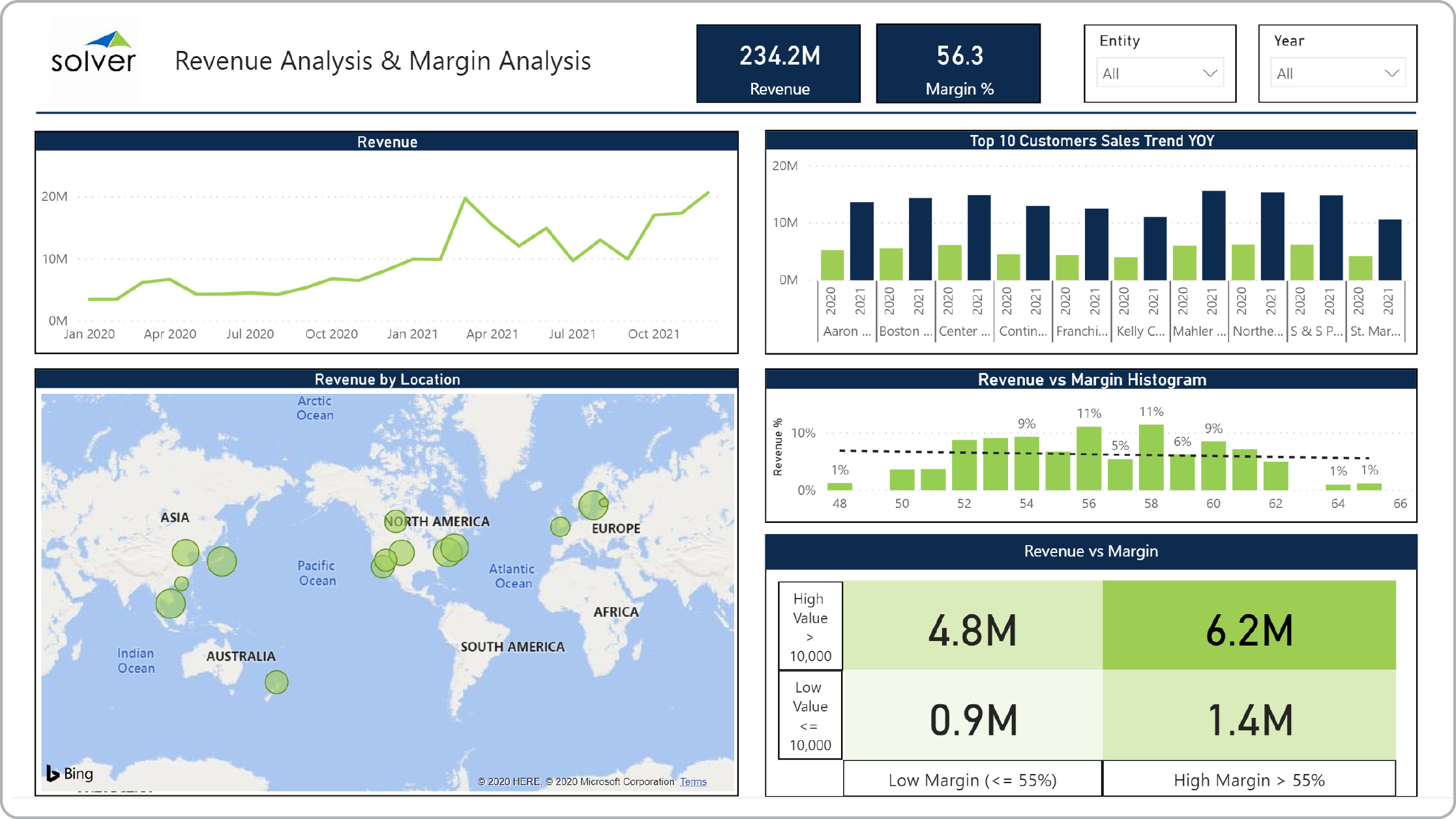
- Integrated best-in-class dashboards
How much does a dashboard solution cost? While it is important to do your homework to ensure that the vendor you choose has the key features needed for a successful deployment, the total savings in time and effort as well as improved decision-making capabilities are just as important. Here are some things to think about when you get prices from your vendor finalists:
- Does the annual subscription from each vendor contain the same user count and modules?
- If you are receiving a discount, how long until it resets to the list price?
- Does the vendor offer a written policy for annual price increases?
- Are the implementation estimates from each vendor for exactly the same work?
- Vendor Comparison Tool and ROI Calculator
- Solver Tour Central
- 500+ Budget and Report Examples
- Analyst reports and ratings: G2 and Dresner
- Software Selection Blog
- QuickStart - 1 day deployment with pre-built templates
January 18, 2021
TAGS: Reporting, Solver, Microsoft, visualization, Netsuite, planning, dashboard, Business Central, excel, forecasting, Dynamics 365, analysis, budgeting, Sage Intacct, KPI, Tableau, d365 finance, chart, CPM, Power BI, EPM, consolidations, best software, Management Reporter, prophix, PowerPoint, best tools, Vena, jet reports, software comparison, Azure, SAP Business One, sap bydesign, dynamics nav, dynamics gp, anaplan, Adaptive Insight, Planful, Teams